## Multiple Line Charts: Optimization Performance
### Overview
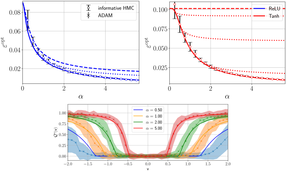
The image contains three line charts comparing the performance of different optimization algorithms and activation functions. The top-left chart compares "informative HMC" and "ADAM" algorithms. The top-right chart compares "ReLU" and "Tanh" activation functions. The bottom chart shows Q*(v) for different values of alpha.
### Components/Axes
**Top-Left Chart:**
* **X-axis:** α (Alpha), ranging from 0 to 4.
* **Y-axis:** ε<sup>opt</sup> (Epsilon-opt), ranging from 0 to 0.08.
* **Legend:** Located in the top-right corner.
* "informative HMC" (black circles with error bars)
* "ADAM" (black x markers)
* Three lines are present, all in blue: solid, dashed, and dotted. These lines do not have a direct legend entry in this chart.
**Top-Right Chart:**
* **X-axis:** α (Alpha), ranging from 0 to 4.
* **Y-axis:** ε<sup>opt</sup> (Epsilon-opt), ranging from 0 to 0.100.
* **Legend:** Located in the top-right corner.
* "ReLU" (blue solid line)
* "Tanh" (red solid line)
* Two additional lines are present: red dotted and red dashed. These lines do not have a direct legend entry in this chart.
**Bottom Chart:**
* **X-axis:** v, ranging from -2.0 to 2.0.
* **Y-axis:** Q*(v), ranging from 0.00 to 1.00.
* **Legend:** Located in the top-center.
* α = 0.50 (blue line with x markers)
* α = 1.00 (yellow/orange line with x markers)
* α = 2.00 (green line with x markers)
* α = 5.00 (red line with x markers)
* Each line has a shaded region around it, indicating uncertainty or variance.
### Detailed Analysis
**Top-Left Chart:**
* **Informative HMC (black circles):** The epsilon-opt value decreases as alpha increases.
* α = 0, ε<sup>opt</sup> ≈ 0.08
* α = 1, ε<sup>opt</sup> ≈ 0.04
* α = 2, ε<sup>opt</sup> ≈ 0.02
* α = 4, ε<sup>opt</sup> ≈ 0.01
* **ADAM (black x markers):** The epsilon-opt value decreases as alpha increases.
* α = 0, ε<sup>opt</sup> ≈ 0.07
* α = 1, ε<sup>opt</sup> ≈ 0.03
* α = 2, ε<sup>opt</sup> ≈ 0.02
* α = 4, ε<sup>opt</sup> ≈ 0.01
* **Blue Solid Line:** Starts at approximately 0.06 and decreases to approximately 0.015.
* **Blue Dashed Line:** Starts at approximately 0.05 and decreases to approximately 0.018.
* **Blue Dotted Line:** Starts at approximately 0.04 and decreases to approximately 0.01.
**Top-Right Chart:**
* **ReLU (blue solid line):** The epsilon-opt value decreases as alpha increases.
* α = 0, ε<sup>opt</sup> ≈ 0.10
* α = 1, ε<sup>opt</sup> ≈ 0.07
* α = 2, ε<sup>opt</sup> ≈ 0.04
* α = 4, ε<sup>opt</sup> ≈ 0.01
* **Tanh (red solid line):** The epsilon-opt value decreases as alpha increases.
* α = 0, ε<sup>opt</sup> ≈ 0.10
* α = 1, ε<sup>opt</sup> ≈ 0.06
* α = 2, ε<sup>opt</sup> ≈ 0.03
* α = 4, ε<sup>opt</sup> ≈ 0.01
* **Red Dotted Line:** Starts at approximately 0.09 and decreases to approximately 0.02.
* **Red Dashed Line:** Remains constant at approximately 0.10.
**Bottom Chart:**
* **α = 0.50 (blue line):** Starts near 0, rises to approximately 0.5 around v = -1.5, plateaus near 0.5 until v = 1.5, then decreases back to near 0.
* **α = 1.00 (yellow/orange line):** Starts near 0, rises to approximately 0.8 around v = -1.2, plateaus near 0.8 until v = 1.2, then decreases back to near 0.
* **α = 2.00 (green line):** Starts near 0, rises to approximately 0.9 around v = -1.0, plateaus near 0.9 until v = 1.0, then decreases back to near 0.
* **α = 5.00 (red line):** Starts near 0, rises to approximately 1.0 around v = -0.8, plateaus near 1.0 until v = 0.8, then decreases back to near 0.
### Key Observations
* In the top-left chart, both "informative HMC" and "ADAM" algorithms show a decrease in epsilon-opt as alpha increases.
* In the top-right chart, both "ReLU" and "Tanh" activation functions show a decrease in epsilon-opt as alpha increases.
* In the bottom chart, as alpha increases, the Q*(v) function transitions more sharply between 0 and 1.
### Interpretation
The charts suggest that increasing the value of alpha generally leads to better optimization performance (lower epsilon-opt) for both the algorithms and activation functions tested. The bottom chart illustrates how the function Q*(v) becomes more step-like as alpha increases, indicating a sharper transition or decision boundary. The shaded regions in the bottom chart represent the variability or uncertainty associated with each alpha value.