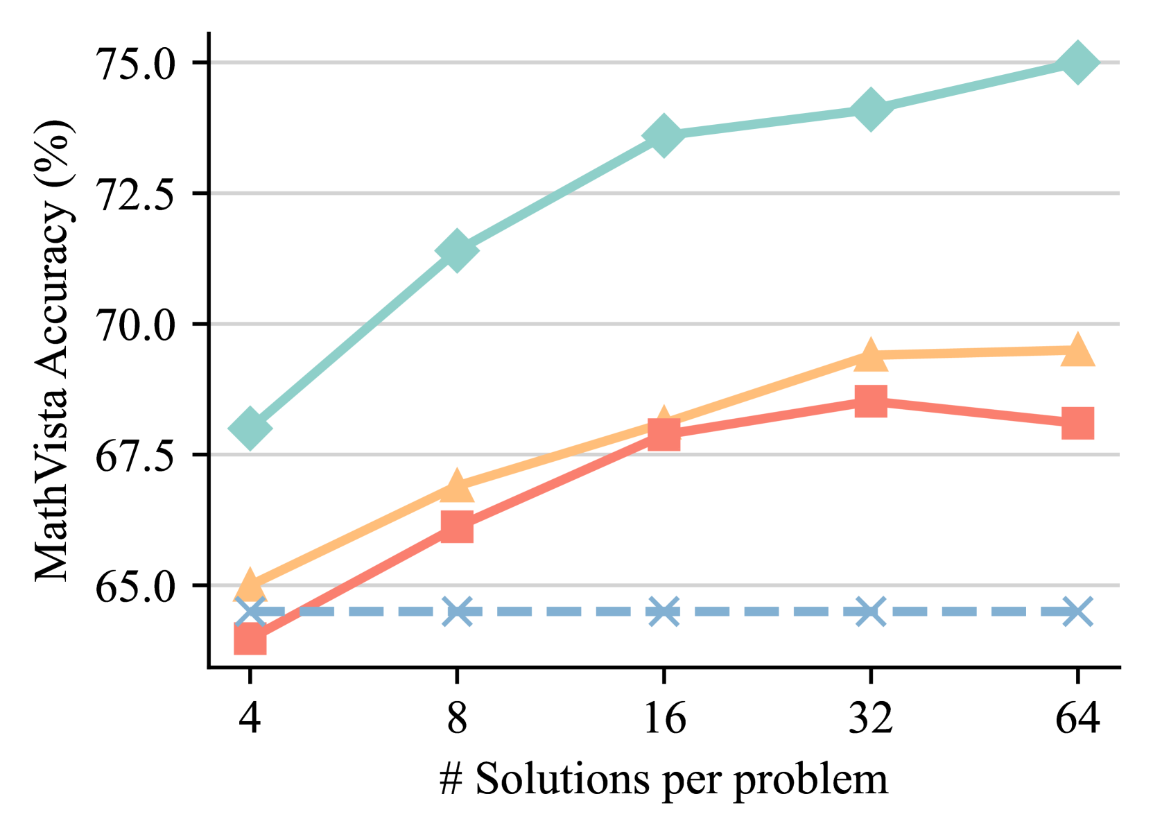
## Line Chart: MathVista Accuracy vs. Number of Solutions per Problem
### Overview
The image is a line chart plotting "MathVista Accuracy (%)" against the "# Solutions per problem". It displays the performance of four distinct methods or models, differentiated by line color, style, and marker shape. The chart demonstrates how accuracy changes as the number of solutions generated per problem increases from 4 to 64.
### Components/Axes
* **Y-Axis (Vertical):** Labeled "MathVista Accuracy (%)". The scale ranges from 65.0 to 75.0, with major grid lines at intervals of 2.5 (65.0, 67.5, 70.0, 72.5, 75.0).
* **X-Axis (Horizontal):** Labeled "# Solutions per problem". It features discrete, non-linearly spaced data points at values: 4, 8, 16, 32, and 64.
* **Data Series (Legend Not Visible):** The chart contains four distinct series. As no legend is present in the image, they are identified by their visual attributes:
1. **Teal Line with Diamond Markers:** Solid line.
2. **Orange Line with Triangle Markers:** Solid line.
3. **Red Line with Square Markers:** Solid line.
4. **Blue Dashed Line with 'X' Markers:** Dashed line.
### Detailed Analysis
**Data Point Extraction (Approximate Values):**
| # Solutions | Teal (Diamond) | Orange (Triangle) | Red (Square) | Blue Dashed (X) |
| :--- | :--- | :--- | :--- | :--- |
| **4** | ~68.0% | ~65.0% | ~64.0% | ~64.5% |
| **8** | ~71.5% | ~67.0% | ~66.0% | ~64.5% |
| **16** | ~73.5% | ~68.0% | ~68.0% | ~64.5% |
| **32** | ~74.0% | ~69.5% | ~68.5% | ~64.5% |
| **64** | ~75.0% | ~69.5% | ~68.0% | ~64.5% |
**Trend Verification:**
* **Teal (Diamond):** Shows a strong, consistent upward trend. The slope is steepest between 4 and 16 solutions, then continues to rise at a slightly slower rate to 64 solutions.
* **Orange (Triangle):** Shows a steady upward trend from 4 to 32 solutions, after which it plateaus (accuracy at 32 and 64 solutions is nearly identical).
* **Red (Square):** Increases from 4 to 32 solutions, but then shows a slight decrease in accuracy when moving from 32 to 64 solutions.
* **Blue Dashed (X):** Exhibits a flat, horizontal trend. Accuracy remains constant at approximately 64.5% across all tested numbers of solutions.
### Key Observations
1. **Performance Hierarchy:** The Teal method is the top performer at every data point, followed generally by Orange, then Red, with Blue consistently at the bottom.
2. **Diminishing Returns:** Both the Orange and Red methods show signs of performance saturation. The Orange method's gain plateaus after 32 solutions, while the Red method's performance slightly regresses.
3. **Baseline Performance:** The Blue dashed line represents a baseline or a method whose accuracy is unaffected by increasing the number of solutions per problem.
4. **Convergence at Low Solutions:** At the lowest setting (4 solutions), the performance gap between the top (Teal) and bottom (Blue) methods is approximately 3.5 percentage points. This gap widens significantly to over 10 percentage points at 64 solutions.
### Interpretation
This chart likely compares different strategies for solving problems in the MathVista benchmark, where each strategy involves generating multiple candidate solutions and then selecting or aggregating them.
* The **Teal method** demonstrates superior scalability; its accuracy benefits significantly from generating more solutions, suggesting an effective mechanism for leveraging additional computational effort (more solutions) to improve final answer quality.
* The **Orange and Red methods** also benefit from more solutions initially, but hit a performance ceiling. The slight drop for Red at 64 solutions could indicate noise or overfitting in the aggregation process when too many candidates are considered.
* The **Blue dashed line** serves as a control, representing a single-solution or non-aggregation baseline. Its flat line confirms that the improvements seen in the other methods are indeed due to the multi-solution approach.
The key takeaway is that for this task, the choice of method for handling multiple solutions is critical. Simply generating more solutions is not enough; the underlying algorithm (represented by the Teal line) must be capable of effectively distilling the correct answer from the increased candidate pool to achieve substantial gains in accuracy.