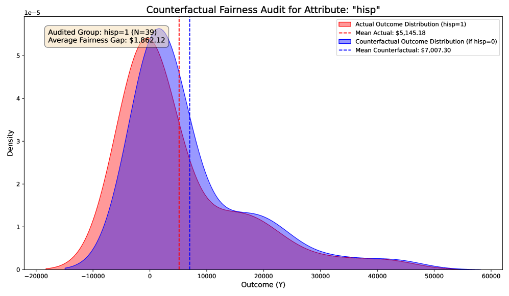
## Density Plot: Counterfactual Fairness Audit for Attribute "hisp"
### Overview
The image is a comparative density plot analyzing fairness in outcomes based on the attribute "hisp" (Hispanic status). It contrasts the **Actual Outcome Distribution** (hisp=1) with the **Counterfactual Outcome Distribution** (hisp=0). The chart highlights disparities in mean outcomes and variability between the two groups, with annotations for statistical significance and fairness gaps.
---
### Components/Axes
- **Title**: "Counterfactual Fairness Audit for Attribute: 'hisp'" (top center).
- **X-axis**: "Outcome (Y)" with a range from **-20,000 to 60,000** (logarithmic scale implied by axis limits).
- **Y-axis**: "Density" with a scale from **0 to 1e-5** (linear scale).
- **Legend**: Located in the **top-right corner**, with two entries:
- **Red**: Actual Outcome Distribution (hisp=1).
- **Blue**: Counterfactual Outcome Distribution (hisp=0).
- **Dashed Lines**: Vertical lines marking the mean outcomes:
- **Red dashed line**: Mean Actual = **$5,145.18**.
- **Blue dashed line**: Mean Counterfactual = **$7,007.30**.
- **Text Box**: Top-left corner, stating:
- "Audited Group: hisp=1 (N=39)".
- "Average Fairness Gap: $1,862.12".
---
### Detailed Analysis
1. **Actual Outcome Distribution (hisp=1, red)**:
- **Peak**: Centered near **$5,000** (x-axis).
- **Spread**: Narrower curve, indicating lower variability in outcomes.
- **Mean**: Marked by red dashed line at **$5,145.18**.
- **Density**: Peaks at ~**5e-5** on the y-axis.
2. **Counterfactual Outcome Distribution (hisp=0, blue)**:
- **Peak**: Centered near **$7,000** (x-axis).
- **Spread**: Wider curve, indicating higher variability in outcomes.
- **Mean**: Marked by blue dashed line at **$7,007.30**.
- **Density**: Peaks at ~**5e-5** on the y-axis, similar to the red curve.
3. **Fairness Gap**:
- The difference between the two means is **$1,862.12** (highlighted in the text box).
- The counterfactual group (hisp=0) has a **35% higher mean outcome** than the actual group (hisp=1).
4. **Distribution Characteristics**:
- Both curves share similar peak densities but differ in spread.
- The red curve (hisp=1) is more concentrated, while the blue curve (hisp=0) is broader, suggesting less consistency in outcomes for the counterfactual group.
---
### Key Observations
- The **mean outcome for hisp=0 is significantly higher** than for hisp=1, indicating a potential fairness issue.
- The **fairness gap of $1,862.12** quantifies the disparity between the two groups.
- The **narrower distribution for hisp=1** suggests more uniform outcomes within that group, but the lower mean raises concerns about systemic bias.
- The **overlap between distributions** (e.g., at ~$5,000–$7,000) implies some individuals in both groups experience similar outcomes, but the systemic gap persists.
---
### Interpretation
The chart reveals a **systemic disparity** in outcomes between the hisp=1 and hisp=0 groups. The counterfactual group (hisp=0) achieves a **35% higher average outcome**, suggesting potential discrimination or inequity in the system being audited. The narrower distribution for hisp=1 indicates less variability in their outcomes, which could reflect either stricter constraints or systemic barriers limiting their opportunities. The fairness gap of **$1,862.12** underscores the magnitude of the inequity, warranting further investigation into the root causes (e.g., algorithmic bias, resource allocation). The chart emphasizes the importance of counterfactual analysis in identifying hidden biases that may not be apparent in raw data.