## Line Chart: Variance vs. Iterations
### Overview
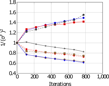
The image is a line chart displaying the relationship between the inverse of the variance (1/(σ^F)^2) and the number of iterations. Several data series are plotted, each represented by a different color and marker, showing how the variance changes with increasing iterations.
### Components/Axes
* **X-axis:** Iterations, ranging from 0 to 1,000 in increments of 200.
* **Y-axis:** 1/(σ^F)^2, ranging from 0.4 to 1.8 in increments of 0.2.
* **Data Series:** Multiple lines with different colors and markers, but no explicit legend is provided.
### Detailed Analysis
Since there is no legend, I will describe the lines by their color and marker.
* **Red Squares:** This line starts at approximately 1.0, increases to about 1.3 at 200 iterations, plateaus around 1.35 until 600 iterations, and then increases slightly to approximately 1.42 at 800 iterations.
* **Blue Diamonds:** This line starts at approximately 1.0, decreases to about 0.75 at 200 iterations, and continues to decrease gradually to approximately 0.6 at 800 iterations.
* **Black Stars:** This line starts at approximately 1.0, and decreases gradually to approximately 0.8 at 800 iterations.
* **Brown Squares:** This line starts at approximately 1.0, decreases to about 0.8 at 200 iterations, and continues to decrease gradually to approximately 0.72 at 800 iterations.
* **Black Circles (Dashed):** This line starts at approximately 1.0, increases to about 1.25 at 200 iterations, and continues to increase to approximately 1.55 at 800 iterations.
* **Red Circles (Dashed):** This line starts at approximately 1.0, decreases to about 0.9 at 200 iterations, and continues to decrease gradually to approximately 0.75 at 800 iterations.
* **Blue Circles (Dashed):** This line starts at approximately 1.0, increases to about 1.2 at 200 iterations, and continues to increase to approximately 1.5 at 800 iterations.
### Key Observations
* Some lines show an increasing trend of 1/(σ^F)^2 with iterations, while others show a decreasing trend.
* The red squares line shows an initial increase, then plateaus, and finally increases slightly.
* The blue diamonds line shows a consistent decrease in 1/(σ^F)^2 with iterations.
* The black stars line shows a consistent decrease in 1/(σ^F)^2 with iterations.
* The brown squares line shows a consistent decrease in 1/(σ^F)^2 with iterations.
* The black circles (dashed) line shows a consistent increase in 1/(σ^F)^2 with iterations.
* The red circles (dashed) line shows a consistent decrease in 1/(σ^F)^2 with iterations.
* The blue circles (dashed) line shows a consistent increase in 1/(σ^F)^2 with iterations.
### Interpretation
The chart illustrates how the inverse of the variance changes as the number of iterations increases. The different lines likely represent different algorithms or parameter settings. The increasing lines suggest that the variance is decreasing with more iterations (indicating convergence or improvement), while the decreasing lines suggest the opposite. The specific meaning depends on what the variance represents in the context of the experiment. Without a legend, it's impossible to definitively say which line corresponds to which algorithm or setting. The dashed lines may represent a different set of conditions or a variation of the solid lines.