\n
## Line Chart: Performance Metric vs. Iterations
### Overview
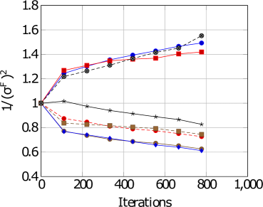
The image is a line chart plotting a performance metric, labeled as `1/(σ^f)^2`, against the number of `Iterations`. The chart displays six distinct data series, each represented by a unique combination of color and marker shape. The overall trend shows a divergence: three series trend upward, while three trend downward over the course of 800 iterations.
### Components/Axes
* **Y-Axis:**
* **Label:** `1/(σ^f)^2`
* **Scale:** Linear, ranging from 0.4 to 1.8.
* **Major Ticks:** 0.4, 0.6, 0.8, 1.0, 1.2, 1.4, 1.6, 1.8.
* **X-Axis:**
* **Label:** `Iterations`
* **Scale:** Linear, ranging from 0 to 1,000.
* **Major Ticks:** 0, 200, 400, 600, 800, 1,000.
* **Legend:**
* **Position:** Top-left corner of the plot area.
* **Content:** Six entries, each with a colored line segment and a marker symbol. The exact text labels for each series are not visible in the image.
* **Series Identification (by color and marker):**
1. Red line with square markers (■).
2. Blue line with circle markers (●).
3. Gray line with circle markers (●).
4. Black line with star/asterisk markers (★).
5. Orange line with square markers (■).
6. Blue line with diamond markers (◆).
### Detailed Analysis
**Trend Verification & Data Point Extraction (Approximate Values):**
All series originate at the same point: (Iterations=0, Value=1.0).
1. **Red Line (■):** Trends upward with a decreasing slope.
* Iterations ~100: ~1.25
* Iterations ~200: ~1.30
* Iterations ~400: ~1.35
* Iterations ~800: ~1.42
2. **Blue Line (●):** Trends upward, closely following the gray line.
* Iterations ~100: ~1.22
* Iterations ~200: ~1.28
* Iterations ~400: ~1.38
* Iterations ~800: ~1.50
3. **Gray Line (●):** Trends upward, ending as the highest value.
* Iterations ~100: ~1.20
* Iterations ~200: ~1.25
* Iterations ~400: ~1.35
* Iterations ~800: ~1.55
4. **Black Line (★):** Trends downward with a shallow slope.
* Iterations ~100: ~1.02
* Iterations ~200: ~0.98
* Iterations ~400: ~0.92
* Iterations ~800: ~0.82
5. **Orange Line (■):** Trends downward.
* Iterations ~100: ~0.85
* Iterations ~200: ~0.82
* Iterations ~400: ~0.78
* Iterations ~800: ~0.72
6. **Blue Line (◆):** Trends downward with the steepest slope.
* Iterations ~100: ~0.75
* Iterations ~200: ~0.72
* Iterations ~400: ~0.68
* Iterations ~800: ~0.62
### Key Observations
* **Divergence:** The primary pattern is a clear split into two groups after the initial point. Three methods (Red ■, Blue ●, Gray ●) improve the metric `1/(σ^f)^2`, while three methods (Black ★, Orange ■, Blue ◆) degrade it.
* **Performance Hierarchy:** At the final measured point (800 iterations), the performance order from best to worst is: Gray (●) > Blue (●) > Red (■) > Black (★) > Orange (■) > Blue (◆).
* **Convergence Rate:** The upward-trending lines show a logarithmic-like growth (rapid initial increase, then slowing). The downward-trending lines show a more linear decline.
* **Anomaly:** The black line (★) is the only downward-trending series that starts above 1.0 and remains above 0.8, showing a much slower rate of degradation compared to the orange and blue (◆) lines.
### Interpretation
The chart likely compares the performance of different algorithms, models, or parameter settings over training/optimization iterations. The metric `1/(σ^f)^2` is inversely proportional to the square of some final variance or error term (`σ^f`). Therefore, a **higher value on the y-axis indicates better performance** (lower final variance/error).
* **What the data suggests:** The "Gray (●)" and "Blue (●)" methods are the most effective, achieving the highest final performance. The "Red (■)" method is also effective but plateaus earlier. The "Black (★)", "Orange (■)", and "Blue (◆)" methods are detrimental to this specific performance metric, with "Blue (◆)" being the most harmful.
* **Relationship between elements:** The shared starting point (1.0) suggests all methods begin from an identical baseline. The divergence immediately after iteration 0 indicates that the choice of method has a rapid and significant impact on the trajectory of the performance metric.
* **Notable implications:** The stark contrast between the two groups implies a fundamental difference in the approaches. The upward-trending methods likely employ a strategy that successfully reduces the underlying variance/error, while the downward-trending methods may be overfitting, using an unstable update rule, or optimizing for a different, conflicting objective. The investigation should focus on the algorithmic differences between the Gray/Blue (●) group and the Blue (◆)/Orange (■) group.