## Diagram and Scatter Plot: Endogenous Protected Attributes
### Overview
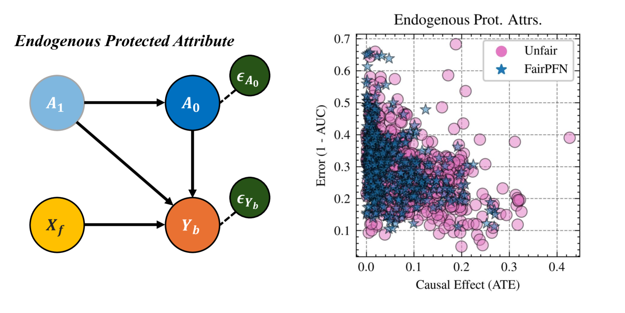
The image presents two distinct visual elements: a directed acyclic graph (DAG) illustrating relationships between endogenous protected attributes, and a scatter plot comparing the causal effect (ATE) against the error rate (1 - AUC) for "Unfair" and "FairPFN" models.
### Components/Axes
**Left: Directed Acyclic Graph (DAG)**
* **Title:** Endogenous Protected Attribute
* **Nodes:**
* A1 (light blue circle)
* A0 (dark blue circle)
* Xf (yellow circle)
* Yb (orange circle)
* εA0 (green circle)
* εYb (green circle)
* **Edges:**
* A1 -> A0 (solid arrow)
* A1 -> Yb (solid arrow)
* Xf -> Yb (solid arrow)
* A0 -> Yb (solid arrow)
* A0 -> εA0 (dashed arrow)
* Yb -> εYb (dashed arrow)
**Right: Scatter Plot**
* **Title:** Endogenous Prot. Attrs.
* **X-axis:** Causal Effect (ATE)
* Scale: 0.0 to 0.4, incrementing by 0.1
* **Y-axis:** Error (1 - AUC)
* Scale: 0.0 to 0.7, incrementing by 0.1
* **Legend (top-right):**
* Pink circle: Unfair
* Blue star: FairPFN
### Detailed Analysis
**Directed Acyclic Graph (DAG)**
The DAG depicts causal relationships between variables. A1 and Xf directly influence Yb. A1 also influences A0, which in turn influences Yb. The dashed arrows indicate error terms associated with A0 and Yb.
**Scatter Plot**
The scatter plot visualizes the relationship between causal effect and error rate for two models: "Unfair" (pink circles) and "FairPFN" (blue stars).
* **Unfair (Pink Circles):** The pink circles are scattered across the plot, with a higher concentration in the region of Causal Effect (ATE) between 0.1 and 0.4, and Error (1 - AUC) between 0.1 and 0.5.
* **FairPFN (Blue Stars):** The blue stars are more densely clustered in the lower-left region of the plot, indicating lower causal effect and lower error rates compared to the "Unfair" model. The majority of the blue stars are located in the region of Causal Effect (ATE) between 0.0 and 0.2, and Error (1 - AUC) between 0.1 and 0.4.
### Key Observations
* The DAG illustrates a causal model with direct and indirect influences between variables.
* The scatter plot suggests that the "FairPFN" model generally achieves lower error rates and lower causal effects compared to the "Unfair" model.
* There is a significant overlap between the two models, especially in the region of lower causal effect and error.
### Interpretation
The image presents a comparison between two models, "Unfair" and "FairPFN," in terms of their causal effect and error rate. The DAG provides a visual representation of the relationships between the variables involved. The scatter plot suggests that the "FairPFN" model is more effective at reducing error, but it also tends to have a lower causal effect. This could indicate a trade-off between fairness and predictive accuracy. The clustering of "FairPFN" points in the lower-left region suggests that this model is generally more desirable in scenarios where both low error and low causal effect are important. The spread of "Unfair" points indicates a wider range of performance, with some instances exhibiting high error and high causal effect.