## Multi-Panel Histogram: Distribution of Progress Ratio by Noise Ratio
### Overview
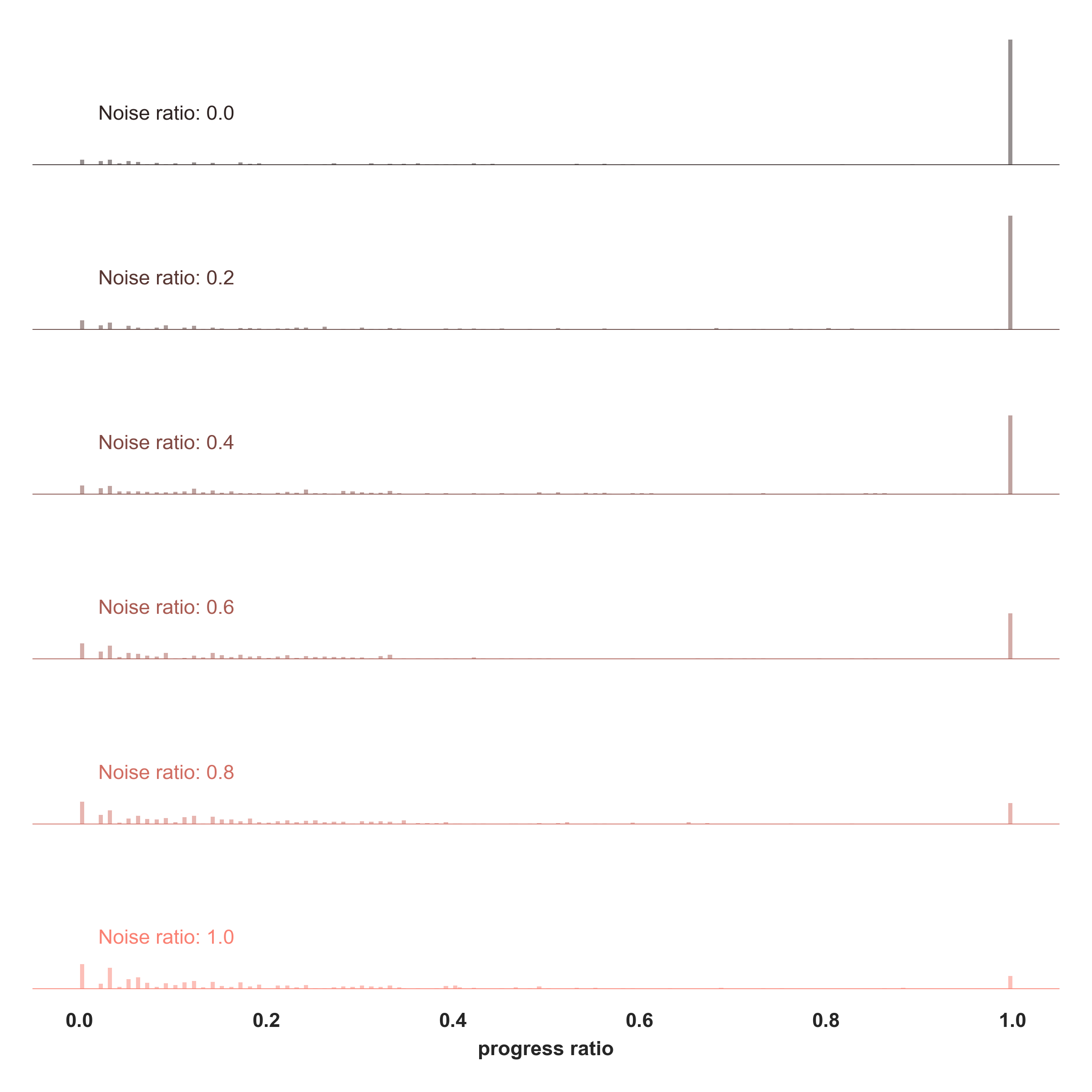
The image displays a series of six stacked histograms, each representing the distribution of a "progress ratio" (ranging from 0.0 to 1.0) under different levels of "Noise ratio" (ranging from 0.0 to 1.0). The chart illustrates how increasing noise levels negatively impact the "progress ratio," shifting the distribution away from completion (1.0) toward lower values.
### Components/Axes
* **X-Axis:** Labeled "progress ratio" at the bottom center. The scale is linear, with major tick marks at 0.0, 0.2, 0.4, 0.6, 0.8, and 1.0.
* **Y-Axis (Implicit):** Each of the six horizontal rows represents a frequency or probability density for a specific "Noise ratio." There are no numerical values on the vertical axis, but the height of the bars indicates relative frequency.
* **Rows (Independent Variables):**
* **Top Row:** "Noise ratio: 0.0" (Color: Dark Grey)
* **Second Row:** "Noise ratio: 0.2" (Color: Grey-Brown)
* **Third Row:** "Noise ratio: 0.4" (Color: Light Brown)
* **Fourth Row:** "Noise ratio: 0.6" (Color: Muted Orange)
* **Fifth Row:** "Noise ratio: 0.8" (Color: Light Orange)
* **Bottom Row:** "Noise ratio: 1.0" (Color: Pale Orange)
### Detailed Analysis
The data shows a consistent bimodal distribution across all noise levels, with a primary mode at 1.0 and a secondary, lower-frequency distribution clustered between 0.0 and 0.3.
* **Noise ratio 0.0 (Top):** The distribution is almost entirely concentrated at 1.0. There is virtually no activity in the 0.0–0.9 range.
* **Noise ratio 0.2:** The dominant spike remains at 1.0. There is a negligible amount of activity appearing in the 0.0–0.1 range.
* **Noise ratio 0.4:** The spike at 1.0 remains dominant, but the activity in the 0.0–0.15 range becomes slightly more visible and frequent.
* **Noise ratio 0.6:** The spike at 1.0 begins to decrease in relative height. The distribution in the 0.0–0.3 range becomes more pronounced and spread out.
* **Noise ratio 0.8:** The spike at 1.0 is noticeably lower than in previous rows. The activity in the 0.0–0.3 range is significant, showing a wider spread of values.
* **Noise ratio 1.0 (Bottom):** The spike at 1.0 is at its lowest point. The distribution in the 0.0–0.3 range is the most dense and widespread, indicating that a large portion of the data has failed to reach the 1.0 progress mark.
### Key Observations
* **Inverse Correlation:** There is a clear inverse relationship between "Noise ratio" and the frequency of reaching a "progress ratio" of 1.0. As noise increases, the probability of reaching full progress decreases.
* **Distribution Shift:** As the noise ratio increases, the data mass shifts from the right side of the chart (1.0) to the left side (0.0–0.3).
* **Visual Encoding:** The color gradient (from dark grey at 0.0 noise to pale orange at 1.0 noise) acts as a visual cue for the increasing severity of the noise.
### Interpretation
This chart likely represents the performance of an iterative process, such as a machine learning model training, a diffusion process, or a task completion algorithm, where "progress ratio" measures the degree of completion.
* **The "Success" State:** The spike at 1.0 represents the successful completion of the task. At low noise levels (0.0–0.2), the system is highly reliable, almost always reaching completion.
* **The "Failure" State:** The cluster of bars on the left (0.0–0.3) represents processes that failed to complete or were interrupted.
* **The Impact of Noise:** The data demonstrates that "Noise ratio" acts as a degradation factor. As noise increases, the system's ability to reach 1.0 is compromised, causing the distribution to "leak" into the lower progress ratios. The transition from 0.6 to 1.0 noise appears to be the most critical phase where the reliability of reaching 1.0 drops significantly.