## Histogram Series: Progress Ratio Distribution by Noise Ratio
### Overview
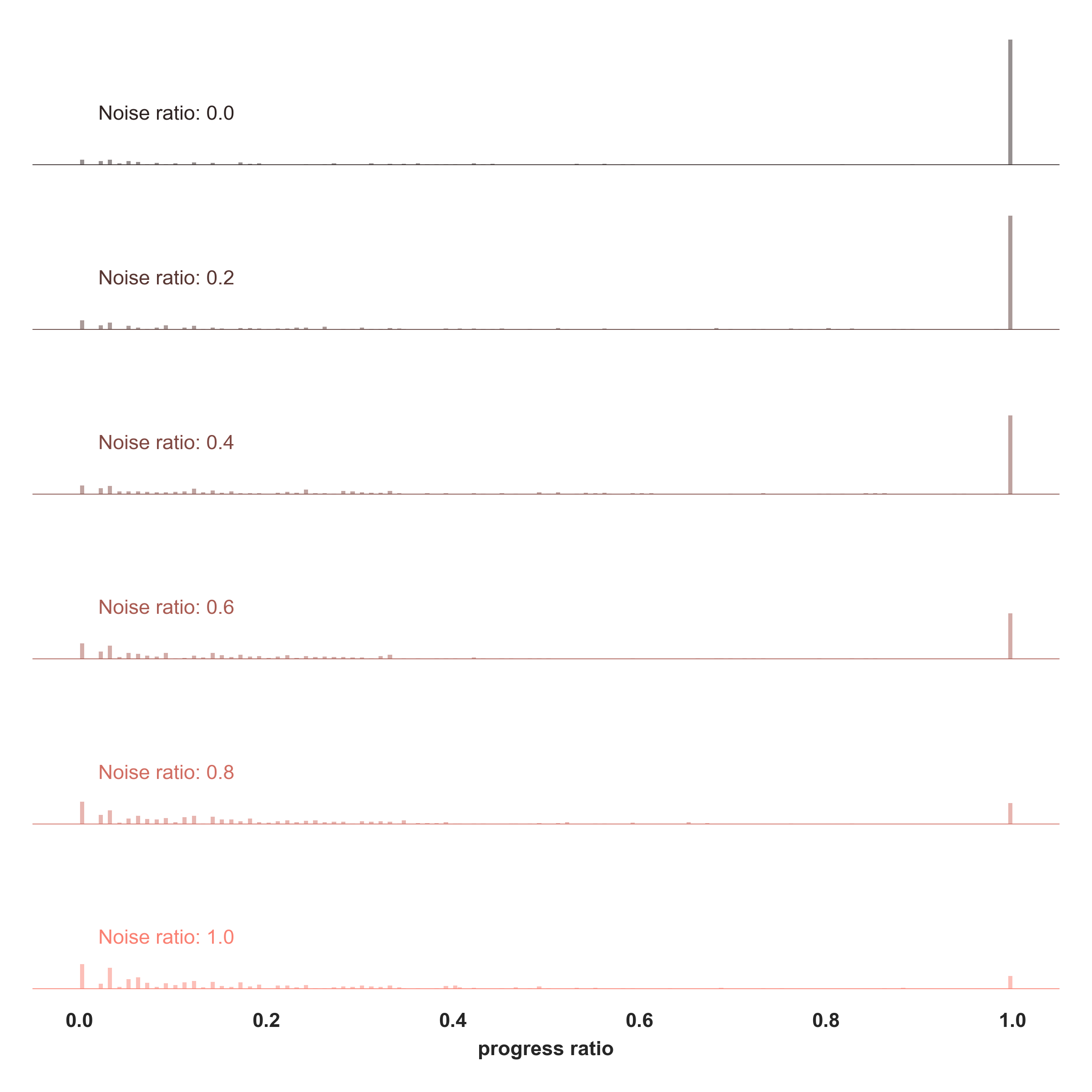
The image displays a series of six vertically stacked histograms, each representing the distribution of a "progress ratio" for a different "Noise ratio" value. The visualization demonstrates how increasing noise affects the distribution of progress outcomes.
### Components/Axes
* **X-Axis (Common to all plots):** Labeled **"progress ratio"**. It is a continuous scale from **0.0 to 1.0**, with major tick marks at 0.0, 0.2, 0.4, 0.6, 0.8, and 1.0.
* **Y-Axis (Implied):** Each histogram has an implicit vertical axis representing frequency or count. The height of the bars indicates the relative number of observations at each progress ratio value. There are no numerical labels on the y-axes.
* **Plot Labels:** Each of the six histograms is labeled in its top-left corner with its corresponding **"Noise ratio"**:
* Noise ratio: 0.0 (top plot, dark grey bars)
* Noise ratio: 0.2 (second plot, dark grey bars)
* Noise ratio: 0.4 (third plot, brownish-grey bars)
* Noise ratio: 0.6 (fourth plot, light brown bars)
* Noise ratio: 0.8 (fifth plot, light salmon bars)
* Noise ratio: 1.0 (bottom plot, light pink bars)
* **Color Coding:** The bar color shifts from a dark grey for low noise ratios to a light pink for the highest noise ratio (1.0), providing a visual cue for the increasing noise level.
### Detailed Analysis
The histograms show a clear and systematic change in the distribution of the progress ratio as the noise ratio increases.
1. **Noise ratio: 0.0 & 0.2:**
* **Trend:** The distribution is heavily right-skewed, with a single, very tall, narrow peak located at or extremely close to a progress ratio of **1.0**.
* **Data Points:** The vast majority of observations are concentrated at 1.0. There are a few, very short bars scattered at lower progress ratios (approximately between 0.0 and 0.3), but their frequency is negligible compared to the peak at 1.0.
2. **Noise ratio: 0.4:**
* **Trend:** The dominant peak at **1.0** remains but is slightly shorter than in the previous plots. The frequency of observations at lower progress ratios (0.0 to 0.4) has visibly increased.
* **Data Points:** The distribution is still strongly right-skewed, but the "tail" of lower progress values is becoming more populated.
3. **Noise ratio: 0.6:**
* **Trend:** A significant shift occurs. The peak at **1.0** is now much shorter. The distribution has become more spread out, with a notable increase in the frequency of progress ratios across the entire lower range (0.0 to 0.6).
* **Data Points:** While a mode still exists near 1.0, the data is now distributed across a wide spectrum of lower values, indicating much higher variability in outcomes.
4. **Noise ratio: 0.8:**
* **Trend:** The peak at **1.0** is further diminished. The distribution appears more uniform or multi-modal across the lower half of the scale (0.0 to 0.5).
* **Data Points:** Observations are scattered across many progress ratio values with relatively similar, low frequencies. The concentration at high progress is largely gone.
5. **Noise ratio: 1.0:**
* **Trend:** The peak at **1.0** is the smallest of all plots. The distribution is the most dispersed, with bars of low but relatively consistent height spread from 0.0 to about 0.6.
* **Data Points:** There is no strong concentration at any single value. The data suggests that with maximum noise, achieving a high progress ratio becomes rare, and outcomes are highly unpredictable and generally low.
### Key Observations
* **Inverse Relationship:** There is a clear inverse relationship between the noise ratio and the concentration of data at a high progress ratio (1.0).
* **Peak Attenuation:** The height of the primary peak at progress ratio = 1.0 decreases monotonically as the noise ratio increases from 0.0 to 1.0.
* **Distribution Spread:** The variance (spread) of the progress ratio distribution increases dramatically with higher noise. Low noise yields precise, high outcomes; high noise yields scattered, generally lower outcomes.
* **Color Consistency:** The color of the bars in each subplot consistently matches the color of its corresponding "Noise ratio" label, confirming the grouping.
### Interpretation
This visualization powerfully demonstrates the detrimental effect of noise on a process's ability to achieve a target outcome (progress ratio of 1.0).
* **What the data suggests:** In a noise-free environment (ratio 0.0), the process is highly reliable, consistently achieving near-perfect progress. As noise is introduced, the process becomes less reliable. First, it occasionally fails to reach full progress (noise 0.2-0.4). Then, with moderate to high noise (0.6-0.8), successful outcomes become the exception rather than the rule. At maximum noise (1.0), the process is essentially randomized, with progress ratios scattered across the lower range and almost never reaching the target.
* **How elements relate:** The "Noise ratio" is the independent variable being manipulated. The "progress ratio" is the dependent variable being measured. The histograms show the causal relationship: increasing the former degrades the distribution of the latter.
* **Notable anomalies/trends:** The most striking trend is the **phase shift** between noise ratios 0.4 and 0.6, where the system transitions from being "mostly successful" to "mostly unsuccessful." This could indicate a critical threshold of noise beyond which system performance collapses. The absence of any data points above 1.0 or below 0.0 defines the bounded nature of the progress metric.