\n
## Line Plot with Error Bands: Scaling Law Analysis
### Overview
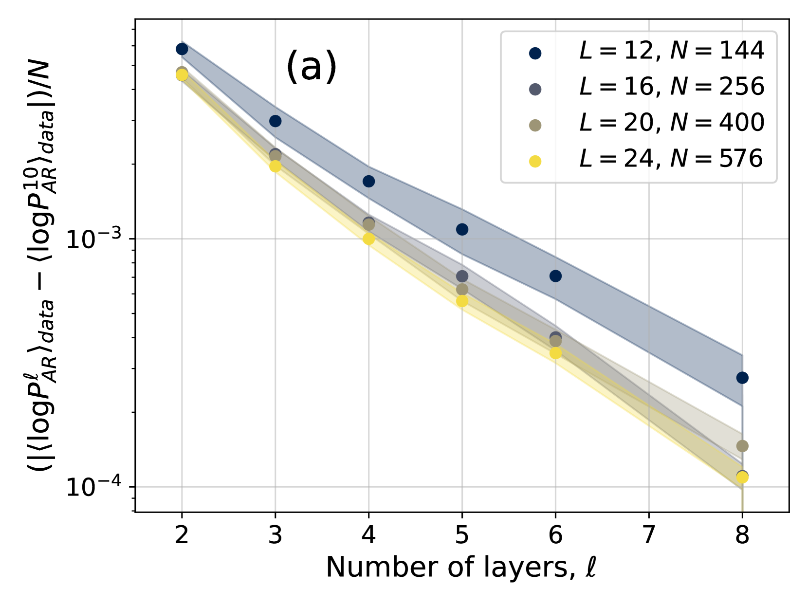
The image displays a scientific line plot labeled "(a)" in the top-center. It illustrates the relationship between a normalized logarithmic probability difference (y-axis) and the number of layers, ℓ (x-axis), for four different model configurations. The plot uses a logarithmic scale on the y-axis and includes shaded error bands around each data series.
### Components/Axes
* **X-Axis:**
* **Label:** "Number of layers, ℓ"
* **Scale:** Linear scale.
* **Markers/Ticks:** Major ticks at integer values from 2 to 8.
* **Y-Axis:**
* **Label:** `( (|⟨log P_AR^ℓ⟩_data| - |⟨log P_AR^10⟩_data|) / N )`
* **Scale:** Logarithmic scale (base 10).
* **Markers/Ticks:** Major ticks at `10^-4` and `10^-3`. Minor ticks are present between them.
* **Legend:**
* **Position:** Top-right corner of the plot area.
* **Content:** Four entries, each with a colored circle marker and text.
1. Dark blue circle: `L = 12, N = 144`
2. Gray circle: `L = 16, N = 256`
3. Tan/Brown circle: `L = 20, N = 400`
4. Yellow circle: `L = 24, N = 576`
* **Data Series:** Four distinct lines, each with a corresponding shaded error band. The lines connect discrete data points at integer layer values (ℓ = 2, 3, 4, 5, 6, 8). The error bands are widest at lower ℓ and narrow as ℓ increases.
### Detailed Analysis
**Trend Verification:** All four data series exhibit a clear downward trend. As the number of layers (ℓ) increases, the value on the y-axis decreases. The relationship appears approximately linear on this semi-log plot, suggesting an exponential decay.
**Data Point Extraction (Approximate Values):**
Values are estimated from the log-scale y-axis. The ordering from highest to lowest y-value at any given ℓ is consistent: Dark Blue > Gray > Tan > Yellow.
* **For ℓ = 2:**
* Dark Blue (L=12): ~3.5 x 10^-3
* Gray (L=16): ~3.2 x 10^-3
* Tan (L=20): ~2.9 x 10^-3
* Yellow (L=24): ~2.7 x 10^-3
* **For ℓ = 3:**
* Dark Blue: ~2.0 x 10^-3
* Gray: ~1.7 x 10^-3
* Tan: ~1.5 x 10^-3
* Yellow: ~1.4 x 10^-3
* **For ℓ = 4:**
* Dark Blue: ~1.2 x 10^-3
* Gray: ~1.0 x 10^-3
* Tan: ~9.0 x 10^-4
* Yellow: ~8.0 x 10^-4
* **For ℓ = 5:**
* Dark Blue: ~7.0 x 10^-4
* Gray: ~5.5 x 10^-4
* Tan: ~5.0 x 10^-4
* Yellow: ~4.5 x 10^-4
* **For ℓ = 6:**
* Dark Blue: ~4.5 x 10^-4
* Gray: ~3.5 x 10^-4
* Tan: ~3.2 x 10^-4
* Yellow: ~3.0 x 10^-4
* **For ℓ = 8:**
* Dark Blue: ~2.0 x 10^-4
* Gray: ~1.5 x 10^-4
* Tan: ~1.3 x 10^-4
* Yellow: ~1.1 x 10^-4
### Key Observations
1. **Consistent Hierarchy:** The series are strictly ordered across all measured layers. The configuration with the smallest L and N (L=12, N=144) consistently has the highest y-value, while the largest configuration (L=24, N=576) has the lowest.
2. **Convergence:** The absolute difference between the series decreases as ℓ increases. The gap between the Dark Blue and Yellow lines is much larger at ℓ=2 than at ℓ=8.
3. **Error Band Behavior:** The uncertainty (width of the shaded band) is largest for the Dark Blue series and smallest for the Yellow series at any given ℓ. All bands narrow significantly as ℓ increases.
4. **Data Spacing:** Data points are provided for ℓ = 2, 3, 4, 5, 6, and 8. There is no data point for ℓ=7.
### Interpretation
This chart likely visualizes a **scaling law** in machine learning, specifically related to autoregressive (AR) models. The y-axis metric appears to measure a normalized deviation in log-probability on a dataset between a model with ℓ layers and a reference model with 10 layers (`P_AR^10`), scaled by the model dimension `N`.
The data demonstrates two key scaling relationships:
1. **Depth Scaling (ℓ):** For a fixed model architecture (fixed L and N), increasing the number of layers ℓ reduces the measured probability deviation. This suggests that deeper models (within the tested range) better approximate the reference or fit the data, as indicated by the decaying exponential trend.
2. **Width/Size Scaling (L, N):** For a fixed depth ℓ, models with larger dimensions (L and N) exhibit a smaller probability deviation. The Yellow series (L=24, N=576) is consistently the lowest, indicating superior performance by this metric. This aligns with the general principle that larger models tend to have better performance.
The narrowing error bands with increasing ℓ suggest that the model's behavior becomes more consistent and predictable as it gets deeper. The convergence of the different series at high ℓ implies that the advantage of increased width (L, N) may diminish relative to the effect of depth in this specific metric and range. The plot provides empirical evidence for how model performance, as defined by this specific log-probability metric, scales with both depth and width.