## Pie Chart Grid: Benchmark Performance (YES/NO)
### Overview
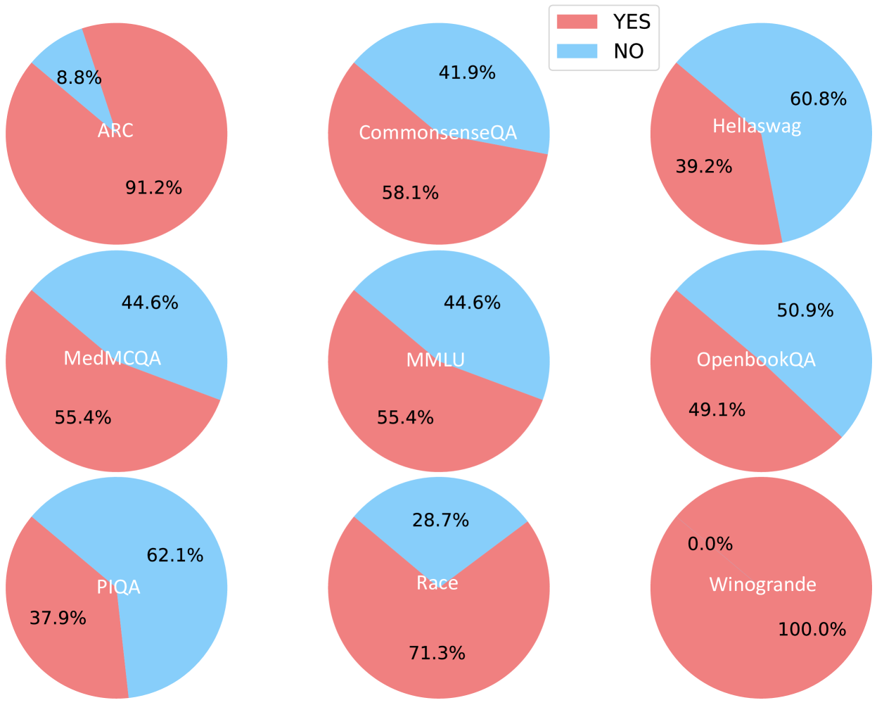
The image displays a 3x3 grid of nine pie charts, each representing the performance distribution (YES vs. NO) on a different benchmark or dataset. A single legend is positioned in the top-right corner of the overall image. The charts are arranged in three rows and three columns.
### Components/Axes
* **Legend:** Located in the top-right corner. It defines two categories:
* **YES:** Represented by a red/salmon color.
* **NO:** Represented by a light blue color.
* **Chart Labels:** Each pie chart is labeled with the name of a benchmark dataset. The label is placed within the larger segment of the pie.
* **Data Labels:** Each segment of every pie chart contains a percentage value.
### Detailed Analysis
The following is a breakdown of each pie chart, listed in reading order (left to right, top to bottom).
**Row 1:**
1. **Top-Left Chart: ARC**
* **YES (Red):** 91.2% (Label "ARC" is within this segment)
* **NO (Blue):** 8.8%
* *Trend:* Overwhelming majority YES.
2. **Top-Center Chart: CommonsenseQA**
* **YES (Red):** 58.1% (Label "CommonsenseQA" is within this segment)
* **NO (Blue):** 41.9%
* *Trend:* Majority YES, but with a significant NO portion.
3. **Top-Right Chart: Hellaswag**
* **YES (Red):** 39.2%
* **NO (Blue):** 60.8% (Label "Hellaswag" is within this segment)
* *Trend:* Majority NO.
**Row 2:**
4. **Middle-Left Chart: MedMCQA**
* **YES (Red):** 55.4% (Label "MedMCQA" is within this segment)
* **NO (Blue):** 44.6%
* *Trend:* Majority YES, similar split to CommonsenseQA.
5. **Middle-Center Chart: MMLU**
* **YES (Red):** 55.4% (Label "MMLU" is within this segment)
* **NO (Blue):** 44.6%
* *Trend:* Identical distribution to MedMCQA.
6. **Middle-Right Chart: OpenbookQA**
* **YES (Red):** 49.1%
* **NO (Blue):** 50.9% (Label "OpenbookQA" is within this segment)
* *Trend:* Nearly even split, with a slight majority NO.
**Row 3:**
7. **Bottom-Left Chart: PIQA**
* **YES (Red):** 37.9%
* **NO (Blue):** 62.1% (Label "PIQA" is within this segment)
* *Trend:* Strong majority NO.
8. **Bottom-Center Chart: Race**
* **YES (Red):** 71.3% (Label "Race" is within this segment)
* **NO (Blue):** 28.7%
* *Trend:* Strong majority YES.
9. **Bottom-Right Chart: Winogrande**
* **YES (Red):** 100.0% (Label "Winogrande" is within this segment)
* **NO (Blue):** 0.0%
* *Trend:* Perfect YES score. This is an extreme outlier.
### Key Observations
1. **Extreme Variability:** Performance varies dramatically across benchmarks, from 100% YES (Winogrande) to 37.9% YES (PIQA).
2. **Identical Distributions:** MedMCQA and MMLU show identical performance splits (55.4% YES / 44.6% NO).
3. **Perfect Score:** Winogrande is the only benchmark with a 100% YES result, indicating no NO responses.
4. **Majority Splits:** Benchmarks fall into three groups: strong majority YES (ARC, Race), moderate majority YES (CommonsenseQA, MedMCQA, MMLU), and majority NO (Hellaswag, OpenbookQA, PIQA).
5. **Label Placement:** The benchmark name is consistently placed within the larger segment of its pie chart.
### Interpretation
This visualization compares the binary (YES/NO) outcome distribution across nine distinct evaluation benchmarks, likely for an AI model or system. The "YES" outcome could represent correct answers, successful task completions, or positive classifications, depending on the benchmark's nature.
The data suggests the evaluated system has highly variable proficiency:
* It excels on the **Winogrande** and **ARC** benchmarks, achieving perfect or near-perfect YES rates.
* It performs moderately on knowledge-intensive or reasoning benchmarks like **CommonsenseQA**, **MedMCQA**, and **MMLU**.
* It struggles most with **Hellaswag**, **OpenbookQA**, and **PIQA**, where the NO outcome is more frequent. This could indicate specific weaknesses in areas like commonsense reasoning, physical intuition, or open-book question answering.
The identical scores for MedMCQA and MMLU are noteworthy and could imply either a coincidence in performance or that the model's capabilities on these two specific medical and general knowledge tasks are perfectly aligned. The perfect score on Winogrande is a significant outlier and may warrant investigation into whether the benchmark was appropriately challenging for the system or if there was a methodological factor at play.
Overall, the chart provides a clear, at-a-glance comparison of performance across diverse tasks, highlighting both strengths and clear areas for potential improvement.