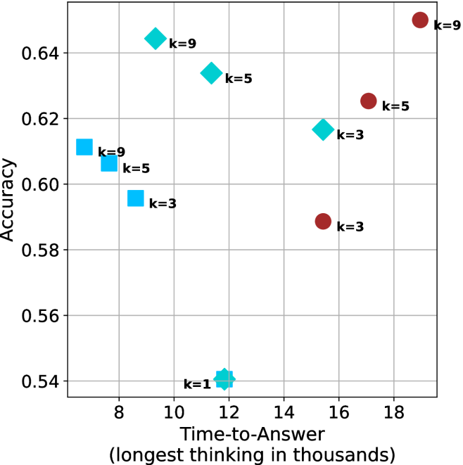
## Scatter Plot: Accuracy vs. Time-to-Answer
### Overview
The image is a scatter plot comparing the accuracy of a system against the time it takes to answer, with data points differentiated by the parameter 'k'. The x-axis represents "Time-to-Answer (longest thinking in thousands)", and the y-axis represents "Accuracy". There are two distinct series of data points, represented by different shapes and colors: cyan squares, cyan diamonds, and brown circles. Each data point is labeled with a 'k' value.
### Components/Axes
* **X-axis:** Time-to-Answer (longest thinking in thousands). Scale ranges from approximately 7 to 19, with gridlines at integer values.
* **Y-axis:** Accuracy. Scale ranges from approximately 0.53 to 0.65, with gridlines at intervals of 0.02.
* **Data Series:**
* Cyan Squares: k=3, k=5, k=9
* Cyan Diamonds: k=1, k=3, k=5, k=9
* Brown Circles: k=3, k=5, k=9
### Detailed Analysis
**Cyan Squares Data Series:**
* k=9: Located at approximately (7.5, 0.61)
* k=5: Located at approximately (8.5, 0.605)
* k=3: Located at approximately (9, 0.595)
* Trend: As 'k' decreases, the time-to-answer increases slightly, and the accuracy decreases slightly.
**Cyan Diamonds Data Series:**
* k=1: Located at approximately (11.7, 0.54)
* k=3: Located at approximately (15, 0.615)
* k=5: Located at approximately (11.5, 0.63)
* k=9: Located at approximately (9.5, 0.645)
* Trend: The accuracy increases as k increases from 1 to 9. The time-to-answer is lowest for k=9 and highest for k=3.
**Brown Circles Data Series:**
* k=3: Located at approximately (15.5, 0.59)
* k=5: Located at approximately (16.5, 0.625)
* k=9: Located at approximately (18.5, 0.65)
* Trend: As 'k' increases, both the time-to-answer and the accuracy increase.
### Key Observations
* The cyan squares data points are clustered in the top-left of the plot, indicating relatively low time-to-answer and moderate accuracy.
* The cyan diamonds data points are more spread out, with k=1 having the lowest accuracy and k=9 having the highest accuracy.
* The brown circles data points are located in the top-right of the plot, indicating relatively high time-to-answer and high accuracy.
* For the brown circles, increasing 'k' results in both increased time-to-answer and increased accuracy.
### Interpretation
The scatter plot visualizes the relationship between accuracy and time-to-answer for different values of 'k'. The data suggests that there is a trade-off between accuracy and time-to-answer, and that the optimal value of 'k' depends on the specific application.
The cyan squares and cyan diamonds appear to represent different algorithms or configurations, as they exhibit different trends. The brown circles show a clear positive correlation between 'k', time-to-answer, and accuracy.
The plot highlights the importance of considering both accuracy and time-to-answer when evaluating the performance of a system. It also suggests that tuning the parameter 'k' can have a significant impact on the system's performance.