## Scatter Plot: Accuracy vs. Time-to-Answer
### Overview
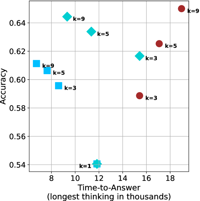
This image is a scatter plot visualizing the relationship between "Time-to-Answer" (x-axis) and "Accuracy" (y-axis). The data points are categorized by shape and color, with labels indicating a "k" value (likely representing a parameter such as search depth, number of samples, or model complexity). The plot contains three distinct clusters of data points, plus one outlier.
### Components/Axes
* **Y-Axis:** Labeled "Accuracy". The scale ranges from 0.54 to 0.64+, with grid lines at 0.54, 0.56, 0.58, 0.60, 0.62, and 0.64.
* **X-Axis:** Labeled "Time-to-Answer (longest thinking in thousands)". The scale ranges from 8 to 18+, with grid lines at 8, 10, 12, 14, 16, and 18.
* **Data Markers:**
* **Cyan Squares:** Located in the left-middle region.
* **Cyan Diamonds:** Located in the upper-middle region.
* **Cyan Star:** Located at the bottom-center.
* **Maroon Circles:** Located in the right region.
* **Labels:** Each data point is annotated with a "k=" value (k=1, k=3, k=5, k=9).
### Detailed Analysis
The data is segmented into four distinct visual groups based on shape and color.
#### 1. Cyan Squares (Left Cluster)
* **Trend:** As 'k' increases, accuracy increases while time-to-answer decreases (the points move up and to the left).
* **Data Points:**
* **k=3:** Positioned at x ≈ 8.8, y ≈ 0.595.
* **k=5:** Positioned at x ≈ 7.8, y ≈ 0.605.
* **k=9:** Positioned at x ≈ 7.2, y ≈ 0.61.
#### 2. Cyan Diamonds (Upper-Middle Cluster)
* **Trend:** As 'k' increases, accuracy increases while time-to-answer decreases (the points move up and to the left).
* **Data Points:**
* **k=3:** Positioned at x ≈ 15.5, y ≈ 0.615.
* **k=5:** Positioned at x ≈ 11.5, y ≈ 0.635.
* **k=9:** Positioned at x ≈ 9.2, y ≈ 0.645.
#### 3. Cyan Star (Bottom-Center Outlier)
* **Data Point:**
* **k=1:** Positioned at x ≈ 11.8, y ≈ 0.54. This is the lowest accuracy point on the chart.
#### 4. Maroon Circles (Right Cluster)
* **Trend:** As 'k' increases, accuracy increases, and time-to-answer also increases (the points move up and to the right).
* **Data Points:**
* **k=3:** Positioned at x ≈ 15.5, y ≈ 0.59.
* **k=5:** Positioned at x ≈ 17.2, y ≈ 0.625.
* **k=9:** Positioned at x ≈ 19.0, y ≈ 0.65.
### Key Observations
* **Consistent 'k' Impact:** Across all three main clusters (Squares, Diamonds, Circles), increasing the 'k' value consistently results in higher accuracy.
* **Divergent Efficiency:**
* The **Cyan groups** (Squares and Diamonds) exhibit an inverse relationship between time and accuracy: higher 'k' values result in *faster* answers with *higher* accuracy.
* The **Maroon group** exhibits a direct relationship: higher 'k' values result in *slower* answers with *higher* accuracy.
* **Performance Ceiling:** The highest accuracy achieved is approximately 0.65 (Maroon k=9), while the lowest is 0.54 (Cyan k=1).
### Interpretation
This chart likely compares different model architectures or inference strategies. The "k" parameter appears to be a hyperparameter that improves performance (accuracy) in all scenarios.
The most striking finding is the difference in efficiency between the groups. The **Cyan groups** appear to be more efficient architectures; as they scale up (increasing 'k'), they become both more accurate and faster, suggesting that higher 'k' values might optimize the search or reasoning process in these specific models. Conversely, the **Maroon group** represents a more traditional computational trade-off where increasing accuracy requires a linear increase in processing time. The **Cyan Star (k=1)** acts as a baseline or "naive" approach, showing significantly lower performance than any of the k=3, 5, or 9 configurations.