\n
## Diagram: Convolutional Neural Network Pipeline Visualization
### Overview
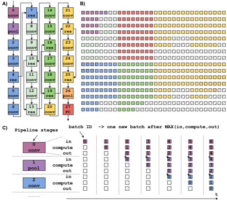
The image presents a visualization of a convolutional neural network (CNN) pipeline, broken down into three parts (A, B, and C). Part A shows the network architecture with labeled layers. Part B displays a heatmap-like representation of batch processing across pipeline stages. Part C details the pipeline stages and their activity over time with a table.
### Components/Axes
**Part A: Network Architecture**
* Layers: "conv" (convolutional), "res" (residual), "pool" (pooling), "FC" (fully connected).
* Nodes are numbered 1 through 27.
* Connections indicate data flow.
**Part B: Batch Processing Heatmap**
* X-axis: "batch ID" – representing sequential batches processed. The arrow indicates that each batch represents the maximum of "in, compute, out".
* Y-axis: Rows represent individual processing units or stages.
* Colors: Represent the stage of processing (likely "in", "compute", "out"). The legend is implicit in the color scheme.
* Red: Likely "in"
* Yellow: Likely "compute"
* Blue: Likely "out"
* Green: Likely "compute"
**Part C: Pipeline Stages Table**
* Pipeline Stages: 0, 1, 2.
* Stage 0: "conv"
* Stage 1: "pool"
* Stage 2: "conv"
* Columns: Represent time steps (batch IDs) from 0 to 6.
* Rows: Indicate the state of each pipeline stage ("in", "compute", "out") at each time step.
* Colors: Correspond to the pipeline stage state.
* Red: "in"
* Yellow: "compute"
* Blue: "out"
### Detailed Analysis or Content Details
**Part A: Network Architecture**
The network consists of a series of convolutional, residual, pooling, and fully connected layers. The layers are arranged in a sequential manner.
* Nodes 1-3: "conv"
* Node 4: "res"
* Nodes 5-7: "conv"
* Node 8: "pool"
* Nodes 9-11: "conv"
* Node 12: "res"
* Nodes 13-15: "conv"
* Node 16: "pool"
* Nodes 17-19: "conv"
* Node 20: "res"
* Nodes 21-23: "conv"
* Node 24: "pool"
* Nodes 25-27: "conv"
* Node 27: "FC"
**Part B: Batch Processing Heatmap**
The heatmap shows the activity of different processing units over time.
* The heatmap is approximately 15 rows by 7 columns.
* The first few columns (batch IDs 0-2) show predominantly red ("in") states.
* As the batch ID increases, yellow ("compute") and blue ("out") states become more prevalent.
* There is a staggered pattern of activity, indicating pipelining.
* The heatmap shows a repeating pattern of activity across batches.
**Part C: Pipeline Stages Table**
The table details the state of each pipeline stage at each time step.
* Stage 0 ("conv"):
* Batch 0: "in" (red)
* Batch 1: "compute" (yellow)
* Batch 2: "out" (blue)
* Batch 3-6: "in" (red)
* Stage 1 ("pool"):
* Batch 0: "in" (red)
* Batch 1: "out" (blue)
* Batch 2: "in" (red)
* Batch 3: "compute" (yellow)
* Batch 4: "out" (blue)
* Batch 5-6: "in" (red)
* Stage 2 ("conv"):
* Batch 0: "in" (red)
* Batch 1: "in" (red)
* Batch 2: "compute" (yellow)
* Batch 3: "out" (blue)
* Batch 4: "in" (red)
* Batch 5: "compute" (yellow)
* Batch 6: "out" (blue)
### Key Observations
* The pipeline operates in a staged manner, with each stage processing data sequentially.
* The heatmap in Part B visually demonstrates the pipelining effect, where multiple batches are in different stages of processing simultaneously.
* The table in Part C confirms the pipelining behavior, showing how each stage transitions between "in", "compute", and "out" states over time.
* The network architecture in Part A provides the structural context for the pipeline visualization.
### Interpretation
The image illustrates the concept of pipelining in a CNN. Pipelining allows for increased throughput by overlapping the execution of different stages of the network. The heatmap and table in Parts B and C provide a visual and tabular representation of how data flows through the pipeline, with each batch progressing through the stages concurrently. The staggered activity patterns demonstrate that while one batch is being processed in one stage, another batch may be in a different stage. This parallel processing significantly improves the efficiency of the CNN. The network architecture in Part A shows the layers that are being pipelined. The color coding consistently represents the state of each stage, making it easy to understand the flow of data. The diagram effectively communicates the benefits of pipelining in CNNs, highlighting how it enables faster and more efficient processing of data.