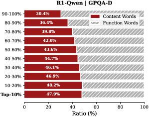
## Horizontal Bar Chart: R1-Qwen | GPOA-D
### Overview
The image displays a horizontal bar chart comparing the percentage ratio of "Content Words" and "Function Words" across ten distinct percentile groups, from "Top-10%" to "90-100%". The chart is titled "R1-Qwen | GPOA-D". The data suggests an inverse relationship between the two word categories across the performance spectrum.
### Components/Axes
* **Chart Title:** "R1-Qwen | GPOA-D" (centered at the top).
* **Y-Axis (Vertical):** Lists ten percentile ranges, ordered from highest performance at the bottom to lowest at the top:
* Top-10%
* 10-20%
* 20-30%
* 30-40%
* 40-50%
* 50-60%
* 60-70%
* 70-80%
* 80-90%
* 90-100%
* **X-Axis (Horizontal):** Labeled "Ratio (%)", with a scale from 0 to 100 in increments of 20 (0, 20, 40, 60, 80, 100).
* **Legend:** Located in the top-right corner.
* A red rectangle corresponds to "Content Words".
* A gray rectangle corresponds to "Function Words".
* **Data Series:** For each percentile range, there are two horizontal bars:
* A **red bar** (left-aligned) representing the "Content Words" ratio.
* A **gray bar** (right-aligned, starting from the end of the red bar) representing the "Function Words" ratio. The combined length of both bars for each category sums to 100%.
### Detailed Analysis
The following table reconstructs the data presented in the chart. Values are read directly from the labels on each bar.
| Percentile Range | Content Words (Red Bar) | Function Words (Gray Bar) |
| :--- | :--- | :--- |
| **Top-10%** | 47.9% | 52.1% |
| **10-20%** | 48.2% | 51.8% |
| **20-30%** | 46.9% | 53.1% |
| **30-40%** | 46.1% | 53.9% |
| **40-50%** | 44.7% | 55.3% |
| **50-60%** | 43.6% | 56.4% |
| **60-70%** | 42.0% | 58.0% |
| **70-80%** | 39.8% | 60.2% |
| **80-90%** | 36.4% | 63.6% |
| **90-100%** | 30.4% | 69.6% |
**Trend Verification:**
* **Content Words (Red Bars):** The red bars show a clear **downward trend** as we move from the "Top-10%" group to the "90-100%" group. The ratio starts at its highest point (47.9%) and steadily decreases to its lowest point (30.4%).
* **Function Words (Gray Bars):** Conversely, the gray bars show a clear **upward trend** across the same progression. The ratio starts at its lowest point (52.1%) and steadily increases to its highest point (69.6%).
### Key Observations
1. **Inverse Relationship:** There is a perfect inverse correlation between the two metrics. As the percentile range indicates lower performance (moving up the y-axis), the proportion of Content Words decreases while the proportion of Function Words increases.
2. **Crossover Point:** The ratio of Content Words to Function Words is closest to parity (≈50/50) in the highest-performing groups ("Top-10%" and "10-20%"). The "Top-10%" group has the highest Content Word ratio (47.9%).
3. **Maximum Divergence:** The greatest disparity is observed in the lowest-performing group ("90-100%"), where Function Words (69.6%) are more than double the ratio of Content Words (30.4%).
4. **Monotonic Change:** The change in ratio between adjacent percentile groups is consistent and monotonic for both series, with no reversals in the trend.
### Interpretation
This chart likely visualizes a linguistic or textual analysis metric (GPOA-D) applied to the outputs of a model named "R1-Qwen". The data suggests a strong correlation between the lexical composition of text and a performance ranking.
* **What the data suggests:** Higher-performing outputs (Top-10%, 10-20%) are characterized by a more balanced use of "Content Words" (nouns, verbs, adjectives carrying semantic meaning) and "Function Words" (articles, prepositions, conjunctions providing grammatical structure). As performance decreases, the text becomes increasingly dominated by Function Words, with a corresponding drop in Content Words.
* **How elements relate:** The percentile ranking (y-axis) is the independent variable, and the word ratio (x-axis) is the dependent variable. The chart demonstrates that the GPOA-D metric is sensitive to this lexical balance.
* **Notable implications:** This pattern could indicate that higher-quality or more relevant outputs (as defined by the GPOA-D score) require a denser use of meaningful, content-specific vocabulary. Conversely, lower-quality outputs may be more verbose or structurally repetitive without adding substantive content. The trend is smooth and significant, suggesting the ratio of content to function words is a robust indicator within this evaluation framework.