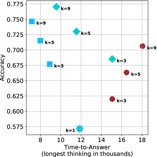
## Scatter Plot: Accuracy vs. Time-to-Answer for Different 'k' Values
### Overview
The image is a scatter plot comparing the performance of different models or configurations, parameterized by a variable 'k'. It plots **Accuracy** (y-axis) against **Time-to-Answer** (x-axis), measured in thousands of units (likely tokens or steps). The data is segmented into three distinct series, differentiated by color and marker shape, each representing a different model or method. Each data point is explicitly labeled with its corresponding 'k' value.
### Components/Axes
* **Y-Axis (Vertical):**
* **Label:** `Accuracy`
* **Scale:** Linear, ranging from approximately 0.575 to 0.775.
* **Major Ticks:** 0.575, 0.600, 0.625, 0.650, 0.675, 0.700, 0.725, 0.750, 0.775.
* **X-Axis (Horizontal):**
* **Label:** `Time-to-Answer (longest thinking in thousands)`
* **Scale:** Linear, ranging from approximately 7 to 18.
* **Major Ticks:** 8, 10, 12, 14, 16, 18.
* **Data Series (Inferred Legend):**
* **Series 1:** Cyan squares (■). Positioned on the left side of the chart.
* **Series 2:** Cyan diamonds (◆). Positioned in the middle of the chart.
* **Series 3:** Red circles (●). Positioned on the right side of the chart.
* **Data Point Annotations:** Each marker is accompanied by a text label indicating the 'k' value (e.g., `k=9`).
### Detailed Analysis
**Data Points (Approximate Coordinates & Labels):**
* **Cyan Square Series (Left Cluster):**
* Point 1: (x ≈ 7.5, y ≈ 0.750), Label: `k=9`
* Point 2: (x ≈ 8.0, y ≈ 0.715), Label: `k=5`
* Point 3: (x ≈ 9.0, y ≈ 0.675), Label: `k=3`
* **Cyan Diamond Series (Middle Cluster):**
* Point 4: (x ≈ 10.0, y ≈ 0.770), Label: `k=9`
* Point 5: (x ≈ 11.5, y ≈ 0.730), Label: `k=5`
* Point 6: (x ≈ 12.0, y ≈ 0.570), Label: `k=1`
* Point 7: (x ≈ 15.0, y ≈ 0.685), Label: `k=3`
* **Red Circle Series (Right Cluster):**
* Point 8: (x ≈ 15.0, y ≈ 0.620), Label: `k=3`
* Point 9: (x ≈ 16.5, y ≈ 0.660), Label: `k=5`
* Point 10: (x ≈ 18.0, y ≈ 0.705), Label: `k=9`
**Visual Trends per Series:**
* **Cyan Squares:** Shows a clear **downward trend**. As Time-to-Answer increases from ~7.5 to ~9, Accuracy decreases from ~0.750 to ~0.675.
* **Cyan Diamonds:** Shows a **non-monotonic trend**. Accuracy peaks at the highest 'k' value (k=9, y≈0.770) at a moderate time (x≈10). It then drops significantly for k=5 and k=3, with a severe outlier at k=1 (lowest accuracy, y≈0.570) at x≈12.
* **Red Circles:** Shows a clear **upward trend**. As Time-to-Answer increases from ~15 to ~18, Accuracy increases from ~0.620 to ~0.705.
### Key Observations
1. **Performance Clusters:** The three series occupy distinct regions of the time-accuracy space. Cyan squares are fast but mid-accuracy, cyan diamonds are mid-speed with high variance, and red circles are slow but show improving accuracy.
2. **Impact of 'k':** Within each series, higher 'k' values generally correlate with higher accuracy, with the notable exception of the cyan diamond series where k=1 is a drastic outlier.
3. **Trade-off Visualization:** The chart illustrates a complex trade-off. The fastest method (cyan squares) sacrifices peak accuracy. The method with the highest observed accuracy (cyan diamond, k=9) requires moderate time. The slowest method (red circles) starts with lower accuracy but improves with more time.
4. **Outlier:** The data point for the cyan diamond series at `k=1` (x≈12, y≈0.570) is a significant outlier, having the lowest accuracy on the chart despite not having the shortest time.
### Interpretation
This chart likely compares different reasoning or search strategies (parameterized by 'k', possibly the number of candidates or steps) for an AI model. The data suggests:
* **No Single Best Strategy:** There is a Pareto frontier. The choice of optimal 'k' and underlying method depends on the priority: minimizing latency (choose cyan squares with k=9) or maximizing accuracy (choose cyan diamonds with k=9, if the ~10k time cost is acceptable).
* **Method Efficiency:** The cyan square method is the most time-efficient for a given accuracy level in its range. The red circle method appears to be a different paradigm that benefits from more "thinking" time, showing a positive scaling law within its observed range.
* **The 'k=1' Anomaly:** The poor performance of k=1 in the cyan diamond series suggests that some minimal level of computation or candidate generation (k>1) is crucial for that method's effectiveness. k=1 might represent a greedy or baseline approach that fails to capture necessary complexity.
* **Underlying Mechanism:** The separation of clusters implies the three series represent fundamentally different algorithms or model architectures, not just parameter tweaks. The cyan diamond method has the highest potential ceiling but also the highest variance and risk of failure (as seen with k=1).
In summary, the visualization provides a technical comparison for system designers to select a model configuration based on their specific constraints for speed and accuracy, highlighting that increased computational time does not universally guarantee better performance—it depends heavily on the chosen method.