## Scatter Plot: Accuracy vs. Time-to-Answer
### Overview
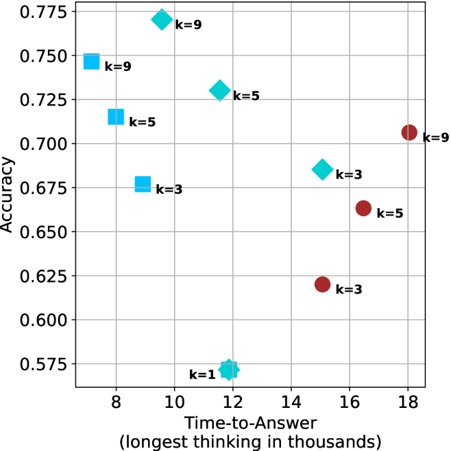
The image is a scatter plot showing the relationship between "Time-to-Answer" (in thousands) and "Accuracy". The plot displays data points for different values of 'k' (1, 3, 5, and 9), represented by different shapes and colors. The x-axis represents "Time-to-Answer" and the y-axis represents "Accuracy".
### Components/Axes
* **Title:** There is no explicit title on the chart.
* **X-axis:** "Time-to-Answer (longest thinking in thousands)". The x-axis ranges from approximately 7 to 18.
* **Y-axis:** "Accuracy". The y-axis ranges from 0.575 to 0.775.
* **Data Points:**
* Light Blue Squares: Represent data points where 'k=9', 'k=5', and 'k=3'.
* Light Blue Diamonds: Represent data points where 'k=9', 'k=5', 'k=3', and 'k=1'.
* Dark Red Circles: Represent data points where 'k=9', 'k=5', and 'k=3'.
* **Gridlines:** The plot has gridlines for both x and y axes.
### Detailed Analysis
Here's a breakdown of the data points:
* **Light Blue Squares:**
* k=9: Located at approximately (7.5, 0.75).
* k=5: Located at approximately (8, 0.715).
* k=3: Located at approximately (8.5, 0.675).
* **Light Blue Diamonds:**
* k=9: Located at approximately (11.5, 0.77).
* k=5: Located at approximately (13, 0.73).
* k=3: Located at approximately (14.5, 0.69).
* k=1: Located at approximately (12, 0.57).
* **Dark Red Circles:**
* k=9: Located at approximately (18, 0.705).
* k=5: Located at approximately (16, 0.665).
* k=3: Located at approximately (15.5, 0.62).
### Key Observations
* For the light blue squares, as 'k' decreases from 9 to 3, both the time-to-answer and accuracy decrease.
* For the light blue diamonds, as 'k' decreases from 9 to 1, the time-to-answer increases slightly, and the accuracy decreases significantly.
* For the dark red circles, as 'k' decreases from 9 to 3, both the time-to-answer and accuracy decrease.
* The lowest accuracy is observed when k=1.
* The highest accuracy is observed when k=9 with light blue diamonds.
### Interpretation
The scatter plot visualizes the relationship between the time taken to answer a question and the accuracy achieved, categorized by different values of 'k'. The data suggests that there is no simple linear relationship between time-to-answer and accuracy. The optimal 'k' value appears to be 'k=9' with light blue diamonds, as it yields the highest accuracy, although it requires a moderate time-to-answer. The 'k=1' value results in the lowest accuracy, indicating that this parameter setting is not effective. The plot highlights the importance of tuning the 'k' parameter to achieve the best balance between time efficiency and accuracy. The different shapes (squares, diamonds, and circles) likely represent different algorithms or methods being tested, with each having a different performance profile based on 'k' and time-to-answer.