\n
## Line Chart: MultiChallenge Model Scores
### Overview
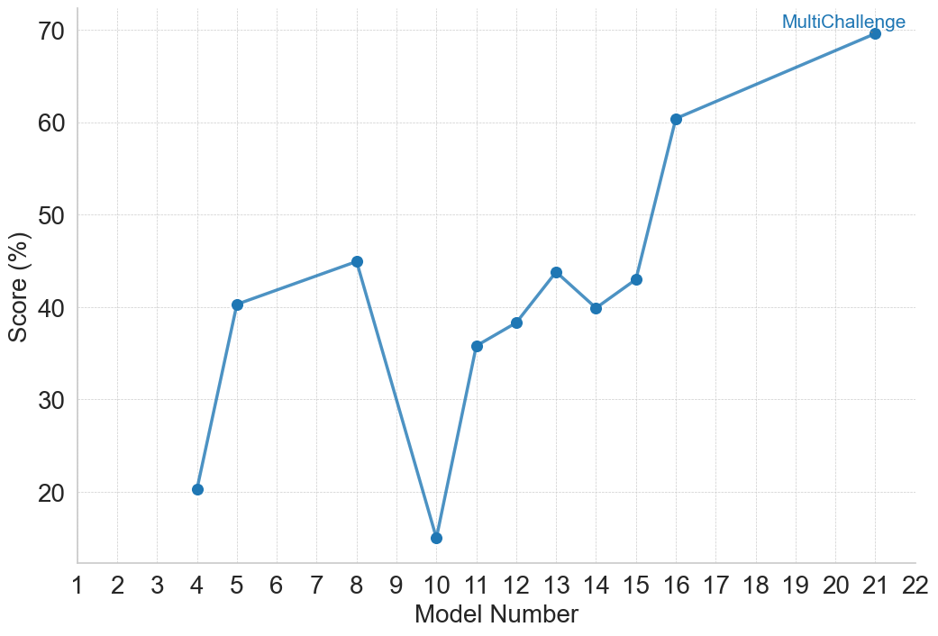
The image displays a line chart plotting the performance scores of various models, identified by number, on a metric called "MultiChallenge." The chart shows significant variability in scores across the models, with a general upward trend in the later model numbers.
### Components/Axes
* **Chart Type:** Line chart with data points marked by blue circular markers.
* **Title/Legend:** A single data series labeled **"MultiChallenge"** is indicated by a legend in the **top-right corner** of the chart area. The legend text is blue, matching the line and marker color.
* **X-Axis (Horizontal):**
* **Label:** "Model Number"
* **Scale:** Linear scale with major tick marks and labels for every integer from 1 to 22.
* **Y-Axis (Vertical):**
* **Label:** "Score (%)"
* **Scale:** Linear scale with major tick marks and labels at intervals of 10, from 20 to 70. Gridlines extend horizontally from these ticks across the chart.
* **Data Series:** A single blue line connecting blue circular data points. The line is solid and of medium thickness.
### Detailed Analysis
The chart plots the "Score (%)" for specific "Model Number" entries. The data points, read from left to right, are as follows (values are approximate based on visual alignment with the grid):
* **Model 4:** ~20%
* **Model 5:** ~40%
* **Model 8:** ~45%
* **Model 10:** ~15% (This is the lowest point on the chart)
* **Model 11:** ~36%
* **Model 12:** ~38%
* **Model 13:** ~44%
* **Model 14:** ~40%
* **Model 15:** ~43%
* **Model 16:** ~60%
* **Model 21:** ~70% (This is the highest point on the chart)
**Trend Verification:**
1. The line starts at a low point (Model 4).
2. It rises sharply to a local peak at Model 8.
3. It then drops dramatically to the global minimum at Model 10.
4. From Model 10, the line begins a general upward trend, with minor fluctuations (a small dip at Model 14), until Model 15.
5. Between Model 15 and Model 16, there is a very steep, significant increase.
6. The upward trend continues at a more gradual slope from Model 16 to the final point at Model 21.
### Key Observations
1. **High Variability:** Scores are not consistent, ranging from a low of ~15% to a high of ~70%.
2. **Significant Dip:** Model 10 is a clear outlier with a score (~15%) far below its immediate neighbors.
3. **Strong Late-Stage Improvement:** The most substantial and sustained improvement occurs after Model 15, with the score jumping over 15 percentage points to Model 16 and continuing to rise.
4. **Non-Sequential Data:** The plotted model numbers are not consecutive (e.g., 4, 5, 8, 10, 11...). This suggests the chart is comparing a selected subset of models, not a continuous sequence.
### Interpretation
The data suggests that performance on the "MultiChallenge" benchmark is highly sensitive to the specific model version or architecture, as indicated by the "Model Number." There is no smooth, linear progression of improvement.
* **The Dip at Model 10:** This could indicate a model version that introduced a regression, was trained on different data, or represents a failed experiment. It serves as a critical point for investigation into what factors negatively impacted performance.
* **The Inflection at Model 15/16:** The sharp rise starting at Model 16 strongly implies a significant architectural change, training methodology breakthrough, or data scaling event occurred at this point in the model development lineage. This is the most notable positive trend in the chart.
* **Overall Trajectory:** Despite the severe dip, the overall trajectory from the earliest model (4) to the latest (21) is positive, showing that later models, particularly those after number 15, have achieved substantially higher scores on this challenge. The chart tells a story of volatile development with a recent period of strong, successful advancement.