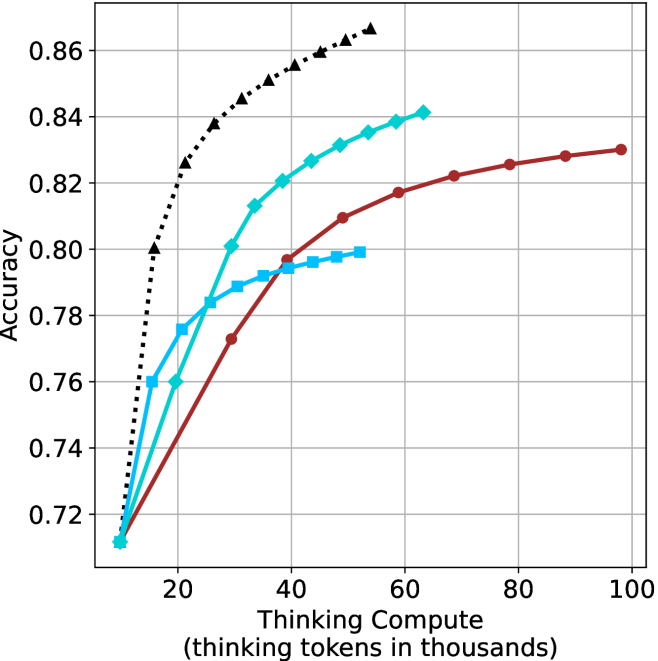
## Line Chart: Accuracy vs. Thinking Compute
### Overview
The image is a line chart comparing the accuracy of different models as a function of "Thinking Compute" (measured in thousands of thinking tokens). Four different models are represented by different colored lines with distinct markers. The chart illustrates how accuracy improves with increased computational resources.
### Components/Axes
* **X-axis:** "Thinking Compute (thinking tokens in thousands)". The scale ranges from 0 to 100, with tick marks at intervals of 20.
* **Y-axis:** "Accuracy". The scale ranges from 0.72 to 0.86, with tick marks at intervals of 0.02.
* **Data Series:** Four distinct data series are plotted:
* Black dotted line with triangle markers.
* Turquoise line with diamond markers.
* Brown line with circle markers.
* Light blue line with square markers.
* **Grid:** The chart has a light gray grid to aid in reading values.
### Detailed Analysis
* **Black dotted line with triangle markers:** This line shows the highest accuracy for a given thinking compute value. It increases rapidly from approximately (12, 0.72) to (20, 0.80), then continues to increase, but at a slower rate, reaching approximately (30, 0.84) and (35, 0.85), and finally reaching approximately (40, 0.86).
* **Turquoise line with diamond markers:** This line starts at approximately (12, 0.71). It increases steadily, reaching approximately (20, 0.77), (30, 0.81), (40, 0.83), (50, 0.84), (60, 0.845).
* **Brown line with circle markers:** This line starts at approximately (12, 0.71). It increases steadily, reaching approximately (25, 0.77), (40, 0.79), (60, 0.82), (80, 0.825), and (95, 0.83).
* **Light blue line with square markers:** This line starts at approximately (12, 0.71). It increases steadily, reaching approximately (20, 0.77), (30, 0.79), (40, 0.795), (50, 0.80), and then stops.
### Key Observations
* The black dotted line (with triangle markers) achieves the highest accuracy with the least amount of thinking compute.
* All lines show diminishing returns as thinking compute increases, meaning the rate of accuracy improvement slows down at higher compute values.
* The light blue line (with square markers) plateaus and stops at a thinking compute value of approximately 50.
### Interpretation
The chart demonstrates the relationship between computational resources (thinking compute) and model accuracy. The different lines likely represent different model architectures or training strategies. The black dotted line represents the most efficient model, achieving high accuracy with relatively low compute. The other models require more compute to achieve similar levels of accuracy, and some plateau before reaching the maximum accuracy achieved by the black dotted line model. The diminishing returns observed across all models suggest that there is a limit to how much accuracy can be gained by simply increasing compute, and that optimizing model architecture or training methods may be necessary to achieve further improvements.