## Network Graph: Interconnected Nodes
### Overview
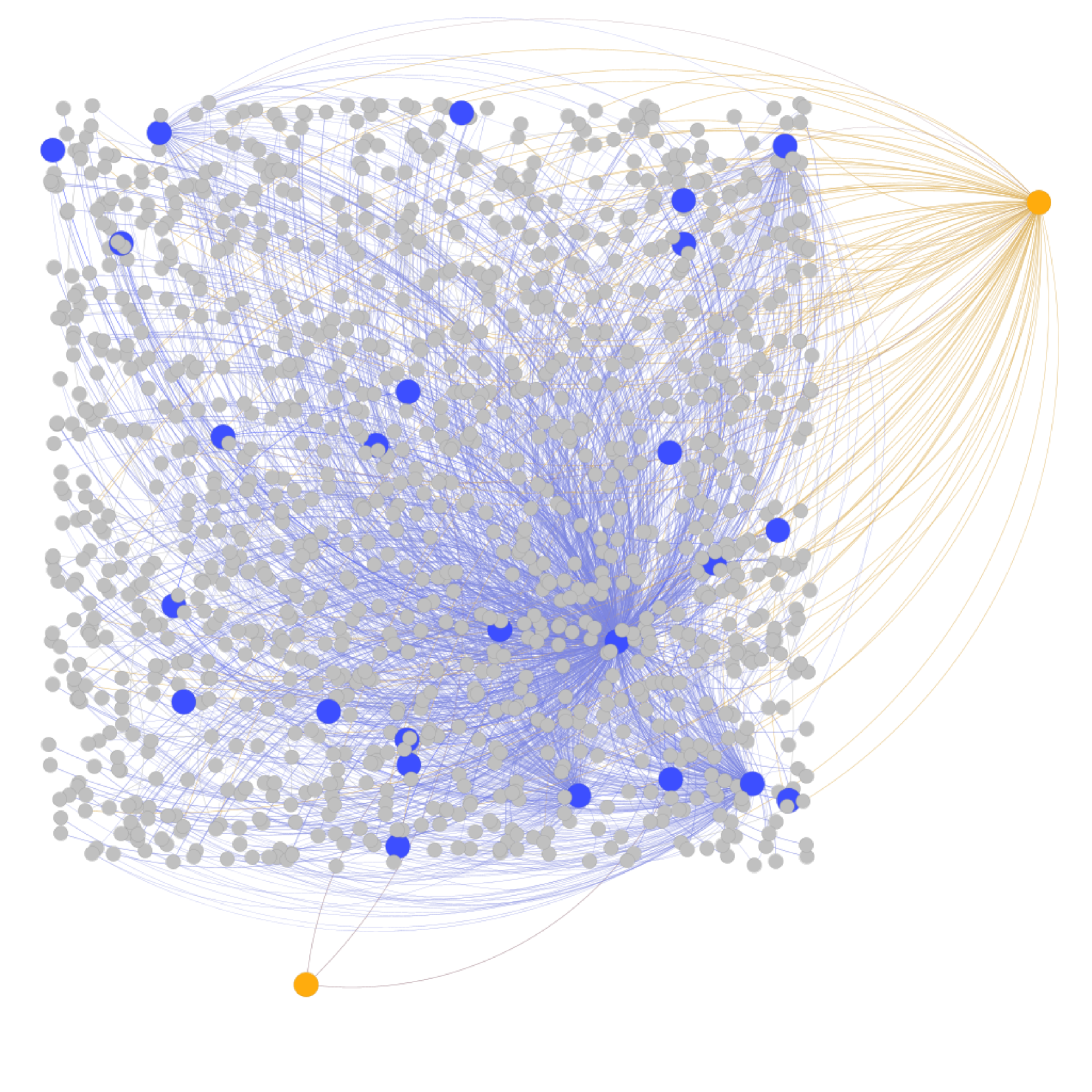
This image displays a network graph, illustrating the relationships between various nodes. The nodes are represented by circles of different colors and sizes, and the connections between them are depicted by lines. The graph appears to be a visualization of a complex system with a central cluster of nodes and some peripheral nodes.
### Components/Axes
* **Nodes:**
* **Grey Nodes:** These are the most numerous nodes in the graph. They are generally smaller in size and are densely clustered in the central and left portions of the image.
* **Blue Nodes:** These nodes are larger than the grey nodes and are scattered throughout the central cluster. They appear to have a higher degree of connectivity within the blue and grey node groups.
* **Orange Nodes:** There are two distinct orange nodes. One is located in the far right of the image, and the other is in the bottom-left corner. These nodes appear to be highly connected to other nodes, particularly the orange node on the right.
* **Edges (Lines):**
* **Blue Lines:** These lines connect various nodes, predominantly linking blue nodes to other blue nodes and to the surrounding grey nodes. They form a dense web within the central cluster.
* **Orange Lines:** These lines emanate from the orange node on the right and connect to a large number of grey nodes, forming a fan-like structure. There are also a few thin grey lines connecting the orange node on the bottom-left to some grey nodes.
### Detailed Analysis or Content Details
* **Grey Nodes:** There are approximately 800-1000 grey nodes visible. They are distributed across the majority of the graph, with a high concentration in the central and left areas.
* **Blue Nodes:** There are approximately 20-25 blue nodes. They are larger than the grey nodes and are interspersed within the dense cluster of grey nodes.
* **Orange Nodes:** There are exactly 2 orange nodes.
* One orange node is positioned on the far right edge of the graph. It has a very high degree of connectivity, with numerous orange lines extending from it to many grey nodes.
* The second orange node is located in the bottom-left corner of the graph. It has a much lower degree of connectivity, with only a few thin grey lines connecting it to some grey nodes.
* **Connectivity:**
* The blue nodes appear to be highly interconnected with each other and with the surrounding grey nodes, forming a dense sub-network.
* The orange node on the right acts as a central hub for a significant portion of the grey nodes, indicated by the dense fan of orange lines.
* The orange node on the bottom-left seems to have a more isolated role, with limited connections.
### Key Observations
* **Centralized Clustering:** The majority of grey and blue nodes are clustered together in the center and left of the graph, suggesting a tightly knit community or system.
* **Hub-and-Spoke Structure:** The orange node on the right exhibits a clear hub-and-spoke pattern, connecting to a large number of other nodes. This suggests it might be a central source or influencer.
* **Differential Connectivity:** The two orange nodes have vastly different levels of connectivity, indicating distinct roles or importance within the network.
* **Color-Coded Significance:** The use of different colors (grey, blue, orange) likely signifies different types of nodes or categories within the network, with distinct interaction patterns.
### Interpretation
This network graph visually represents a system with distinct components and relationships. The dense cluster of grey and blue nodes suggests a core group with many internal connections. The blue nodes, being larger and interspersed within this cluster, might represent key entities or influencers within that core group.
The orange node on the right is a significant outlier, acting as a major connector to a large segment of the grey nodes. This could represent an external influence, a central server, a primary data source, or a critical point of interaction for a large part of the network. The sheer number of orange lines emanating from it strongly suggests a dominant role.
In contrast, the orange node on the bottom-left appears to be a minor or peripheral element, with very few connections. This could represent a less important entity, a newly added component, or a node with limited interaction scope.
The overall structure suggests a network that is not uniformly connected. There's a clear distinction between the densely interconnected core and the more peripheral elements, with the orange node on the right acting as a significant bridge or gateway. This visualization could be used to understand information flow, identify central points of control or influence, or analyze the structure of a complex system. The different node colors and line types likely represent different types of entities and the nature of their relationships (e.g., data flow, communication, dependency).