\n
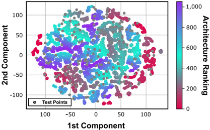
## Scatter Plot: 2D Component Analysis with Architecture Ranking
### Overview
The image presents a scatter plot visualizing data points in a two-dimensional space defined by the "1st Component" (x-axis) and "2nd Component" (y-axis). The color of each data point represents its "Architecture Ranking," indicated by a colorbar on the right side of the plot. The plot appears to show a clustering of points, with color variations suggesting a correlation between component values and architecture ranking.
### Components/Axes
* **X-axis:** "1st Component" - Scale ranges approximately from -100 to 100.
* **Y-axis:** "2nd Component" - Scale ranges approximately from -100 to 100.
* **Colorbar:** "Architecture Ranking" - Scale ranges from 0 to 1,000. The color gradient transitions from red (low ranking, ~0) to blue (high ranking, ~1,000).
* **Legend:** Located in the bottom-left corner, labeled "Test Points". The legend symbol is a gray circle.
### Detailed Analysis
The scatter plot contains a large number of data points (approximately 500-1000). The points are distributed in a roughly circular or elliptical shape. The color distribution shows a complex pattern:
* **Low Ranking (Red):** Points with low architecture ranking (red color) are concentrated in the lower-right quadrant (positive 1st Component, negative 2nd Component) and the lower-left quadrant (negative 1st Component, negative 2nd Component).
* **Medium Ranking (Purple/Blue):** Points with medium architecture ranking (purple and blue colors) are distributed throughout the plot, with a higher concentration in the upper-left quadrant (negative 1st Component, positive 2nd Component) and the center of the plot.
* **High Ranking (Cyan/Turquoise):** Points with high architecture ranking (cyan and turquoise colors) are concentrated in the upper-right quadrant (positive 1st Component, positive 2nd Component) and the upper-left quadrant.
* There is a noticeable gradient of colors within each quadrant, indicating a continuous range of architecture rankings.
* The density of points appears to be relatively uniform across the plot, with some areas showing slightly higher concentrations.
### Key Observations
* There appears to be a negative correlation between the 1st Component and the Architecture Ranking, as points with lower 1st Component values tend to have lower rankings (red).
* The 2nd Component seems to have a more complex relationship with the Architecture Ranking, with both positive and negative values associated with various ranking levels.
* The clustering of points suggests that the data can be separated into distinct groups based on their component values and architecture rankings.
* There are no obvious outliers or anomalies in the data.
### Interpretation
This scatter plot likely represents the results of a dimensionality reduction technique (e.g., Principal Component Analysis - PCA) applied to a dataset of architectural designs or features. The "1st Component" and "2nd Component" represent the principal components that capture the most variance in the data. The "Architecture Ranking" could be a metric assigned to each design based on its performance, quality, or other criteria.
The plot suggests that the first two principal components are able to effectively separate the architectural designs based on their ranking. The clustering of points indicates that designs with similar characteristics tend to have similar rankings. The color gradient provides a visual representation of the relationship between the component values and the ranking metric.
The negative correlation between the 1st Component and the Architecture Ranking suggests that designs with lower values on the first component tend to have lower rankings. This could indicate that the first component captures a feature that is negatively correlated with the desired architectural qualities.
Further analysis would be needed to determine the specific meaning of the components and the ranking metric, as well as to validate the findings and explore the underlying relationships in the data.