## Scatter Plots: Correlation: change in correction marker presence vs change in accuracy after appending Wait
### Overview
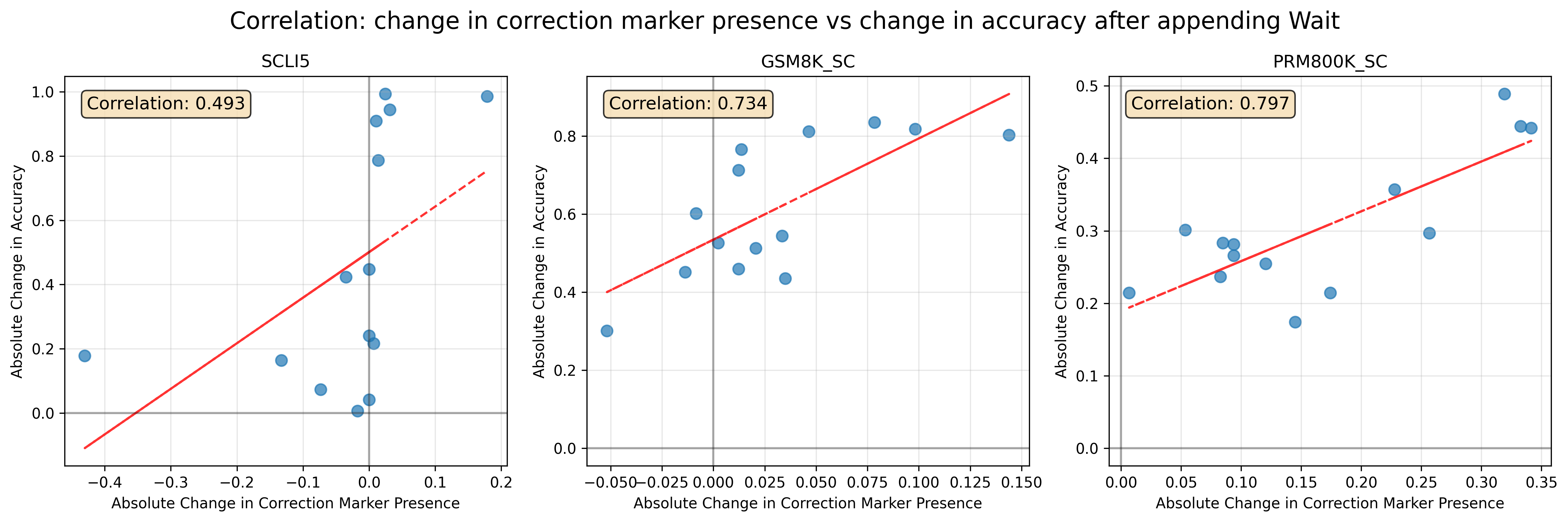
The image presents three scatter plots, each displaying the correlation between the "Absolute Change in Correction Marker Presence" and the "Absolute Change in Accuracy" after appending "Wait". Each plot corresponds to a different model: SCLI5, GSM8K_SC, and PRM800K_SC. A linear regression line is fitted to each scatter plot, along with the calculated correlation coefficient. A light green grid is overlaid on each plot.
### Components/Axes
Each plot shares the following components:
* **X-axis Label:** "Absolute Change in Correction Marker Presence"
* **Y-axis Label:** "Absolute Change in Accuracy"
* **Title:** "Correlation: change in correction marker presence vs change in accuracy after appending Wait" followed by the model name (SCLI5, GSM8K_SC, PRM800K_SC).
* **Correlation Coefficient:** Displayed in the top-left corner of each plot.
* **Linear Regression Line:** A red line representing the best fit for the data.
* **Data Points:** Blue circles representing individual data points.
* **Grid:** A light green grid for easier visual interpretation.
### Detailed Analysis or Content Details
**Plot 1: SCLI5**
* **Correlation:** 0.493
* **Trend:** The data points show a generally upward trend, but with significant scatter. The linear regression line has a positive slope.
* **Data Points (Approximate):**
* (-0.35, 0.05)
* (-0.25, 0.15)
* (-0.2, 0.25)
* (-0.1, 0.9)
* (0.0, 0.1)
* (0.1, 0.1)
* (0.15, 0.05)
**Plot 2: GSM8K_SC**
* **Correlation:** 0.734
* **Trend:** The data points exhibit a stronger upward trend than the SCLI5 plot, with less scatter. The linear regression line has a steeper positive slope.
* **Data Points (Approximate):**
* (-0.05, 0.45)
* (-0.025, 0.55)
* (0.0, 0.5)
* (0.025, 0.6)
* (0.05, 0.65)
* (0.075, 0.7)
* (0.1, 0.75)
* (0.125, 0.8)
* (0.15, 0.85)
**Plot 3: PRM800K_SC**
* **Correlation:** 0.797
* **Trend:** This plot shows the strongest upward trend and least scatter of the three. The linear regression line has the steepest positive slope.
* **Data Points (Approximate):**
* (0.0, 0.25)
* (0.05, 0.28)
* (0.1, 0.3)
* (0.15, 0.33)
* (0.2, 0.36)
* (0.25, 0.38)
* (0.3, 0.4)
* (0.35, 0.42)
### Key Observations
* The correlation between "Absolute Change in Correction Marker Presence" and "Absolute Change in Accuracy" is positive for all three models.
* The strength of the correlation varies significantly across models, with PRM800K_SC exhibiting the strongest correlation (0.797) and SCLI5 the weakest (0.493).
* The scatter of data points is lowest for PRM800K_SC, indicating a more consistent relationship between the two variables.
### Interpretation
The data suggests that increasing the presence of correction markers generally leads to an increase in accuracy for all three models after appending "Wait". However, the degree to which accuracy improves varies depending on the model. PRM800K_SC appears to benefit the most from correction markers, showing a strong and consistent positive correlation. SCLI5, on the other hand, shows a weaker correlation, suggesting that other factors may play a more significant role in determining its accuracy.
The differences in correlation strength could be due to variations in model architecture, training data, or the way correction markers are implemented. The strong correlation in PRM800K_SC suggests that this model is particularly sensitive to the presence of correction markers, potentially indicating that it relies heavily on this information for accurate predictions. The weaker correlation in SCLI5 suggests that this model may be more robust to errors or have alternative mechanisms for achieving accuracy. The linear regression lines provide a visual representation of the average relationship between the two variables, while the scatter of data points highlights the variability in this relationship.