\n
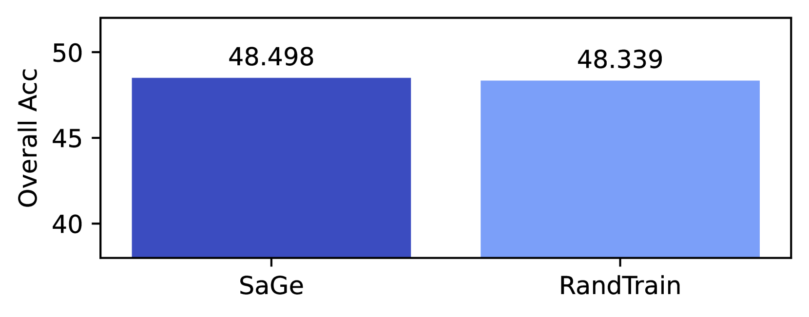
## Bar Chart: Comparison of Overall Accuracy: SaGe vs. RandTrain
### Overview
The image is a simple bar chart comparing the "Overall Acc" (Overall Accuracy) of two distinct methods or models, labeled "SaGe" and "RandTrain". The chart presents a single performance metric for each.
### Components/Axes
* **Y-Axis (Vertical):**
* **Label:** "Overall Acc"
* **Scale:** Linear scale with major tick marks and numerical labels at 40, 45, and 50.
* **X-Axis (Horizontal):**
* **Categories:** Two categorical bars.
* **Labels:** "SaGe" (left bar) and "RandTrain" (right bar).
* **Legend:** No separate legend is present. The bars are distinguished by color and their x-axis labels.
* **Data Labels:** Each bar has its exact numerical value displayed directly above it.
### Detailed Analysis
* **Bar 1 (SaGe):**
* **Position:** Left side of the chart.
* **Color:** Dark blue.
* **Value:** 48.498 (displayed above the bar).
* **Visual Height:** The top of the bar aligns just below the 50 mark on the y-axis.
* **Bar 2 (RandTrain):**
* **Position:** Right side of the chart.
* **Color:** Light blue.
* **Value:** 48.339 (displayed above the bar).
* **Visual Height:** The top of the bar is visually very slightly lower than the SaGe bar, consistent with its lower numerical value.
### Key Observations
1. **Minimal Performance Difference:** The numerical difference between the two methods is very small (48.498 - 48.339 = 0.159).
2. **Truncated Y-Axis:** The y-axis begins at 40, not 0. This visual choice amplifies the perceived difference in bar height, making the small numerical gap appear more significant than it would on a zero-based scale.
3. **Color Coding:** The chart uses two distinct shades of blue to differentiate the categories, with the higher-performing "SaGe" in a darker, more saturated hue.
### Interpretation
The chart demonstrates that the "SaGe" method achieves a marginally higher overall accuracy score than the "RandTrain" method in this specific evaluation. However, the difference of approximately 0.16 percentage points is extremely small and may not be statistically or practically significant without additional context (e.g., error bars, confidence intervals, or the scale of the accuracy metric).
The primary takeaway is that the two methods perform at a nearly identical level on this metric. The visualization, through its truncated axis and side-by-side placement, is designed to highlight this direct comparison, but the data itself suggests parity rather than a clear superiority of one method over the other. The choice to display the precise values to three decimal places implies a high-precision measurement, but the practical relevance of such a fine-grained difference is questionable.