TECHNICAL ASSET FINGERPRINT
d2b43bb07533a99d595fc666
Click to view fullscreen
Press ESC or click to close
FOUND IN PAPERS
EXPERT: healer-alpha-free VERSION 1
RUNTIME: free/openrouter/healer-alpha
INTEL_VERIFIED
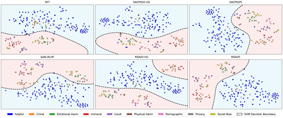
## [Scatter Plot Grid with Decision Boundaries]: Comparison of Safety Alignment Methods
### Overview
The image displays a 2x3 grid of six scatter plots, each visualizing the classification results of a different AI safety alignment method. The plots show data points representing text prompts or responses, color-coded by their safety category. A dashed black line in each plot represents the SVM (Support Vector Machine) decision boundary separating "helpful" (blue) points from various "harmful" categories. The overall purpose is to compare how effectively different training methods isolate safe, helpful content from unsafe content across multiple harm dimensions.
### Components/Axes
* **Subplot Titles (Top of each panel):**
* Top Row (Left to Right): `SFT`, `SACPO(H+S)`, `SACPO(P)`
* Bottom Row (Left to Right): `Safe-RLHF`, `RSA(H+S)`, `RSA(P)`
* **Legend (Bottom of image):** A horizontal legend defines the color coding for 10 categories and the decision boundary.
* **Categories (Colored Circles):**
* Blue: `helpful`
* Orange: `Crime`
* Green: `Emotional Harm`
* Red: `Immoral`
* Purple: `Insult`
* Brown: `Physical Harm`
* Pink: `Pornographic`
* Grey: `Privacy`
* Olive Green: `Social Bias`
* **Boundary:** Black dashed line: `SVM Decision Boundary`
* **Axes:** The plots are unlabeled 2D projections (likely from a dimensionality reduction technique like t-SNE or PCA). No numerical axis scales or titles are provided. The spatial arrangement represents relative similarity between data points.
### Detailed Analysis
The analysis is segmented by subplot region.
**Top-Left: SFT (Supervised Fine-Tuning)**
* **Layout:** The decision boundary runs roughly horizontally across the lower third of the plot.
* **Data Distribution:** The vast majority of blue (`helpful`) points are clustered in the large upper region (light blue background). Points from harmful categories (orange, green, red, purple, brown, pink, olive) are predominantly located in the smaller lower region (light pink background). There is noticeable mixing, with several harmful-category points (notably green, brown, and purple) appearing above the boundary among the helpful points.
**Top-Center: SACPO(H+S)**
* **Layout:** The decision boundary is a wavy line across the lower half.
* **Data Distribution:** Similar to SFT, blue points dominate the upper area. Harmful category points are concentrated below the boundary. The separation appears slightly cleaner than SFT, with fewer harmful points intruding into the upper blue cluster, though some green and brown points remain near or above the line.
**Top-Right: SACPO(P)**
* **Layout:** The decision boundary is a pronounced curve, creating a large pink region on the right and a smaller blue region on the left.
* **Data Distribution:** This plot shows a dramatically different spatial organization. The blue (`helpful`) points are densely clustered on the left side. All harmful category points are segregated to the right side of the boundary. The separation is visually very clean, with no obvious mixing.
**Bottom-Left: Safe-RLHF**
* **Layout:** The decision boundary is a complex, wavy line dividing the plot into a large upper pink region and a smaller lower blue region.
* **Data Distribution:** This plot inverts the common pattern. The blue (`helpful`) points are primarily clustered in the lower section. Points from harmful categories are spread across the large upper region. There is significant intermingling among the harmful categories themselves.
**Bottom-Center: RSA(H+S)**
* **Layout:** The decision boundary is a wavy line across the lower half, similar to SACPO(H+S).
* **Data Distribution:** Blue points are concentrated in the upper region. Harmful category points are mostly below the boundary. The distribution is somewhat diffuse, with harmful points (especially green and brown) scattered widely in the lower region.
**Bottom-Right: RSA(P)**
* **Layout:** The decision boundary is a sharp, near-vertical curve on the left side, creating a small pink region on the left and a large blue region on the right.
* **Data Distribution:** Similar to SACPO(P), this shows strong segregation. The blue (`helpful`) points form a dense cluster occupying most of the plot area on the right. All harmful category points are confined to the narrow strip on the left of the boundary.
### Key Observations
1. **Method-Dependent Spatial Organization:** The projection space organizes data very differently depending on the training method. SFT, SACPO(H+S), and RSA(H+S) show a rough "helpful on top, harmful on bottom" layout. Safe-RLHF inverts this. SACPO(P) and RSA(P) show a "helpful on left, harmful on right" layout.
2. **Boundary Effectiveness Varies:** The SVM decision boundary's ability to cleanly separate blue from non-blue points differs markedly.
* **Most Effective Separation:** `SACPO(P)` and `RSA(P)` demonstrate the clearest visual separation with minimal to no overlap.
* **Moderate Separation:** `SACPO(H+S)` and `RSA(H+S)` show good but imperfect separation.
* **Least Effective Separation:** `SFT` and `Safe-RLHF` show the most significant mixing of helpful and harmful points across the boundary.
3. **Harm Category Clustering:** Within the "harmful" regions, points of different colors (e.g., Crime, Insult, Physical Harm) are often intermingled, suggesting these methods do not strongly differentiate between *types* of harm in the embedding space, only between "harmful" and "helpful."
### Interpretation
This visualization provides a qualitative assessment of how different AI alignment techniques structure the model's internal representation of safety.
* **What the Data Suggests:** The methods labeled with `(P)` (likely standing for a "Preference" or "Pairwise" objective) result in a much sharper and more effective linear separation (as captured by the SVM) between helpful and harmful content in the projected feature space. This implies these training objectives create a more distinct and possibly more robust boundary for safety classifiers.
* **Relationship Between Elements:** The stark difference in spatial layout between method families (e.g., SFT vs. SACPO(P)) indicates that the training objective fundamentally alters the geometry of the learned representation. The `(H+S)` variants (perhaps "Harm + Safety") show intermediate performance, suggesting a blend of effects.
* **Notable Anomalies/Patterns:** The complete inversion of the layout in `Safe-RLHF` is a significant anomaly. It suggests this method's optimization leads to a qualitatively different embedding space where the direction of the "helpful" cluster is opposite to that of other methods. This could have implications for how safety filters or classifiers built on top of these representations would need to be designed.
* **Underlying Implication:** The clean separation in `SACPO(P)` and `RSA(P)` suggests these methods may produce models where safety is a more linearly separable concept, potentially making them easier to audit, control, or use as a base for further safety work. The mixing in `SFT` reflects the known limitation that standard supervised fine-tuning alone is often insufficient for robust safety alignment.
DECODING INTELLIGENCE...