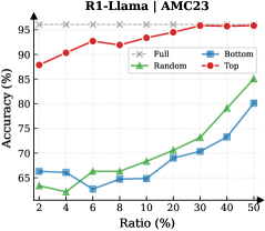
## Line Chart: R1-Llama | AMC23
### Overview
The image displays a line chart comparing the performance of four different methods or data selection strategies ("Full", "Random", "Bottom", "Top") on a task labeled "AMC23". The chart plots model accuracy against an increasing ratio of data used, showing how each method's effectiveness scales.
### Components/Axes
* **Chart Title:** "R1-Llama | AMC23" (Top center)
* **Y-Axis:** Labeled "Accuracy (%)". Scale runs from 65 to 95 in increments of 5.
* **X-Axis:** Labeled "Ratio (%)". The scale is non-linear, with marked points at 2, 4, 6, 10, 20, 30, 40, and 50.
* **Legend:** Positioned in the top-left corner of the plot area. It defines four data series:
* **Full:** Gray line with 'x' markers.
* **Random:** Green line with upward-pointing triangle markers.
* **Bottom:** Blue line with square markers.
* **Top:** Red line with circle markers.
### Detailed Analysis
**Data Series Trends and Approximate Points:**
1. **Full (Gray, 'x'):**
* **Trend:** Perfectly horizontal line, indicating constant performance.
* **Data Points:** Accuracy remains at approximately 95% across all ratios from 2% to 50%.
2. **Top (Red, Circles):**
* **Trend:** Starts high and shows a steady, slight upward trend, consistently outperforming Random and Bottom.
* **Data Points (Approximate):**
* Ratio 2%: ~88%
* Ratio 4%: ~90%
* Ratio 6%: ~93%
* Ratio 10%: ~93%
* Ratio 20%: ~94%
* Ratio 30%: ~95%
* Ratio 40%: ~95%
* Ratio 50%: ~95%
3. **Random (Green, Triangles):**
* **Trend:** Starts low, dips slightly at ratio 6%, then shows a consistent upward slope, converging towards the Top method at higher ratios.
* **Data Points (Approximate):**
* Ratio 2%: ~63%
* Ratio 4%: ~64%
* Ratio 6%: ~63% (local minimum)
* Ratio 10%: ~66%
* Ratio 20%: ~68%
* Ratio 30%: ~71%
* Ratio 40%: ~80%
* Ratio 50%: ~85%
4. **Bottom (Blue, Squares):**
* **Trend:** Starts low, dips at ratio 6%, then increases steadily but remains the lowest-performing method until the highest ratios, where it begins to close the gap with Random.
* **Data Points (Approximate):**
* Ratio 2%: ~65%
* Ratio 4%: ~65%
* Ratio 6%: ~62% (local minimum)
* Ratio 10%: ~65%
* Ratio 20%: ~67%
* Ratio 30%: ~70%
* Ratio 40%: ~73%
* Ratio 50%: ~80%
### Key Observations
* **Performance Hierarchy:** A clear and consistent hierarchy is visible: Full > Top > Random > Bottom for almost all data ratios.
* **The "Full" Baseline:** The "Full" method serves as a performance ceiling, maintaining perfect accuracy (95%) regardless of the data ratio, suggesting it represents training on the complete dataset.
* **Critical Dip at 6%:** Both the "Random" and "Bottom" methods show a noticeable dip in accuracy at the 6% data ratio before recovering and improving.
* **Convergence at High Ratios:** As the data ratio increases towards 50%, the performance gap between "Random" and "Bottom" narrows, and both show accelerated improvement, though they remain below "Top" and "Full".
* **"Top" Method Efficiency:** The "Top" method achieves near-ceiling performance (~93-95%) with as little as 6-10% of the data, indicating highly effective data selection.
### Interpretation
This chart demonstrates the efficacy of different data selection or curriculum learning strategies for the "R1-Llama" model on the "AMC23" task. The data suggests:
1. **Strategic Selection is Powerful:** The "Top" strategy, which likely selects the most informative or highest-quality data samples, is extremely efficient. It reaches near-optimal performance using only a small fraction (6-10%) of the total available data. This has significant implications for reducing training costs and time.
2. **Random Sampling is Suboptimal but Improves:** Randomly selecting data ("Random") is a poor strategy at low ratios but improves steadily as more data is added, showing that quantity can eventually compensate somewhat for lack of quality in selection.
3. **"Bottom" Selection is Detrimental:** Selecting from the "Bottom" (likely the least informative or lowest-quality data) yields the worst performance, confirming that not all data is equally valuable. Its persistent underperformance highlights the risk of using poorly curated datasets.
4. **The Value of Full Data:** The flat "Full" line confirms that the model's peak performance on this task is 95% accuracy, achievable only with the complete dataset. The other lines show how close different selection strategies can get to this peak with less data.
5. **Anomaly at 6% Ratio:** The synchronized dip for "Random" and "Bottom" at the 6% ratio is curious. It could indicate a specific subset of data introduced at that ratio which is particularly noisy or misleading for these non-selective methods, or it could be a statistical artifact in the experiment.
In essence, the chart provides strong evidence that intelligent data curation ("Top") is a highly effective method for achieving high model performance efficiently, significantly outperforming naive random sampling or the use of low-quality data.