\n
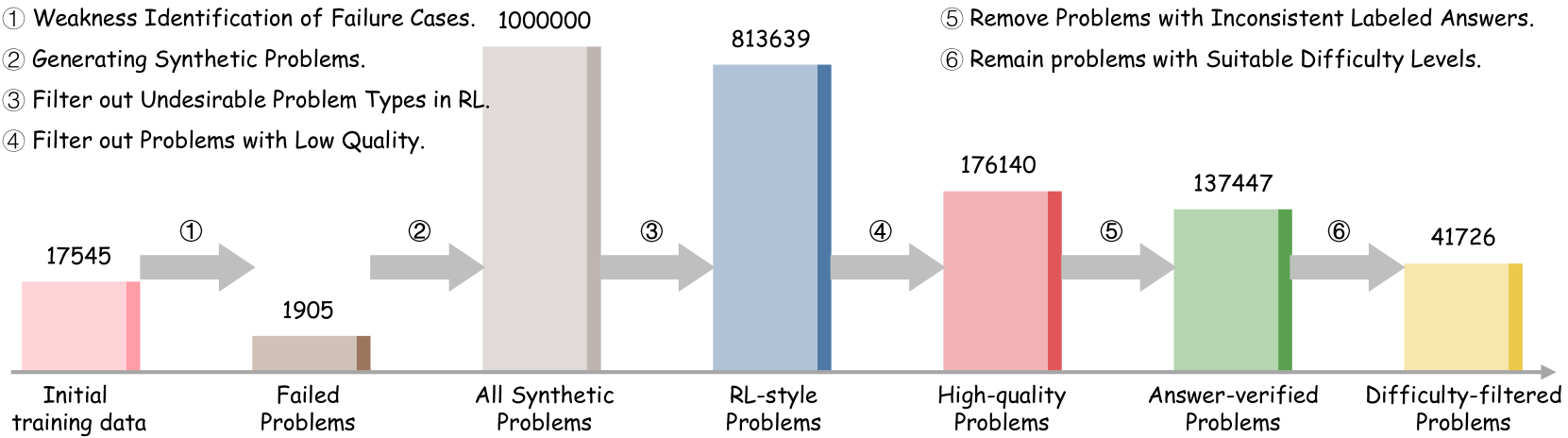
## Diagram: Data Filtering Pipeline
### Overview
This diagram illustrates a data filtering pipeline, showing the reduction in the number of problems as they pass through various filtering stages. The pipeline starts with an initial training dataset and progressively refines it by removing undesirable or low-quality problems, ultimately resulting in a smaller, difficulty-filtered dataset. The diagram uses horizontal bars to represent the number of problems at each stage, with arrows indicating the flow of data.
### Components/Axes
The diagram consists of six stages, labeled 1 through 6, each corresponding to a specific filtering step. The horizontal axis represents the stages of the pipeline, and the vertical axis implicitly represents the number of problems. The stages are:
1. Initial training data
2. Failed Problems
3. All Synthetic Problems
4. RL-style Problems
5. High-quality Problems
6. Answer-verified Problems
7. Difficulty-filtered Problems
The diagram also includes numbered labels indicating the filtering steps:
1. Weakness Identification of Failure Cases. 100000
2. Generating Synthetic Problems.
3. Filter out Undesirable Problem Types in RL.
4. Filter out Problems with Low Quality.
5. Remove Problems with Inconsistent Labeled Answers.
6. Remain problems with Suitable Difficulty Levels.
### Detailed Analysis
* **Initial training data:** 17545 problems (represented by a pink bar).
* **Failed Problems:** 1905 problems (represented by a green bar). This represents a reduction from the initial data.
* **All Synthetic Problems:** 813639 problems (represented by a blue bar). This is a significant increase in the number of problems, indicating the generation of synthetic data.
* **RL-style Problems:** 176140 problems (represented by a pink bar). This represents a reduction from the synthetic problems.
* **Answer-verified Problems:** 137447 problems (represented by a green bar). This represents a further reduction.
* **Difficulty-filtered Problems:** 41726 problems (represented by a yellow bar). This is the final filtered dataset.
The arrows indicate the flow of data from one stage to the next. The numbers associated with each stage represent the number of problems remaining after that filtering step.
### Key Observations
* The number of problems increases dramatically after the "Generating Synthetic Problems" stage, suggesting a large-scale data augmentation process.
* Each subsequent filtering step results in a reduction in the number of problems, indicating that the filtering process is effectively removing undesirable data.
* The final dataset (Difficulty-filtered Problems) is significantly smaller than the initial training data, suggesting a substantial refinement of the dataset.
* The color scheme alternates between pink, green, blue, and yellow, potentially indicating different types of filtering or data characteristics.
### Interpretation
This diagram demonstrates a data pipeline designed to improve the quality and suitability of a training dataset. The initial step of identifying failure cases and generating synthetic data likely aims to address data scarcity or bias. The subsequent filtering steps focus on removing problematic data points, such as those with inconsistent labels or unsuitable difficulty levels. The overall goal is to create a refined dataset that is more likely to lead to robust and reliable machine learning models.
The large increase in data volume after synthetic data generation suggests a strategy to overcome limitations in the original dataset. The subsequent filtering steps are crucial for ensuring that the synthetic data is of high quality and does not introduce new biases or errors. The final difficulty filtering step indicates a focus on creating a dataset that is appropriate for the intended application.
The diagram highlights the importance of data preprocessing and filtering in machine learning. By carefully curating the training data, it is possible to improve the performance and generalization ability of the resulting models.