## Horizontal Bar Chart: R1-Qwen | AIME24
### Overview
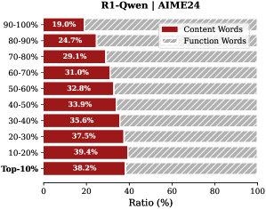
This image displays a horizontal stacked bar chart titled "R1-Qwen | AIME24". It compares the percentage ratio of "Content Words" versus "Function Words" across ten performance percentile categories, from "Top-10%" to "90-100%". The chart illustrates a clear inverse relationship between the two word types across the performance spectrum.
### Components/Axes
* **Chart Title:** "R1-Qwen | AIME24" (located at the top center).
* **Y-Axis (Vertical):** Lists ten performance percentile categories. From bottom to top: "Top-10%", "10-20%", "20-30%", "30-40%", "40-50%", "50-60%", "60-70%", "70-80%", "80-90%", "90-100%".
* **X-Axis (Horizontal):** Labeled "Ratio (%)". The scale runs from 0 to 100, with major tick marks at 0, 20, 40, 60, 80, and 100.
* **Legend:** Positioned in the top-right corner of the chart area.
* A solid red rectangle is labeled "Content Words".
* A gray rectangle with diagonal hatching is labeled "Function Words".
* **Data Bars:** Each category has a single horizontal bar spanning 100% of the width. The bar is divided into two segments:
* The left segment (solid red) represents the "Content Words" ratio.
* The right segment (gray with diagonal hatching) represents the "Function Words" ratio.
* The numerical percentage for the "Content Words" segment is printed inside the red portion of each bar.
### Detailed Analysis
The chart presents the following data points for each category:
| Performance Category | Content Words (%) | Function Words (%) |
| :------------------- | :---------------- | :----------------- |
| Top-10% | 38.2 | 61.8 |
| 10-20% | 39.4 | 60.6 |
| 20-30% | 37.5 | 62.5 |
| 30-40% | 35.6 | 64.4 |
| 40-50% | 33.9 | 66.1 |
| 50-60% | 32.8 | 67.2 |
| 60-70% | 31.0 | 69.0 |
| 70-80% | 29.1 | 70.9 |
| 80-90% | 24.7 | 75.3 |
| 90-100% | 19.0 | 81.0 |
**Trend Verification:**
* **Content Words (Red Bars):** The visual trend shows a consistent decrease in the length of the red segment as you move from the "Top-10%" category at the bottom to the "90-100%" category at the top. The numerical values confirm this downward trend, falling from a high of 39.4% (10-20%) to a low of 19.0% (90-100%).
* **Function Words (Gray Hatched Bars):** The visual trend is the inverse; the gray segment grows longer as you move up the y-axis. The numerical values increase from a low of 60.6% (10-20%) to a high of 81.0% (90-100%).
### Key Observations
1. **Inverse Relationship:** There is a perfect inverse correlation between the ratio of Content Words and Function Words across all categories. As one increases, the other decreases by the same amount, summing to 100%.
2. **Peak Content Word Ratio:** The highest proportion of Content Words (39.4%) is found in the "10-20%" performance bracket, not the absolute "Top-10%".
3. **Steepest Change:** The most significant single drop in Content Word ratio (5.6 percentage points) occurs between the "70-80%" (29.1%) and "80-90%" (24.7%) categories.
4. **Lowest Content Word Ratio:** The "90-100%" category has the lowest Content Word ratio at 19.0%, meaning over four-fifths of the words in this segment are Function Words.
### Interpretation
This chart likely analyzes the linguistic composition of text generated by or associated with the "R1-Qwen" model on the "AIME24" benchmark or dataset, segmented by performance percentiles.
* **What the data suggests:** The data demonstrates that higher-performing segments (especially the top 20%) utilize a significantly higher proportion of "Content Words" (nouns, verbs, adjectives, adverbs that carry semantic meaning) relative to "Function Words" (grammatical words like articles, prepositions, conjunctions). Conversely, the lowest-performing segment ("90-100%") relies heavily on Function Words, with Content Words making up less than a fifth of the total.
* **How elements relate:** The performance percentile (y-axis) is the independent variable, and the word type ratio (x-axis) is the dependent variable. The chart posits that the lexical choice—the balance between meaningful content and grammatical structure—is a strong correlate, and potentially an indicator, of performance quality on this specific task.
* **Notable implications:** This pattern could imply that successful responses are more information-dense and semantically rich. The lower-performing responses may be more verbose, structurally repetitive, or lack substantive content, relying on filler and grammatical scaffolding. The anomaly of the peak being at "10-20%" rather than "Top-10%" might suggest a slight over-correction or a different stylistic approach at the very highest tier of performance.