## Diagram: Healthcare Assessment and Planning Process
### Overview
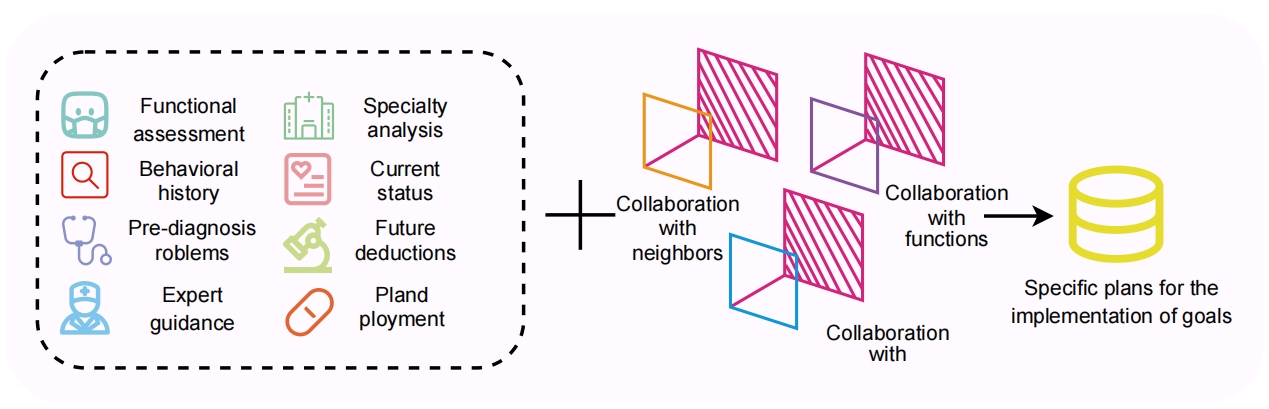
The image is a conceptual diagram illustrating a multi-step process for developing specific implementation plans in a healthcare or clinical context. It shows how various assessment inputs are combined through collaborative processes to generate actionable plans. The diagram flows from left to right, starting with data collection, moving through integration, and ending with output.
### Components/Axes
The diagram is divided into three main spatial regions:
1. **Left Region (Input Data):** A dashed-line box containing eight icon-label pairs arranged in two columns.
2. **Center Region (Integration Process):** A plus sign (`+`) followed by a cluster of overlapping geometric shapes with associated labels.
3. **Right Region (Output):** An arrow pointing to a cylindrical icon with a final label.
### Detailed Analysis
**1. Left Region - Input Data (within dashed box):**
This section lists eight categories of information or assessment inputs. Each is represented by a colored icon and a text label.
* **Column 1 (Left):**
* Icon: Teal robot face. Label: `Functional assessment`
* Icon: Red magnifying glass. Label: `Behavioral history`
* Icon: Blue stethoscope. Label: `Pre-diagnosis roblems` (Note: Likely a typo for "problems").
* Icon: Blue doctor silhouette. Label: `Expert guidance`
* **Column 2 (Right):**
* Icon: Green hospital building. Label: `Specialty analysis`
* Icon: Pink heart with a document. Label: `Current status`
* Icon: Green microscope. Label: `Future deductions`
* Icon: Orange pill. Label: `Pland ployment` (Note: Likely a typo for "Planned placement").
**2. Center Region - Integration Process:**
A large plus sign (`+`) indicates the combination or addition of the left-side inputs to the following collaborative processes.
* **Visual Element:** Three sets of overlapping, outlined geometric shapes (appearing as squares or diamonds). Each set consists of a colored outline (orange, purple, blue) overlapping a pink, diagonally hatched square.
* **Labels (positioned near the shapes):**
* `Collaboration with neighbors` (positioned near the orange-outlined shape).
* `Collaboration with functions` (positioned near the purple-outlined shape).
* `Collaboration with` (positioned near the blue-outlined shape; the label appears incomplete, ending with "with").
**3. Right Region - Output:**
* A black arrow points from the central collaborative cluster to the final element.
* **Visual Element:** A yellow, cylindrical icon resembling a database or storage drum.
* **Label:** `Specific plans for the implementation of goals`
### Key Observations
* **Process Flow:** The diagram explicitly shows a linear, additive workflow: Inputs + Collaboration = Output Plans.
* **Typographical Errors:** Two labels contain apparent typos: "roblems" and "Pland ployment."
* **Incomplete Label:** The label "Collaboration with" is grammatically incomplete, suggesting either a cut-off or an implied object (e.g., "systems," "teams").
* **Visual Metaphor:** The overlapping shapes in the center visually represent the integration and intersection of different collaborative domains. The hatched pink squares may symbolize a common framework or goal that these collaborations act upon.
* **Color Coding:** Icons in the input section use distinct colors (teal, red, blue, green, pink, orange), but these colors do not have a clear, explicit mapping to the colors used in the central collaborative shapes (orange, purple, blue outlines).
### Interpretation
This diagram outlines a structured methodology for generating targeted action plans in a healthcare setting. It suggests that effective implementation plans cannot be created from raw data alone. The process requires a critical intermediate step of **collaboration**.
The eight inputs on the left represent a comprehensive patient or system assessment, covering functional, behavioral, diagnostic, expert, specialty, current, future, and logistical (placement) dimensions. The core argument of the diagram is that these diverse data streams must be synthesized through collaborative engagement with different entities ("neighbors," "functions," and an unspecified third group). This collaborative synthesis is the transformative step that converts assessment information into concrete, goal-oriented plans.
The final output, "Specific plans for the implementation of goals," stored in a database-like cylinder, implies that the end product is a structured, actionable, and likely digital set of instructions or protocols. The diagram advocates for a collaborative, integrative approach to care planning, moving beyond siloed data analysis.