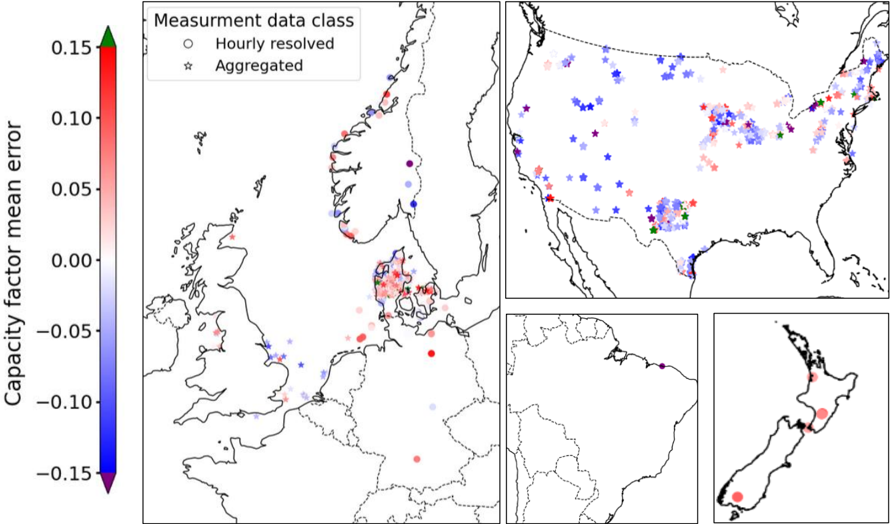
## Composite Map: Capacity Factor Mean Error by Region
### Overview
The image presents a composite map visualization of capacity factor mean error across four regions: Europe, the United States, South America, and New Zealand. Data points are color-coded using a gradient scale from -0.15 (blue) to +0.15 (red), with green at the top. Two data classes are distinguished: "Hourly resolved" (circles) and "Aggregated" (stars). The visualization emphasizes spatial distribution and measurement accuracy variations.
### Components/Axes
1. **Primary Map (Europe)**:
- **Legend**: Located in the top-left corner, with:
- **Color Scale**: Vertical gradient from blue (-0.15) to red (+0.15), labeled "Capacity factor mean error."
- **Data Class Symbols**:
- Circles (blue to red gradient) for "Hourly resolved" data.
- Stars (blue to red gradient) for "Aggregated" data.
- **Markers**:
- Red, blue, and green circles/stars distributed across Europe, with higher density in Northern and Central Europe.
- Notable clusters in Scandinavia (red), UK (blue), and Central Europe (mixed).
2. **Sub-Maps**:
- **USA**:
- Mixed markers (red, blue, green) with higher density in the Midwest and Northeast.
- Aggregated data (stars) dominate in Texas and California.
- **South America**:
- Sparse markers, primarily blue (negative error) in Brazil and Argentina.
- **New Zealand**:
- Two red circles (positive error) in the North Island and one blue circle in the South Island.
3. **Color Scale**:
- Positioned left of the Europe map, with a green arrowhead at the top (0.15) and a purple arrowhead at the bottom (-0.15).
### Detailed Analysis
- **Europe**:
- **Hourly Resolved Data**:
- Red circles (positive error) concentrated in Scandinavia and the UK.
- Blue circles (negative error) in Southern Europe (e.g., Spain, Italy).
- **Aggregated Data**:
- Red stars in Germany and France; blue stars in Eastern Europe.
- **Color Scale Alignment**: Red markers align with the upper end of the scale (+0.10 to +0.15), while blue markers align with the lower end (-0.10 to -0.05).
- **USA**:
- **Hourly Resolved Data**:
- Red circles in the Midwest (e.g., Illinois, Ohio) and blue circles in the Southwest (e.g., Arizona).
- **Aggregated Data**:
- Red stars in Texas and California; blue stars in the Midwest.
- **Notable**: Mixed data types in the Northeast (e.g., New York, Pennsylvania).
- **South America**:
- **Hourly Resolved Data**:
- Blue circles in Brazil and Argentina, indicating negative errors (-0.05 to -0.10).
- **Aggregated Data**:
- No stars present; all markers are circles.
- **New Zealand**:
- **Hourly Resolved Data**:
- Red circles in the North Island (positive error, ~+0.05) and a blue circle in the South Island (-0.05).
### Key Observations
1. **Data Density**: Europe has the highest density of markers, suggesting more granular measurement data.
2. **Error Distribution**:
- Positive errors (+0.05 to +0.15) dominate in Northern Europe and the US Midwest.
- Negative errors (-0.10 to -0.05) are prevalent in Southern Europe, South America, and New Zealand.
3. **Data Class Distribution**:
- Aggregated data (stars) are more common in the US and Europe, while South America relies solely on hourly data.
4. **Outliers**:
- A single red circle in South America (Brazil) deviates from the general negative error trend.
### Interpretation
The visualization highlights regional disparities in capacity factor measurement accuracy:
- **Europe**: High-resolution data (hourly) shows mixed errors, with Northern regions experiencing overestimation (red) and Southern regions underestimation (blue). Aggregated data aligns with these trends but with broader spatial coverage.
- **USA**: Mixed data types suggest varied measurement approaches. The Midwest’s positive errors may reflect grid instability, while the Southwest’s negative errors could indicate underreporting.
- **South America**: Sparse data and consistent negative errors may indicate limited measurement infrastructure or systemic underestimation.
- **New Zealand**: Isolated positive errors in the North Island suggest localized measurement challenges.
The capacity factor mean error range (-0.15 to +0.15) underscores significant variability in renewable energy measurement accuracy, with implications for grid management and policy. The dominance of aggregated data in the US and Europe highlights a preference for coarser resolution, potentially sacrificing granular insights for broader trends.