\n
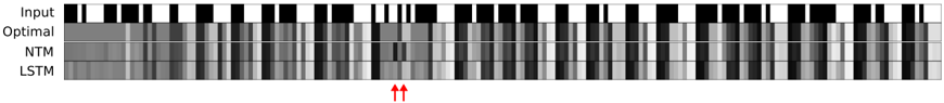
## Heatmap: Sequence Comparison of Input, Optimal, NTM, and LSTM
### Overview
The image is a heatmap-like representation comparing the sequences generated by different models (NTM and LSTM) against an "Optimal" sequence, given a specific "Input" sequence. The sequences are represented as rows, with each column representing a time step or element in the sequence. The color intensity indicates the value or state at each step.
### Components/Axes
* **Rows (from top to bottom):**
* Input: A binary sequence (black and white).
* Optimal: A grayscale sequence.
* NTM: A grayscale sequence generated by a Neural Turing Machine.
* LSTM: A grayscale sequence generated by a Long Short-Term Memory network.
* **Columns:** Represent the sequence elements or time steps. There are approximately 30-40 columns.
* **Color Scale:** Grayscale, where darker shades likely represent higher values or activation.
* **Annotations:** Two red upward-pointing arrows are present near the bottom, indicating a specific point of interest in the LSTM sequence.
### Detailed Analysis
* **Input:** The input sequence consists of alternating black and white bars, indicating a binary input. The pattern is irregular, with varying widths of black and white segments.
* **Optimal:** The "Optimal" sequence shows a more graded response, with varying shades of gray. It appears to follow the general pattern of the input but with smoothed transitions.
* **NTM:** The NTM sequence shows a similar pattern to the "Optimal" sequence, but with some differences in the intensity of the gray shades. In some regions, it closely matches the "Optimal" sequence, while in others, it deviates.
* **LSTM:** The LSTM sequence also attempts to replicate the "Optimal" sequence. The red arrows point to a specific location where the LSTM sequence seems to have a distinct response compared to the other sequences.
### Key Observations
* The "Optimal" sequence serves as a target or ground truth for the NTM and LSTM models.
* Both NTM and LSTM models attempt to approximate the "Optimal" sequence, but with varying degrees of accuracy.
* The red arrows highlight a specific point where the LSTM model's behavior is of particular interest, possibly indicating a point of divergence or error.
### Interpretation
The heatmap visually compares the performance of NTM and LSTM models in generating a sequence that matches a desired "Optimal" sequence, given a specific input. The differences in the grayscale patterns indicate the models' varying abilities to capture the underlying dynamics of the sequence generation task. The red arrows suggest a specific area where the LSTM model's performance warrants further investigation. The image suggests that both NTM and LSTM models can approximate the optimal sequence, but there are differences in their performance, with specific areas where one model might outperform the other. The analysis of these differences can provide insights into the strengths and weaknesses of each model architecture for sequence generation tasks.