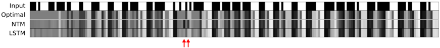
## Heatmap: Model Performance Comparison Across Time Steps
### Overview
The image is a grayscale heatmap comparing the performance of three models (Optimal, NTM, LSTM) against an "Input" baseline across sequential time steps. The visualization uses varying shades of gray to represent performance metrics, with darker shades likely indicating higher values (e.g., accuracy) and lighter shades lower values. Red arrows highlight a critical divergence point between models.
### Components/Axes
- **Y-Axis (Models)**:
- Labels: "Input" (top), "Optimal" (second), "NTM" (third), "LSTM" (bottom).
- Spatial Positioning: Vertically stacked from top to bottom.
- **X-Axis (Time Steps)**:
- Label: "Time Steps" (horizontal axis).
- Scale: Discrete intervals (exact count unspecified, but visually ~20-30 steps).
- **Color Legend**:
- Implied gradient: Black (highest value) → White (lowest value).
- No explicit legend present; interpretation based on visual contrast.
### Detailed Analysis
1. **Input Baseline**:
- Uniform black blocks dominate, suggesting consistent high performance across all time steps.
- No visible degradation over time.
2. **Optimal Model**:
- Dark gray blocks with occasional white streaks.
- Maintains high performance but shows minor deviations from the Input baseline.
3. **NTM Model**:
- Lighter gray blocks with irregular white patches.
- Performance degrades noticeably after ~15 time steps (marked by red arrows).
- Shows periodic "dips" in performance (e.g., ~5, 10, 20 time steps).
4. **LSTM Model**:
- Similar to NTM but with slightly darker shading overall.
- Degradation occurs later (~20 time steps) but with more pronounced white regions.
- Exhibits a distinct "failure zone" near the end of the sequence.
### Key Observations
- **Divergence Point**: At ~15 time steps (red arrows), NTM and LSTM performance drops sharply compared to Optimal and Input.
- **Temporal Trends**:
- All models degrade over time, but Optimal maintains the slowest decline.
- NTM and LSTM exhibit non-linear degradation patterns, with LSTM failing later but more severely.
- **Anomalies**:
- NTM shows a unique "spike" in performance (~10 time steps) before collapsing.
- LSTM has a "plateau" of consistent failure near the end (~25-30 time steps).
### Interpretation
The heatmap demonstrates that:
1. **Optimal Model** balances consistency and adaptability, maintaining near-baseline performance throughout.
2. **NTM and LSTM** struggle with long-term dependencies, with NTM failing earlier but LSTM collapsing more catastrophically.
3. The red arrows emphasize a critical failure threshold where both NTM and LSTM deviate significantly from Optimal, suggesting architectural limitations in handling extended sequences.
4. The Input baseline's uniformity implies the task has inherent simplicity, making model shortcomings more apparent.
This visualization highlights trade-offs between model complexity and temporal robustness, with Optimal serving as a benchmark for ideal performance.