\n
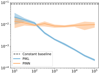
## Line Chart: Error Rate vs. Data Points
### Overview
This image presents a line chart comparing the error rates of three methods – PIKL, PINN, and a Constant Baseline – as a function of the number of data points used. The error rate is plotted on a logarithmic scale (y-axis) against the number of data points on a logarithmic scale (x-axis). Each method's performance is represented by a line with a shaded area indicating the uncertainty or variance around the mean.
### Components/Axes
* **X-axis:** Labeled "Data Points", with a logarithmic scale ranging from 10¹ to 10⁵. Tick marks are visible at 10¹, 10², 10³, 10⁴, and 10⁵.
* **Y-axis:** Labeled "Error Rate", with a logarithmic scale ranging from 10⁻⁴ to 10⁻¹. Tick marks are visible at 10⁻⁴, 10⁻³, 10⁻², and 10⁻¹.
* **Legend:** Located in the bottom-left corner. It contains the following entries:
* "Constant baseline" – represented by a dashed black line.
* "PIKL" – represented by a solid blue line.
* "PINN" – represented by a solid orange line.
### Detailed Analysis
* **Constant Baseline:** The dashed black line is horizontal and represents a constant error rate of approximately 0.1 (10⁻¹).
* **PIKL (Blue Line):** The blue line starts at approximately 0.03 (3 x 10⁻²) at x = 10¹ and slopes downward, decreasing rapidly. At x = 10², the error rate is approximately 0.01 (1 x 10⁻²). The line continues to decrease, reaching approximately 0.0003 (3 x 10⁻⁴) at x = 10⁵. The shaded area around the line indicates a relatively small uncertainty, especially at higher data point values.
* **PINN (Orange Line):** The orange line starts at approximately 0.04 (4 x 10⁻²) at x = 10¹ and initially increases slightly, reaching a peak around x = 10². After x = 10², the line plateaus and remains relatively constant, fluctuating between approximately 0.01 (1 x 10⁻²) and 0.02 (2 x 10⁻²). The shaded area around the line is larger than that of PIKL, indicating greater uncertainty.
### Key Observations
* PIKL consistently outperforms the Constant Baseline and PINN across all data point values.
* PINN's error rate does not decrease significantly with increasing data points, suggesting it may be limited by its method.
* The Constant Baseline provides a fixed error rate, serving as a reference point for evaluating the performance of the other methods.
* The uncertainty around PINN is significantly higher than that of PIKL, indicating greater variability in its performance.
### Interpretation
The chart demonstrates that the PIKL method is significantly more effective at reducing error rates as the number of data points increases compared to PINN. PINN appears to reach a performance plateau, while PIKL continues to improve. The Constant Baseline serves as a benchmark, and both PIKL and PINN outperform it. The smaller uncertainty around PIKL suggests it is a more reliable method.
This data suggests that PIKL is a more scalable and robust approach for this particular problem, as its performance improves with more data. PINN, while initially comparable, does not benefit from increased data and exhibits greater variability. The logarithmic scales on both axes emphasize the substantial reduction in error rate achieved by PIKL, particularly as the number of data points grows. The consistent performance of the Constant Baseline highlights the value of the improvements offered by PIKL and PINN.