## Line Chart: Accuracy vs. Sample Size (k)
### Overview
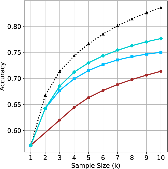
This image displays a line chart illustrating the relationship between "Accuracy" (Y-axis) and "Sample Size (k)" (X-axis). The chart tracks four distinct data series, each represented by a different color and marker style. All four series originate from a single point at the minimum sample size and diverge as the sample size increases.
### Components/Axes
* **X-Axis:** Labeled "Sample Size (k)". The scale is linear, ranging from 1 to 10, with integer markers.
* **Y-Axis:** Labeled "Accuracy". The scale ranges from 0.60 to 0.80, with grid lines indicating increments of 0.05.
* **Data Series (Legend is absent):**
* **Series 1 (Top):** Black dotted line with triangle markers.
* **Series 2 (Upper-Middle):** Teal/Cyan solid line with diamond markers.
* **Series 3 (Lower-Middle):** Light blue solid line with square markers.
* **Series 4 (Bottom):** Dark red/brown solid line with circle markers.
### Detailed Analysis
**Trend Verification:** All four data series exhibit a positive, logarithmic-style trend. The rate of accuracy increase is steepest between $k=1$ and $k=3$, after which the slope gradually flattens, indicating diminishing returns as the sample size increases.
**Data Point Extraction (Approximate Values):**
| Sample Size (k) | Black (Triangle) | Teal (Diamond) | Light Blue (Square) | Red (Circle) |
| :--- | :--- | :--- | :--- | :--- |
| **1** | ~0.57 | ~0.57 | ~0.57 | ~0.57 |
| **2** | ~0.67 | ~0.64 | ~0.64 | ~0.60 |
| **3** | ~0.71 | ~0.69 | ~0.68 | ~0.62 |
| **4** | ~0.74 | ~0.71 | ~0.70 | ~0.64 |
| **5** | ~0.77 | ~0.73 | ~0.72 | ~0.66 |
| **6** | ~0.79 | ~0.74 | ~0.73 | ~0.68 |
| **7** | ~0.80 | ~0.75 | ~0.74 | ~0.69 |
| **8** | ~0.81 | ~0.76 | ~0.74 | ~0.70 |
| **9** | ~0.82 | ~0.77 | ~0.75 | ~0.71 |
| **10** | ~0.84 | ~0.78 | ~0.75 | ~0.71 |
### Key Observations
* **Convergence at Origin:** All four models/methods perform identically at $k=1$ (Accuracy $\approx$ 0.57).
* **Divergence:** As the sample size increases, the performance gap between the models widens significantly.
* **Performance Hierarchy:** The Black (Triangle) series is the most accurate throughout the range $k > 1$. The Red (Circle) series is consistently the least accurate.
* **Diminishing Returns:** The "elbow" of the curves occurs around $k=3$ or $k=4$. Beyond this point, adding more samples yields smaller incremental gains in accuracy for all series.
### Interpretation
This chart likely represents a performance comparison of four different machine learning models or algorithms evaluated against increasing amounts of training data (or "shots" in a few-shot learning context).
* **Model Efficiency:** The Black (Triangle) model is the most efficient, scaling best with increased data. The Red (Circle) model appears to be the least robust, struggling to capitalize on the additional data provided.
* **Missing Context:** The absence of a legend is a critical omission. Without it, we cannot determine if these lines represent different algorithms, different hyperparameter settings, or different data preprocessing techniques.
* **Saturation:** The flattening of the curves suggests that all models are approaching a performance ceiling. For the Red (Circle) model, this ceiling appears to be reached or approached much earlier than for the Black (Triangle) model.
* **Strategic Insight:** If this were a resource allocation problem, one might conclude that for the Red model, increasing the sample size beyond $k=6$ or $k=7$ provides negligible benefit, whereas the Black model continues to show meaningful improvement even at $k=10$.