## Line Chart: Accuracy vs. Sample Size
### Overview
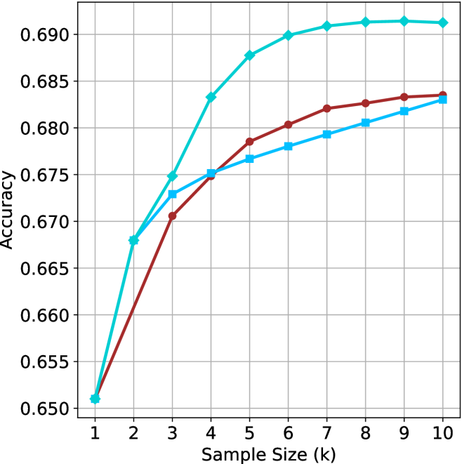
The image is a line chart comparing the accuracy of three different methods as a function of sample size. The x-axis represents the sample size (k), ranging from 1 to 10. The y-axis represents the accuracy, ranging from 0.650 to 0.690. Three lines, each representing a different method, are plotted on the chart.
### Components/Axes
* **X-axis:** Sample Size (k), with tick marks at each integer value from 1 to 10.
* **Y-axis:** Accuracy, with tick marks at 0.650, 0.655, 0.660, 0.665, 0.670, 0.675, 0.680, 0.685, and 0.690.
* **Data Series:** Three data series are plotted on the chart, each represented by a different color and marker. The legend is missing, so the exact identity of each line is unknown.
* **Cyan line with diamond markers:** This line starts at approximately (1, 0.651) and increases rapidly until approximately (5, 0.688), then plateaus around 0.691.
* **Brown line with circle markers:** This line starts at approximately (1, 0.651) and increases steadily until approximately (8, 0.683), then plateaus around 0.684.
* **Light Blue line with square markers:** This line starts at approximately (1, 0.651) and increases steadily until approximately (10, 0.683).
### Detailed Analysis
* **Cyan line with diamond markers:**
* (1, 0.651)
* (2, 0.668)
* (3, 0.674)
* (4, 0.683)
* (5, 0.688)
* (6, 0.690)
* (7, 0.691)
* (8, 0.691)
* (9, 0.691)
* (10, 0.691)
* **Brown line with circle markers:**
* (1, 0.651)
* (2, 0.661)
* (3, 0.671)
* (4, 0.675)
* (5, 0.679)
* (6, 0.681)
* (7, 0.682)
* (8, 0.683)
* (9, 0.683)
* (10, 0.684)
* **Light Blue line with square markers:**
* (1, 0.651)
* (2, 0.671)
* (3, 0.673)
* (4, 0.676)
* (5, 0.677)
* (6, 0.679)
* (7, 0.680)
* (8, 0.681)
* (9, 0.682)
* (10, 0.683)
### Key Observations
* All three methods start with the same accuracy at a sample size of 1.
* The cyan line (with diamond markers) shows the most rapid increase in accuracy initially, but plateaus at a sample size of around 5.
* The brown line (with circle markers) increases steadily and plateaus at a sample size of around 8.
* The light blue line (with square markers) increases steadily and does not appear to have fully plateaued by a sample size of 10.
* The cyan line achieves the highest accuracy overall.
### Interpretation
The chart compares the accuracy of three different methods as a function of sample size. The cyan line (with diamond markers) appears to be the most effective method, achieving the highest accuracy with a smaller sample size. The other two methods (brown and light blue lines) show a more gradual increase in accuracy as the sample size increases. The data suggests that the cyan method may be more efficient for achieving high accuracy, while the other two methods may require larger sample sizes to reach similar levels of performance. The absence of a legend makes it impossible to determine what methods are being compared.