## Line Chart: Accuracy vs. Sample Size (k)
### Overview
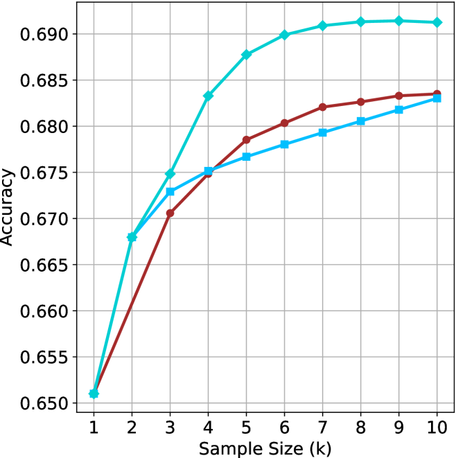
This image displays a line chart illustrating the relationship between "Sample Size (k)" and "Accuracy." The chart features three distinct data series, each represented by a different color and marker shape. All three series originate from the same starting point at a sample size of 1. Notably, the chart lacks a legend, making it impossible to identify the specific models or methods associated with each line without external context.
### Components/Axes
* **Y-Axis:** Labeled "Accuracy." The scale ranges from 0.650 to 0.690, with major grid lines at intervals of 0.005.
* **X-Axis:** Labeled "Sample Size (k)." The scale ranges from 1 to 10, with integer markers.
* **Data Series (Visual Identification):**
* **Series A (Cyan/Light Blue):** Line with diamond-shaped markers.
* **Series B (Maroon/Dark Red):** Line with circular markers.
* **Series C (Blue/Medium Blue):** Line with square-shaped markers.
### Detailed Analysis
All three series begin at the coordinate (1, 0.651). The trends diverge significantly as the sample size increases.
| Sample Size (k) | Series A (Cyan/Diamond) | Series B (Maroon/Circle) | Series C (Blue/Square) |
| :--- | :--- | :--- | :--- |
| 1 | ~0.651 | ~0.651 | ~0.651 |
| 2 | ~0.668 | ~0.660 | ~0.668 |
| 3 | ~0.675 | ~0.671 | ~0.673 |
| 4 | ~0.683 | ~0.675 | ~0.675 |
| 5 | ~0.688 | ~0.6785 | ~0.6765 |
| 6 | ~0.690 | ~0.6805 | ~0.678 |
| 7 | ~0.691 | ~0.682 | ~0.679 |
| 8 | ~0.6915 | ~0.6825 | ~0.6805 |
| 9 | ~0.6915 | ~0.683 | ~0.682 |
| 10 | ~0.691 | ~0.6835 | ~0.683 |
* **Series A (Cyan/Diamond) Trend:** Exhibits the steepest initial growth. It rises sharply until k=4, then continues to climb at a slower rate, reaching a plateau around k=6 to k=7, where it stabilizes near 0.691.
* **Series B (Maroon/Circle) Trend:** Shows a steady, consistent upward slope throughout the entire range. It does not show the same sharp plateauing effect as the Cyan line.
* **Series C (Blue/Square) Trend:** Shows a steady, slightly shallower upward slope compared to the Maroon line. It tracks closely with the Cyan line initially but falls behind after k=2.
### Key Observations
* **Convergence:** All three models perform identically at the minimum sample size (k=1).
* **Performance Leader:** The Cyan/Diamond series is the clear top performer across the entire range from k=2 to k=10.
* **Crossover Points:**
* The Cyan line and Blue line start together, but the Cyan line pulls ahead immediately after k=1.
* The Maroon line starts lower than the Blue line at k=2, but crosses over the Blue line between k=3 and k=4, eventually ending with slightly higher accuracy than the Blue line at k=10.
* **Diminishing Returns:** The Cyan line exhibits clear signs of saturation (diminishing returns) after k=6, as the accuracy gains become negligible.
### Interpretation
This chart is characteristic of a machine learning performance evaluation, likely comparing different model architectures or training strategies under varying data constraints (few-shot learning).
* **Data Efficiency:** The Cyan/Diamond model is the most data-efficient, achieving higher accuracy with fewer samples.
* **Saturation Point:** The plateauing of the Cyan line suggests that for this specific model, increasing the sample size beyond k=6 provides minimal benefit, indicating that the model has likely reached its performance ceiling for this task or dataset.
* **Missing Context:** The absence of a legend is a critical omission. Without it, one cannot determine if these lines represent different algorithms, different hyperparameter settings, or different data augmentation techniques.
* **Comparative Dynamics:** The fact that the Maroon line (Circle) eventually overtakes the Blue line (Square) suggests that the Maroon model may have a slower learning rate or requires more data to "warm up," but ultimately scales better than the Blue model as sample size increases.