## Line Chart: Accuracy vs. Sample Size
### Overview
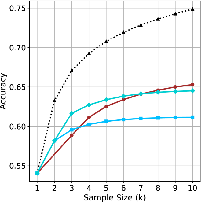
The image is a line chart illustrating the relationship between "Sample Size (k)" and "Accuracy." The chart contains four distinct data series, each represented by a unique color and marker shape. All four series originate from a common starting point at a sample size of 1. Notably, the chart lacks a legend, making it impossible to identify the specific models or methods associated with each line without external context.
### Components/Axes
* **X-Axis:** Labeled "Sample Size (k)". The scale is linear, ranging from 1 to 10 in integer increments.
* **Y-Axis:** Labeled "Accuracy". The scale ranges from 0.55 to 0.75, with grid lines provided at 0.05 intervals.
* **Data Series (4 total):**
* **Series A (Black, dotted line, triangle markers):** Positioned at the top of the chart.
* **Series B (Dark Red, solid line, circle markers):** Positioned in the middle-to-lower section.
* **Series C (Cyan/Teal, solid line, diamond markers):** Positioned in the middle section.
* **Series D (Light Blue, solid line, square markers):** Positioned at the bottom section.
### Detailed Analysis
All four series begin at approximately (1, 0.54).
**1. Series A (Black, Dotted, Triangles)**
* **Trend:** This series exhibits the steepest upward trajectory and maintains the highest accuracy throughout the range. It shows a concave-down curve, indicating diminishing returns, but it does not plateau as sharply as the other series.
* **Data Points:**
* k=2: ~0.635
* k=4: ~0.69
* k=6: ~0.72
* k=8: ~0.735
* k=10: ~0.75
**2. Series B (Dark Red, Solid, Circles)**
* **Trend:** This series shows a steady, consistent upward slope. It starts near the bottom but maintains a more constant growth rate compared to the blue series, eventually overtaking the Cyan/Diamond series.
* **Data Points:**
* k=2: ~0.565
* k=4: ~0.61
* k=6: ~0.635
* k=8: ~0.645
* k=10: ~0.65
**3. Series C (Cyan/Teal, Solid, Diamonds)**
* **Trend:** This series rises sharply between k=1 and k=3, then begins to flatten significantly. It crosses the Dark Red line around k=6.5, after which it is outperformed by the Dark Red line.
* **Data Points:**
* k=2: ~0.58
* k=3: ~0.615
* k=4: ~0.625
* k=6: ~0.635
* k=10: ~0.645
**4. Series D (Light Blue, Solid, Squares)**
* **Trend:** This series shows the least improvement as sample size increases. It rises quickly between k=1 and k=2, then plateaus almost immediately, showing very little gain after k=4.
* **Data Points:**
* k=2: ~0.58
* k=3: ~0.595
* k=4: ~0.60
* k=6: ~0.61
* k=10: ~0.61
### Key Observations
* **Common Origin:** All four methods perform identically at the smallest sample size (k=1).
* **Performance Gap:** The Black Dotted series is significantly superior to the other three, achieving an accuracy of 0.75 at k=10, compared to the ~0.61–0.65 range of the others.
* **Saturation Points:** The two blue-toned lines (Cyan/Diamond and Light Blue/Square) exhibit clear saturation, where increasing the sample size beyond k=4 yields negligible accuracy improvements.
* **Crossover:** The Dark Red/Circle line is the only one that maintains a steady growth trajectory, eventually surpassing the Cyan/Diamond line.
### Interpretation
This chart is characteristic of machine learning model evaluation, likely comparing different algorithms or hyperparameter configurations (e.g., k-Nearest Neighbors, few-shot learning, or data augmentation techniques).
* **The "Black Dotted" method** is clearly the most robust, suggesting it either utilizes more information effectively or is a fundamentally superior architecture.
* **The "Blue" methods** appear to be limited by their architecture or data usage; they reach a "performance ceiling" very early (k=4).