## Scatter Plot: Accuracy vs. Time-to-Answer
### Overview
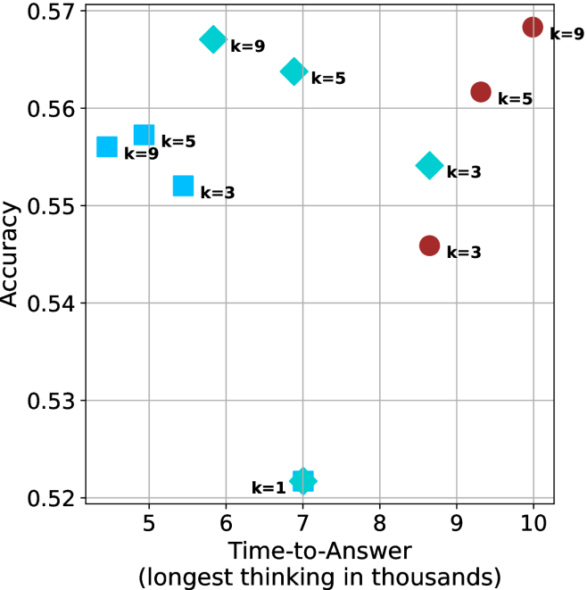
The image is a scatter plot showing the relationship between "Accuracy" and "Time-to-Answer" for different values of 'k'. The plot contains two distinct data series, represented by cyan and brown markers, with each point labeled with its corresponding 'k' value.
### Components/Axes
* **X-axis:** "Time-to-Answer (longest thinking in thousands)". The axis ranges from 5 to 10, with gridlines at each integer value.
* **Y-axis:** "Accuracy". The axis ranges from 0.52 to 0.57, with gridlines at intervals of 0.01.
* **Data Series:** Two data series are plotted:
* Cyan markers (squares, diamonds, and a star)
* Brown markers (circles)
* **Labels:** Each data point is labeled with "k=[value]", where [value] is the specific k-value for that point. The k-values are 1, 3, 5, and 9.
### Detailed Analysis
**Cyan Data Series:**
* **k=1:** Located at approximately (7, 0.52). The marker is a star.
* **k=3:** Located at approximately (5.5, 0.55). The marker is a square.
* **k=5:** Two points:
* Located at approximately (5.2, 0.56). The marker is a square.
* Located at approximately (7.5, 0.565). The marker is a diamond.
* **k=9:** Two points:
* Located at approximately (5, 0.555). The marker is a square.
* Located at approximately (7.2, 0.57). The marker is a diamond.
**Brown Data Series:**
* **k=3:** Located at approximately (8.5, 0.545). The marker is a circle.
* **k=5:** Located at approximately (9, 0.56). The marker is a circle.
* **k=9:** Located at approximately (10, 0.57). The marker is a circle.
### Key Observations
* For the cyan data series, there are multiple points for k=5 and k=9.
* The brown data series shows a clear upward trend: as Time-to-Answer increases, Accuracy also increases.
* The cyan data series does not show a clear trend.
### Interpretation
The scatter plot visualizes the relationship between the time taken to answer and the accuracy achieved, for different values of the parameter 'k'. The two data series (cyan and brown) likely represent different methods or configurations.
The brown data series suggests that increasing the "Time-to-Answer" (or "longest thinking") generally leads to higher accuracy. This could indicate that allowing more processing time results in better performance for that particular method.
The cyan data series is more complex. The multiple points for k=5 and k=9 suggest that there might be other factors influencing the accuracy besides just the 'k' value and "Time-to-Answer". The lack of a clear trend indicates that the relationship between these variables is not straightforward for this method. The different shapes (square, diamond, star) for the cyan data series may represent different sub-categories or experimental conditions, but this is not explicitly stated in the image.