## Scatter Plot: Accuracy vs. EOdd
### Overview
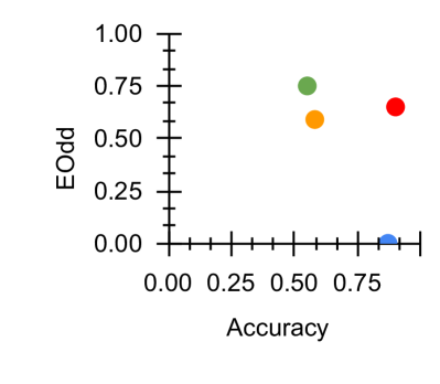
The image is a scatter plot showing the relationship between "Accuracy" on the x-axis and "EOdd" on the y-axis. There are four data points, each represented by a colored circle: blue, red, green, and orange. The plot appears to show the distribution of these points in a two-dimensional space defined by accuracy and EOdd values.
### Components/Axes
* **X-axis:** "Accuracy", ranging from 0.00 to approximately 0.85. Axis markers are present at 0.00, 0.25, 0.50, and 0.75.
* **Y-axis:** "EOdd", ranging from 0.00 to 1.00. Axis markers are present at 0.00, 0.25, 0.50, 0.75, and 1.00.
* **Data Points:** Four colored data points are present: blue, red, green, and orange. There is no legend provided.
### Detailed Analysis
* **Blue Data Point:** Located at approximately (0.80, 0.02).
* **Red Data Point:** Located at approximately (0.82, 0.68).
* **Green Data Point:** Located at approximately (0.55, 0.75).
* **Orange Data Point:** Located at approximately (0.55, 0.60).
### Key Observations
* The blue data point has high accuracy but very low EOdd.
* The red data point has high accuracy and a moderate EOdd.
* The green and orange data points have similar accuracy but different EOdd values.
### Interpretation
The scatter plot visualizes the relationship between accuracy and EOdd for four different entities (represented by the colored points). The plot suggests that high accuracy does not necessarily imply a high EOdd, as seen with the blue data point. The spread of the points indicates a varying trade-off between accuracy and EOdd. Without a legend, it's impossible to know what each color represents, but the plot allows for a comparison of their relative performance in terms of these two metrics.