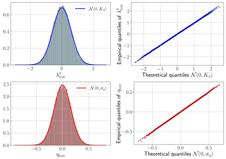
## Chart Type: Distribution and Quantile-Quantile (Q-Q) Plots
### Overview
The image presents four plots arranged in a 2x2 grid. The top-left and bottom-left plots are histograms overlaid with normal distribution curves. The top-right and bottom-right plots are quantile-quantile (Q-Q) plots, comparing empirical quantiles against theoretical quantiles from normal distributions.
### Components/Axes
**Top-Left Plot:**
* **Type:** Histogram with overlaid normal distribution curve
* **X-axis:** λ⁰test, ranging from approximately -2 to 2.
* **Y-axis:** Implicitly represents frequency or density, ranging from 0.0 to 0.6.
* **Curve:** Blue curve labeled "N(0, Kd)", representing a normal distribution with mean 0 and standard deviation Kd.
* **Bars:** Gray bars representing the histogram of the data.
**Top-Right Plot:**
* **Type:** Quantile-Quantile (Q-Q) plot
* **X-axis:** Theoretical quantiles N(0, Kd), ranging from approximately -2 to 2.
* **Y-axis:** Empirical quantiles of λ⁰test, ranging from approximately -2 to 2.
* **Data Points:** Blue dots representing the quantiles.
**Bottom-Left Plot:**
* **Type:** Histogram with overlaid normal distribution curve
* **X-axis:** ηtest, ranging from approximately -0.5 to 0.5.
* **Y-axis:** Implicitly represents frequency or density, ranging from 0.0 to 2.5.
* **Curve:** Red curve labeled "N(0, ση)", representing a normal distribution with mean 0 and standard deviation ση.
* **Bars:** Red bars representing the histogram of the data.
**Bottom-Right Plot:**
* **Type:** Quantile-Quantile (Q-Q) plot
* **X-axis:** Theoretical quantiles N(0, ση), ranging from approximately -0.5 to 0.5.
* **Y-axis:** Empirical quantiles of ηtest, ranging from approximately -0.5 to 0.5.
* **Data Points:** Red dots representing the quantiles.
* **Reference Line:** Dashed black line representing y=x.
### Detailed Analysis
**Top-Left Plot (λ⁰test Distribution):**
* The histogram shows a distribution centered around 0.
* The blue curve "N(0, Kd)" closely fits the histogram, suggesting the data is approximately normally distributed with a mean of 0.
* The peak of the distribution is around 0.6 on the y-axis.
**Top-Right Plot (λ⁰test Q-Q Plot):**
* The blue dots closely follow a straight line, indicating that the empirical distribution of λ⁰test is close to a normal distribution.
* There is a slight deviation from the line at the extreme tails.
**Bottom-Left Plot (ηtest Distribution):**
* The histogram shows a distribution centered around 0.
* The red curve "N(0, ση)" closely fits the histogram, suggesting the data is approximately normally distributed with a mean of 0.
* The peak of the distribution is around 2.5 on the y-axis.
**Bottom-Right Plot (ηtest Q-Q Plot):**
* The red dots closely follow the dashed black line, indicating that the empirical distribution of ηtest is close to a normal distribution.
* There is a slight deviation from the line at the extreme tails.
### Key Observations
* Both λ⁰test and ηtest appear to be approximately normally distributed with a mean of 0.
* The Q-Q plots confirm the normality, with minor deviations at the tails.
* The distribution of ηtest has a higher peak (2.5) than the distribution of λ⁰test (0.6), indicating a smaller standard deviation.
### Interpretation
The plots suggest that both λ⁰test and ηtest are well-modeled by normal distributions with a mean of 0. The Q-Q plots provide a visual assessment of how well the empirical distributions match the theoretical normal distributions. The close alignment of the points with the straight line in the Q-Q plots indicates a good fit, with only slight deviations at the extreme quantiles. This suggests that the assumption of normality is reasonable for these datasets. The difference in peak heights between the two distributions indicates that ηtest has a smaller standard deviation than λ⁰test.