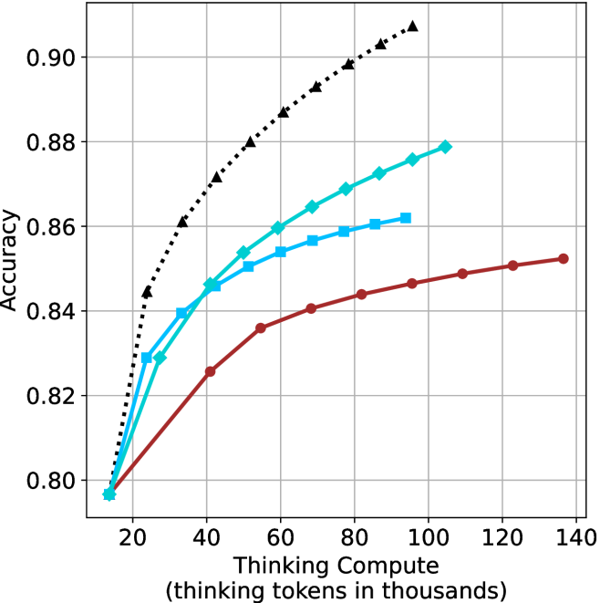
## Line Chart: Accuracy vs. Thinking Compute
### Overview
The image is a line chart plotting model accuracy against computational effort, measured in "thinking tokens." It compares the performance of four distinct models or methods, each represented by a unique line style and color. The chart demonstrates how accuracy improves as more computational resources (thinking tokens) are allocated, with all models showing diminishing returns.
### Components/Axes
* **Y-Axis (Vertical):** Labeled **"Accuracy"**. The scale ranges from **0.80 to 0.90**, with major gridlines at intervals of 0.02 (0.80, 0.82, 0.84, 0.86, 0.88, 0.90).
* **X-Axis (Horizontal):** Labeled **"Thinking Compute (thinking tokens in thousands)"**. The scale ranges from **20 to 140**, with major gridlines at intervals of 20 (20, 40, 60, 80, 100, 120, 140).
* **Legend:** Positioned in the **top-left corner** of the chart area. It contains four entries:
1. **Black dotted line with upward-pointing triangle markers (▲)**
2. **Cyan solid line with diamond markers (◆)**
3. **Light blue solid line with square markers (■)**
4. **Red solid line with circle markers (●)**
* **Grid:** A light gray grid is present, aiding in value estimation.
### Detailed Analysis
The chart displays four data series, each showing a positive, concave-down trend (increasing at a decreasing rate).
1. **Black Dotted Line (▲):**
* **Trend:** This line exhibits the steepest initial slope and achieves the highest overall accuracy. It shows the most significant gains from increased compute.
* **Approximate Data Points:**
* At ~15k tokens: Accuracy ≈ 0.797
* At ~25k tokens: Accuracy ≈ 0.844
* At ~40k tokens: Accuracy ≈ 0.862
* At ~60k tokens: Accuracy ≈ 0.880
* At ~80k tokens: Accuracy ≈ 0.898
* At ~95k tokens: Accuracy ≈ 0.907 (highest point on the chart)
2. **Cyan Line (◆):**
* **Trend:** This line has the second-steepest slope, consistently performing below the black line but above the others.
* **Approximate Data Points:**
* At ~15k tokens: Accuracy ≈ 0.797 (similar starting point to others)
* At ~25k tokens: Accuracy ≈ 0.829
* At ~40k tokens: Accuracy ≈ 0.846
* At ~60k tokens: Accuracy ≈ 0.860
* At ~80k tokens: Accuracy ≈ 0.869
* At ~105k tokens: Accuracy ≈ 0.879
3. **Light Blue Line (■):**
* **Trend:** This line follows a path very close to the cyan line initially but begins to plateau earlier and at a lower accuracy level.
* **Approximate Data Points:**
* At ~15k tokens: Accuracy ≈ 0.797
* At ~25k tokens: Accuracy ≈ 0.829
* At ~40k tokens: Accuracy ≈ 0.846
* At ~60k tokens: Accuracy ≈ 0.854
* At ~80k tokens: Accuracy ≈ 0.859
* At ~95k tokens: Accuracy ≈ 0.862
4. **Red Line (●):**
* **Trend:** This line has the shallowest slope, indicating the least accuracy gain per unit of additional compute. It plateaus at the lowest accuracy level.
* **Approximate Data Points:**
* At ~15k tokens: Accuracy ≈ 0.797
* At ~40k tokens: Accuracy ≈ 0.825
* At ~60k tokens: Accuracy ≈ 0.836
* At ~80k tokens: Accuracy ≈ 0.844
* At ~100k tokens: Accuracy ≈ 0.846
* At ~135k tokens: Accuracy ≈ 0.852
### Key Observations
1. **Performance Hierarchy:** A clear and consistent performance hierarchy is established across nearly the entire compute range: Black (▲) > Cyan (◆) > Light Blue (■) > Red (●).
2. **Diminishing Returns:** All four models exhibit diminishing returns; the accuracy gain from each additional thousand tokens decreases as total compute increases.
3. **Convergence at Low Compute:** At the lowest compute level shown (~15k tokens), all four models start at approximately the same accuracy (~0.797).
4. **Divergence with Scale:** As compute increases, the models diverge significantly. The gap between the best (Black) and worst (Red) performing models widens from near-zero at 15k tokens to over 0.05 accuracy points at 100k tokens.
5. **Plateau Points:** The Light Blue (■) and Red (●) lines show clearer signs of plateauing (flattening) within the displayed range compared to the Black (▲) and Cyan (◆) lines, which are still rising more noticeably at their rightmost data points.
### Interpretation
This chart illustrates a fundamental trade-off in machine learning and AI: the relationship between computational cost ("thinking compute") and model performance ("accuracy").
* **Efficiency Comparison:** The black-dotted method is the most "compute-efficient," achieving superior accuracy at every comparable level of compute beyond the starting point. The red method is the least efficient.
* **Strategic Implications:** The data suggests that for applications where high accuracy is critical, investing in the method represented by the black line yields the best returns, despite potentially higher inherent costs. For resource-constrained environments, one might choose the cyan or light blue methods as a balance, accepting lower peak accuracy for potentially lower operational costs.
* **Underlying Phenomenon:** The concave-down shape of all curves is characteristic of many scaling laws in AI, where performance improves predictably with scale but eventually saturates. The different curves likely represent different model architectures, training techniques, or algorithms, with the black-dotted line embodying a more advanced or optimized approach.
* **Investigative Insight:** The fact that all models start at the same accuracy suggests they may share a common base or were evaluated on the same initial, low-compute task. Their divergence reveals how their underlying designs respond differently to the allocation of greater computational resources for "thinking." The chart doesn't show the absolute maximum possible accuracy (the ceiling), only the trajectory of these four specific approaches.