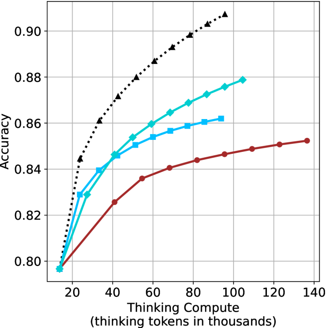
## Line Chart: Accuracy vs. Thinking Compute
### Overview
The image is a line chart comparing the accuracy of different models as a function of "Thinking Compute" (measured in thousands of thinking tokens). There are three distinct lines, each representing a different model, with accuracy increasing as thinking compute increases.
### Components/Axes
* **X-axis:** "Thinking Compute (thinking tokens in thousands)". The scale ranges from approximately 15 to 140, with gridlines at intervals of 20.
* **Y-axis:** "Accuracy". The scale ranges from 0.80 to 0.90, with gridlines at intervals of 0.02.
* **Data Series:** There are three data series represented by lines of different colors and markers:
* **Black dotted line with triangle markers:** This line shows the highest accuracy for a given thinking compute value.
* **Teal line with diamond markers:** This line shows intermediate accuracy.
* **Brown line with circle markers:** This line shows the lowest accuracy.
### Detailed Analysis
* **Black dotted line (triangle markers):** This line starts at approximately (15, 0.80) and increases rapidly, reaching approximately (40, 0.87), then continues to increase at a slower rate, reaching approximately (100, 0.90) and (140, 0.915).
* **Teal line (diamond markers):** This line starts at approximately (15, 0.795) and increases, reaching approximately (40, 0.85), then continues to increase at a slower rate, reaching approximately (80, 0.87) and (100, 0.878).
* **Brown line (circle markers):** This line starts at approximately (15, 0.795) and increases, reaching approximately (40, 0.825), then continues to increase at a slower rate, reaching approximately (80, 0.85), (120, 0.852) and (140, 0.854).
### Key Observations
* All three models show an increase in accuracy as the thinking compute increases.
* The black dotted line (triangle markers) consistently outperforms the other two models.
* The rate of increase in accuracy decreases as the thinking compute increases for all three models.
* The brown line (circle markers) shows the least improvement in accuracy as thinking compute increases.
### Interpretation
The chart demonstrates the relationship between "Thinking Compute" and the accuracy of different models. The data suggests that increasing the thinking compute generally leads to higher accuracy, but the marginal gains diminish as the compute increases. The black dotted line (triangle markers) represents the most efficient model, achieving the highest accuracy with the least amount of thinking compute. The other two models show lower accuracy and diminishing returns as the thinking compute increases. The chart highlights the trade-off between computational cost and model performance, suggesting that there is a point of diminishing returns where increasing the thinking compute provides minimal improvement in accuracy.