## Line Chart: Accuracy vs. Thinking Compute
### Overview
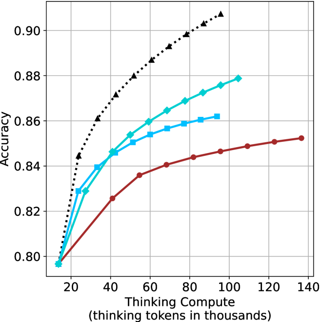
This chart illustrates the relationship between "Thinking Compute" (measured in thousands of thinking tokens) and model "Accuracy." It displays four distinct data series, each representing a different model or configuration. The chart demonstrates that increasing the amount of "thinking" compute generally leads to higher accuracy, though all series exhibit diminishing returns as compute increases.
### Components/Axes
* **Y-Axis:** Labeled "Accuracy." The scale ranges from 0.80 to 0.90, with major grid lines at 0.02 intervals.
* **X-Axis:** Labeled "Thinking Compute (thinking tokens in thousands)." The scale ranges from 20 to 140, with major grid lines at 20-unit intervals.
* **Data Series (Legend inferred by visual markers):**
* **Black Dotted Line (Triangle markers):** The highest-performing series.
* **Cyan Solid Line (Diamond markers):** The second-highest performing series.
* **Blue Solid Line (Square markers):** The third-highest performing series.
* **Dark Red Solid Line (Circle markers):** The lowest-performing series.
### Detailed Analysis
The chart displays four distinct curves, all of which exhibit a positive correlation between compute and accuracy.
**Trend Verification:**
All four lines slope upward from left to right, indicating that additional thinking tokens improve accuracy. The slope of each line decreases as it moves to the right, indicating a concave shape characteristic of diminishing returns.
**Data Point Extraction (Approximate Values):**
* **Black Dotted Line (Triangles):**
* Starts at approximately (15k, 0.845).
* Ends at approximately (105k, 0.908).
* *Trend:* This series maintains the highest accuracy across the entire range and shows the steepest initial improvement.
* **Cyan Solid Line (Diamonds):**
* Starts at approximately (15k, 0.797).
* Ends at approximately (105k, 0.879).
* *Trend:* This series shows strong performance, consistently outperforming the blue and red lines.
* **Blue Solid Line (Squares):**
* Starts at approximately (15k, 0.797).
* Ends at approximately (95k, 0.862).
* *Trend:* This series tracks closely with the cyan line initially but plateaus earlier and at a lower accuracy level.
* **Dark Red Solid Line (Circles):**
* Starts at approximately (15k, 0.797).
* Ends at approximately (135k, 0.853).
* *Trend:* This series has the shallowest slope, indicating it requires significantly more compute to achieve incremental gains in accuracy compared to the other models.
### Key Observations
* **Common Baseline:** Three of the four models (Cyan, Blue, Red) appear to start from the same baseline accuracy (~0.797) at the lowest compute level (~15k tokens). The Black model starts significantly higher (~0.845).
* **Diminishing Returns:** All curves flatten as they extend to the right, suggesting that there is a practical limit to how much accuracy can be gained by simply increasing thinking tokens.
* **Compute Efficiency:** The Black model is the most efficient, achieving an accuracy of ~0.88 with only ~55k tokens, whereas the Red model would require significantly more compute (off-chart) to reach that same level.
* **Range Variance:** The Red model is tested over the widest range of compute (up to 135k tokens), while the Black and Cyan models terminate earlier (around 105k tokens).
### Interpretation
This chart is a visualization of "inference-time scaling laws." It demonstrates that for Large Language Models (LLMs), allowing the model to generate more "thinking" tokens before providing a final answer improves performance.
The data suggests a hierarchy of model capability:
1. **The Black model** is clearly the most capable, starting at a higher baseline and maintaining superior accuracy throughout the compute range.
2. **The Cyan and Blue models** represent intermediate capabilities, with the Cyan model showing better scaling efficiency than the Blue model.
3. **The Red model** appears to be the least capable or least optimized for this specific task, as it requires the most compute to achieve the lowest accuracy results.
The "elbow" in these curves suggests an optimal point of compute expenditure; beyond a certain number of tokens, the marginal gain in accuracy becomes negligible, suggesting that further compute is not cost-effective.