\n
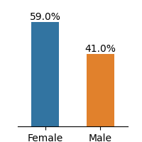
## Bar Chart: Gender Distribution
### Overview
This image presents a bar chart illustrating the distribution of gender within a dataset. The chart compares the percentage representation of females and males.
### Components/Axes
* **X-axis:** Represents gender categories: "Female" and "Male".
* **Y-axis:** Represents percentage, with a scale ranging from approximately 0% to 60%. The scale is not explicitly labeled with numerical markers, but can be inferred from the data points.
* **Bars:** Two vertical bars represent the percentage for each gender.
* Blue bar: Represents "Female".
* Orange bar: Represents "Male".
### Detailed Analysis
* **Female:** The blue bar reaches approximately 59.0%. The bar is positioned above the "Female" label on the x-axis.
* **Male:** The orange bar reaches approximately 41.0%. The bar is positioned above the "Male" label on the x-axis.
### Key Observations
The chart shows a clear difference in the percentage representation of females and males. Females are more prevalent in the dataset, representing approximately 59.0% of the total, while males represent approximately 41.0%.
### Interpretation
The data suggests that the dataset is skewed towards female representation. This could indicate a variety of factors depending on the context of the data. For example, if this data represents users of a specific product, it might suggest that the product is more popular among females. Alternatively, if this data represents participants in a study, it might indicate a bias in the recruitment process. The difference of approximately 18% between the two genders is notable and warrants further investigation to understand the underlying reasons for this distribution.