## Chart: Information Gain and R² Value vs. Training Steps
### Overview
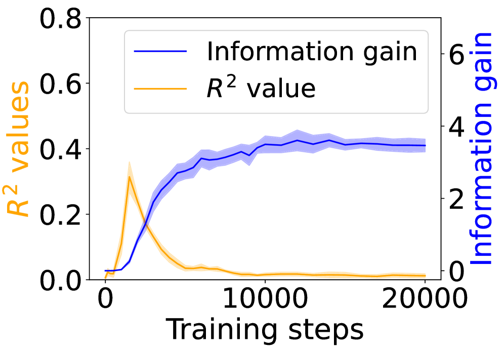
The image is a line graph showing the relationship between training steps and two metrics: Information gain and R² value. The x-axis represents training steps, while the left y-axis represents R² values and the right y-axis represents Information gain. The graph displays how these metrics change as the training progresses.
### Components/Axes
* **X-axis:** Training steps, ranging from 0 to 20000.
* **Left Y-axis:** R² values, ranging from 0.0 to 0.8, with a label in orange.
* **Right Y-axis:** Information gain, ranging from 0 to 6, with a label in blue.
* **Legend:** Located at the top-center of the chart.
* Blue line: Information gain
* Orange line: R² value
### Detailed Analysis
* **Information gain (Blue line):** The information gain starts at approximately 0 at 0 training steps. It increases rapidly until approximately 5000 training steps, reaching a value of approximately 3. It continues to increase at a slower rate, plateauing around 4.2 at approximately 10000 training steps. The shaded area around the blue line represents the uncertainty or variance in the information gain.
* At 0 training steps, Information gain ≈ 0
* At 5000 training steps, Information gain ≈ 3
* At 10000 training steps, Information gain ≈ 4.2
* At 20000 training steps, Information gain ≈ 4.2
* **R² value (Orange line):** The R² value starts at approximately 0 at 0 training steps. It increases rapidly until approximately 1000 training steps, reaching a peak value of approximately 0.3. After reaching its peak, it decreases rapidly, approaching 0 at approximately 5000 training steps. The shaded area around the orange line represents the uncertainty or variance in the R² value.
* At 0 training steps, R² value ≈ 0
* At 1000 training steps, R² value ≈ 0.3
* At 5000 training steps, R² value ≈ 0
* At 20000 training steps, R² value ≈ 0
### Key Observations
* The information gain increases rapidly in the early stages of training and then plateaus.
* The R² value peaks early in training and then decreases to near zero.
* The shaded areas around the lines indicate the variability in the data.
### Interpretation
The graph suggests that the model rapidly gains information in the initial training phase, as indicated by the sharp increase in information gain. However, the R² value, which represents the goodness of fit, peaks early and then declines, suggesting that the model might be overfitting to the training data. The plateau in information gain after 10000 training steps indicates that the model is no longer learning effectively, and further training may not be beneficial. The early peak in R² value followed by a decline suggests that the model initially fits the training data well but loses its generalization ability as training progresses.