\n
## Dual-Axis Line Chart: Training Progress Metrics
### Overview
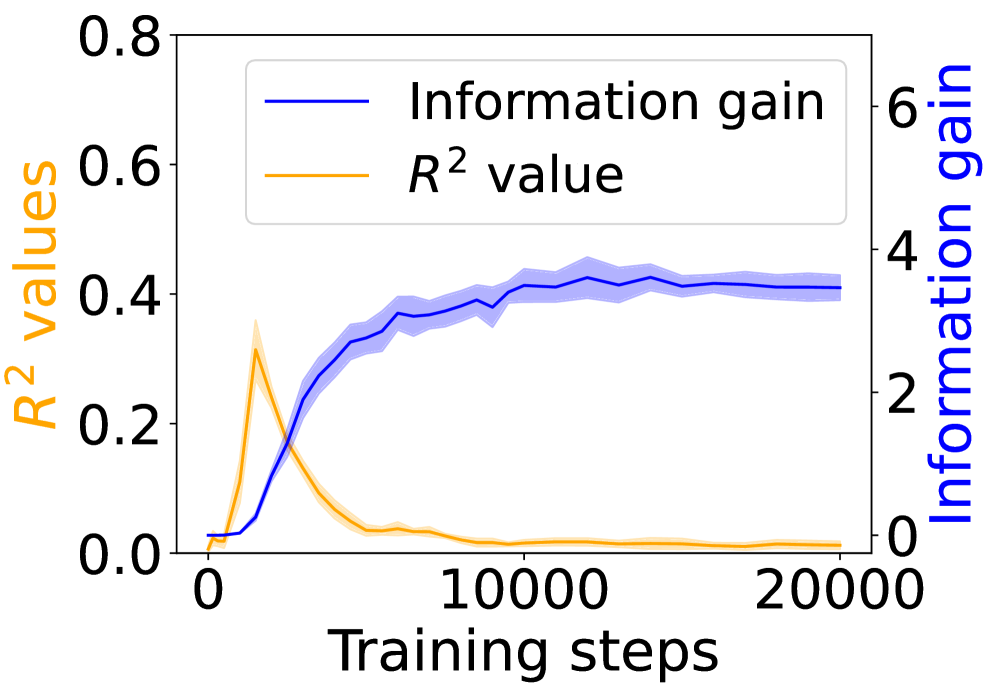
The image displays a dual-axis line chart plotting two different metrics against the number of training steps. The chart illustrates the relationship between a model's "Information gain" and its "R² value" over the course of 20,000 training steps. The data suggests an inverse relationship between the two metrics after an initial phase.
### Components/Axes
* **X-Axis (Bottom):** Labeled "Training steps". The scale runs from 0 to 20,000, with major tick marks at 0, 10,000, and 20,000.
* **Primary Y-Axis (Left):** Labeled "R² values" in orange text. The scale runs from 0.0 to 0.8, with major tick marks at 0.0, 0.2, 0.4, 0.6, and 0.8.
* **Secondary Y-Axis (Right):** Labeled "Information gain" in blue text. The scale runs from 0 to 6, with major tick marks at 0, 2, 4, and 6.
* **Legend:** Located in the top-left quadrant of the chart area. It contains two entries:
* A blue line labeled "Information gain".
* An orange line labeled "R² value".
* **Data Series:**
1. **Information Gain (Blue Line):** A solid blue line with a semi-transparent blue shaded region around it, likely representing a confidence interval or standard deviation.
2. **R² Value (Orange Line):** A solid orange line with a semi-transparent orange shaded region around it.
### Detailed Analysis
**1. Information Gain (Blue Line, Right Axis):**
* **Trend:** The line shows a steep, positive slope initially, followed by a plateau.
* **Data Points (Approximate):**
* Starts near 0 at step 0.
* Rises sharply, crossing a value of ~2 around step 2,500.
* Continues to increase, reaching ~3.5 by step 5,000.
* The growth rate slows, approaching a value of ~4 by step 10,000.
* From step 10,000 to 20,000, the line plateaus, fluctuating slightly around a value of 4.0 (±0.2).
* **Uncertainty (Shaded Region):** The blue shaded band is narrowest at the start and end, and widest during the period of rapid increase (steps ~2,500 to 7,500), indicating higher variance in the measurement during that phase.
**2. R² Value (Orange Line, Left Axis):**
* **Trend:** The line shows a sharp, early peak followed by a rapid decline and a long, low plateau.
* **Data Points (Approximate):**
* Starts near 0.0 at step 0.
* Peaks sharply at approximately step 2,500, reaching a maximum value of ~0.35.
* Declines rapidly after the peak, falling below 0.1 by step 5,000.
* From step 7,500 onward, it stabilizes at a very low value, hovering just above 0.0 (approximately 0.02-0.05) until step 20,000.
* **Uncertainty (Shaded Region):** The orange shaded band is most prominent around the peak (steps ~1,500 to 3,500), suggesting significant variance in the R² value during the model's peak performance on this metric.
### Key Observations
1. **Inverse Relationship Post-Peak:** After approximately step 2,500, the two metrics move in opposite directions. As Information Gain continues to climb and stabilize, the R² value collapses.
2. **Divergent Timescales:** The R² value reaches its maximum very early in training (~12.5% of the total steps shown). In contrast, Information Gain requires about half the displayed training (10,000 steps) to reach its plateau.
3. **Stability vs. Volatility:** The final 10,000 steps show both metrics in a stable state, but at dramatically different levels relative to their scales: Information Gain is high and stable, while R² is near zero and stable.
4. **Variance Patterns:** The uncertainty (shaded regions) for both metrics is highest during their periods of most rapid change.
### Interpretation
This chart likely visualizes the training dynamics of a machine learning model, possibly in representation learning or a similar field.
* **What the data suggests:** The "Information gain" metric appears to measure the model's capacity to learn useful, discriminative features from the data. Its steady rise and plateau indicate successful and sustained learning. The "R² value," a common measure of regression fit or predictive accuracy, peaks early and then degrades. This pattern is a classic signature of **overfitting** or a **shift in the model's objective**. The model may initially fit the training data well (high R²), but as training progresses, it optimizes for a different, more abstract goal (maximizing information gain) that does not correlate with the specific predictive task measured by R².
* **Relationship between elements:** The dual-axis design is crucial for revealing this inverse relationship, which would be obscured if plotted on a single axis. The legend and color coding are essential for correctly associating each trend with its corresponding metric and scale.
* **Notable anomaly:** The most striking feature is the complete decoupling of the two metrics. It implies that for this model and task, continued training (as measured by information gain) actively harms the specific predictive performance measured by R² after a very early point. This could be intentional (e.g., the model is being trained for a different downstream task) or a sign of a problematic training regime.