## Bar Chart: Overall Accuracy Comparison
### Overview
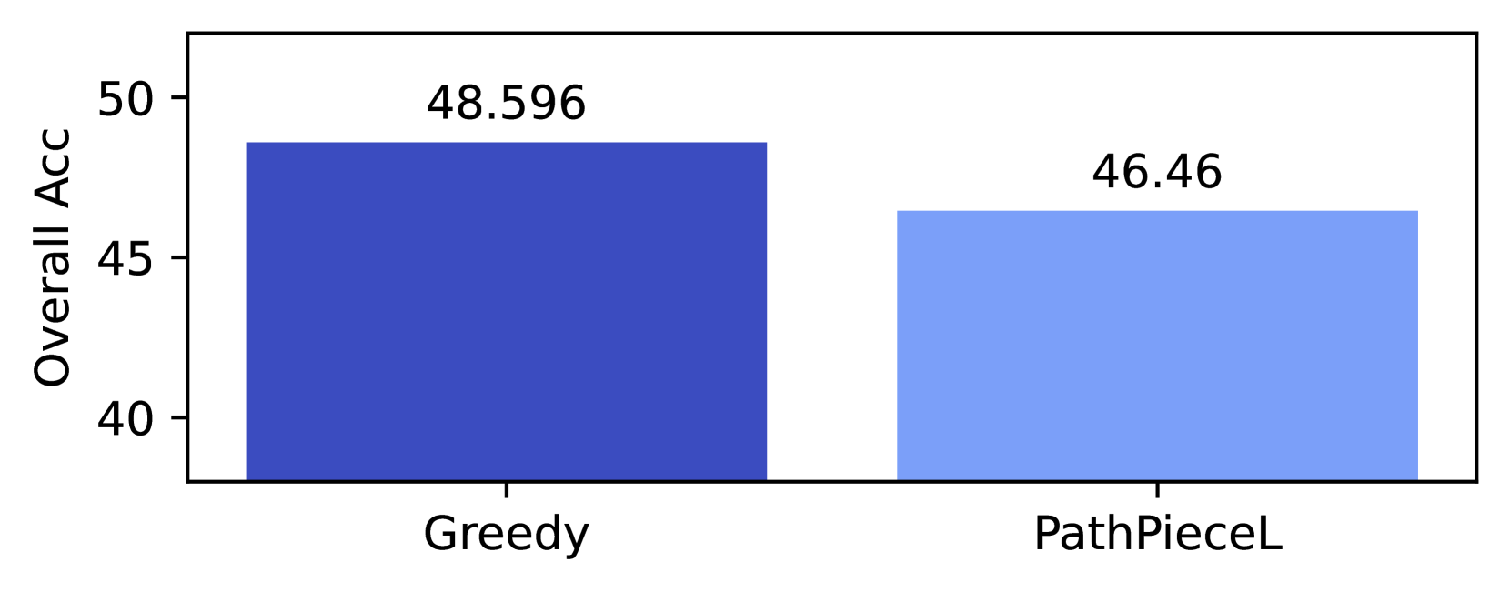
The image displays a simple vertical bar chart comparing the "Overall Acc" (Overall Accuracy) of two distinct methods or models, labeled "Greedy" and "PathPieceL". The chart presents a direct performance comparison, with the "Greedy" method achieving a higher accuracy score.
### Components/Axes
* **Chart Type:** Vertical Bar Chart.
* **Y-Axis:**
* **Label:** "Overall Acc" (presumably Overall Accuracy).
* **Scale:** Linear scale with major tick marks at 40, 45, and 50. The axis is truncated, starting at 40 rather than 0.
* **X-Axis:**
* **Categories:** Two categorical bars.
* **Labels (from left to right):** "Greedy" and "PathPieceL".
* **Data Series & Values:**
* **Greedy:** Represented by a dark blue bar. The exact value, annotated above the bar, is **48.596**.
* **PathPieceL:** Represented by a light blue bar. The exact value, annotated above the bar, is **46.46**.
* **Legend:** Not present. Category identification is provided by direct labels under each bar.
* **Spatial Layout:** The "Greedy" bar is positioned on the left side of the chart area, and the "PathPieceL" bar is on the right. The y-axis label is rotated 90 degrees and placed to the left of the axis.
### Detailed Analysis
* **Data Point Extraction:**
* **Greedy:** Accuracy = 48.596
* **PathPieceL:** Accuracy = 46.46
* **Trend/Comparison:** The "Greedy" bar is visually taller than the "PathPieceL" bar, indicating a higher accuracy value. The numerical difference is 48.596 - 46.46 = **2.136** percentage points.
* **Visual Representation:** The y-axis range (40 to ~50) visually amplifies the difference between the two bars. The "Greedy" bar extends from the baseline (40) to just below the 50 mark, while the "PathPieceL" bar extends to a point slightly above the 45 mark.
### Key Observations
1. **Performance Hierarchy:** The "Greedy" method demonstrates superior performance over "PathPieceL" on the "Overall Acc" metric.
2. **Truncated Axis:** The y-axis starts at 40, not 0. This is a common practice to highlight differences in data points that are close in value, but it can visually exaggerate the relative difference if not noted by the viewer.
3. **Precision of Annotation:** The values are provided with high precision (three decimal places for Greedy, two for PathPieceL), suggesting these are calculated metrics from an experiment or evaluation.
4. **Simplicity:** The chart is minimal, containing only the essential elements needed for the comparison: two bars, their labels, and their exact values.
### Interpretation
This chart provides a clear, quantitative snapshot comparing two approaches. The data suggests that, under the conditions measured by "Overall Acc," the "Greedy" approach is more effective than "PathPieceL" by a margin of approximately 2.1 percentage points.
The choice of a truncated y-axis is a deliberate design decision to make this ~2-point difference more visually apparent. While this aids in quick visual comparison, a technical reader should note the absolute scale to properly contextualize the magnitude of the improvement. The high precision of the reported values implies this is likely a result from a controlled computational experiment, such as evaluating machine learning models or algorithmic performance on a specific task. The absence of error bars or confidence intervals means we cannot assess the statistical significance of the observed difference from this chart alone.