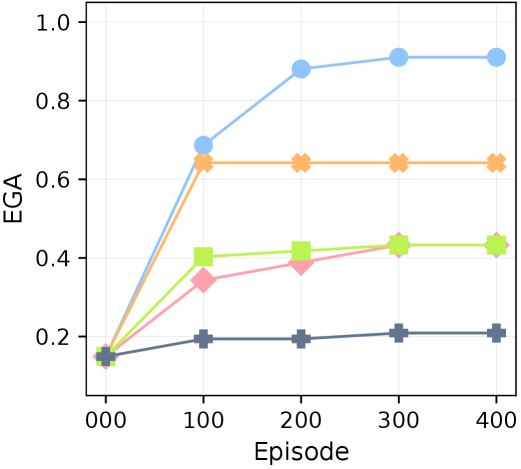
## Line Chart: Performance Comparison Across Episodes
### Overview
The image displays a line chart comparing the performance of five different methods or algorithms over a series of training episodes. The performance metric is labeled "EGA" on the y-axis, and the x-axis represents the progression of "Episode" from 0 to 400. The chart shows that all methods start at a similar low performance level, but their trajectories diverge significantly as training progresses.
### Components/Axes
* **X-Axis (Horizontal):**
* **Label:** "Episode"
* **Scale:** Linear, with major tick marks at 000, 100, 200, 300, and 400.
* **Y-Axis (Vertical):**
* **Label:** "EGA"
* **Scale:** Linear, ranging from 0.0 to 1.0, with major tick marks at intervals of 0.2 (0.0, 0.2, 0.4, 0.6, 0.8, 1.0).
* **Data Series (Lines):** There are five distinct lines, each identified by a unique color and marker shape. **Note:** A formal legend is not present within the chart area. The series are identified below by their visual properties.
1. **Light Blue Line with Circle Markers:** The top-performing series.
2. **Orange Line with 'X' (Cross) Markers:** The second-highest performing series.
3. **Light Green Line with Square Markers:** A mid-tier performer.
4. **Pink Line with Diamond Markers:** A mid-tier performer, closely following the green line.
5. **Dark Gray Line with Plus ('+') Markers:** The lowest-performing series.
### Detailed Analysis
**Trend Verification & Data Point Extraction (Approximate Values):**
1. **Light Blue Line (Circles):**
* **Trend:** Slopes steeply upward from episode 0 to 200, then continues to rise at a slower rate, appearing to plateau near the top of the chart.
* **Data Points:**
* Episode 0: ~0.15
* Episode 100: ~0.68
* Episode 200: ~0.88
* Episode 300: ~0.91
* Episode 400: ~0.91
2. **Orange Line (Crosses):**
* **Trend:** Rises sharply from episode 0 to 100, then immediately plateaus, maintaining a constant value for the remainder of the episodes.
* **Data Points:**
* Episode 0: ~0.15
* Episode 100: ~0.64
* Episode 200: ~0.64
* Episode 300: ~0.64
* Episode 400: ~0.64
3. **Light Green Line (Squares):**
* **Trend:** Increases from episode 0 to 100, then shows very gradual improvement, nearly plateauing.
* **Data Points:**
* Episode 0: ~0.15
* Episode 100: ~0.40
* Episode 200: ~0.42
* Episode 300: ~0.43
* Episode 400: ~0.43
4. **Pink Line (Diamonds):**
* **Trend:** Follows a similar trajectory to the green line but starts slightly lower at episode 100 and converges with it by episode 300.
* **Data Points:**
* Episode 0: ~0.15
* Episode 100: ~0.34
* Episode 200: ~0.38
* Episode 300: ~0.43
* Episode 400: ~0.43
5. **Dark Gray Line (Plus Signs):**
* **Trend:** Shows minimal improvement. It rises slightly from episode 0 to 100 and then remains essentially flat at a low performance level.
* **Data Points:**
* Episode 0: ~0.15
* Episode 100: ~0.20
* Episode 200: ~0.20
* Episode 300: ~0.21
* Episode 400: ~0.21
### Key Observations
* **Performance Hierarchy:** A clear and consistent ranking is established by episode 100 and maintained thereafter: Light Blue > Orange > Light Green ≈ Pink > Dark Gray.
* **Convergence Points:** The Light Green and Pink lines converge to the same final performance value (~0.43). All lines start from the same approximate point (~0.15) at episode 0.
* **Plateau Behavior:** The Orange line exhibits the most abrupt plateau, showing no learning after episode 100. The Light Blue line shows the most sustained learning, continuing to improve (albeit slowly) until episode 300.
* **Lowest Performer:** The Dark Gray line demonstrates significantly limited learning capacity compared to the other four methods.
### Interpretation
This chart likely compares the learning efficiency or final performance of different reinforcement learning agents, machine learning models, or optimization algorithms on a specific task. The "EGA" metric is probably a performance score (e.g., "Expected Goal Advantage," "Episode Gain Average," or a similar domain-specific measure) where higher is better.
The data suggests that the method represented by the **Light Blue line is superior**, achieving near-maximal performance (~0.91) and continuing to learn effectively throughout the training period. The **Orange method** learns very quickly but hits a hard performance ceiling early. The **Green and Pink methods** show moderate, stable learning. The **Dark Gray method** appears to be poorly suited for the task or is a weak baseline, as it learns very little.
The absence of a legend is a significant limitation for precise interpretation, as the specific algorithms or conditions corresponding to each color are unknown. However, the visual trends alone provide a clear comparative analysis of learning dynamics and asymptotic performance. The chart effectively communicates that not all methods are equal in both learning speed and final capability for this particular task.