## Line Graphs: Effective Bandwidth and TPOP vs Offloading Ratio
### Overview
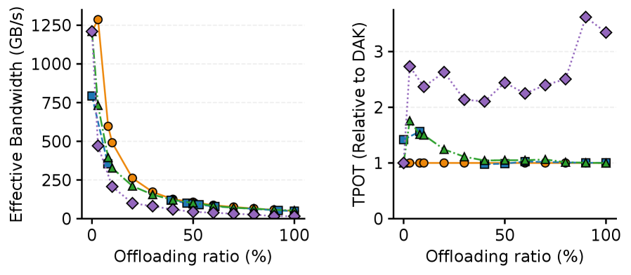
The image contains two line graphs comparing system performance metrics (Effective Bandwidth and TPOP relative to DAK) across varying offloading ratios (0% to 100%). Each graph uses distinct markers and colors to represent different data series, with trends showing how performance degrades or stabilizes as offloading increases.
---
### Components/Axes
#### Left Graph: Effective Bandwidth (GB/s)
- **X-axis**: Offloading ratio (%) (0 to 100 in 50% increments)
- **Y-axis**: Effective Bandwidth (GB/s) (0 to 1250 in 250 increments)
- **Legend**:
- Orange Circle
- Green Triangle
- Blue Square
- Purple Diamond
#### Right Graph: TPOP (Relative to DAK)
- **X-axis**: Offloading ratio (%) (0 to 100 in 50% increments)
- **Y-axis**: TPOP (Relative to DAK) (0 to 3 in 1.0 increments)
- **Legend**:
- Orange Circle
- Green Triangle
- Purple Diamond
---
### Detailed Analysis
#### Left Graph: Effective Bandwidth
1. **Orange Circle** (Highest initial value):
- Starts at ~1250 GB/s at 0% offloading.
- Drops sharply to ~500 GB/s at 10% offloading.
- Plateaus near ~250 GB/s from 20% to 100% offloading.
2. **Green Triangle**:
- Begins at ~750 GB/s at 0% offloading.
- Declines to ~250 GB/s at 20% offloading.
- Stabilizes near ~100 GB/s from 30% to 100% offloading.
3. **Blue Square**:
- Starts at ~500 GB/s at 0% offloading.
- Decreases to ~100 GB/s at 30% offloading.
- Remains flat at ~50 GB/s from 40% to 100% offloading.
4. **Purple Diamond**:
- Initiates at ~1000 GB/s at 0% offloading.
- Falls to ~200 GB/s at 20% offloading.
- Plateaus near ~100 GB/s from 30% to 100% offloading.
#### Right Graph: TPOP Relative to DAK
1. **Orange Circle**:
- Remains constant at ~1.0 across all offloading ratios.
2. **Green Triangle**:
- Starts at ~2.5 at 0% offloading.
- Dips to ~1.5 at 10% offloading.
- Stabilizes near ~1.0 from 20% to 100% offloading.
3. **Purple Diamond**:
- Begins at ~1.0 at 0% offloading.
- Rises to ~3.0 at 50% offloading.
- Fluctuates between ~2.0 and ~3.0 from 60% to 100% offloading.
---
### Key Observations
1. **Left Graph**:
- All data series show significant bandwidth degradation with increasing offloading.
- Orange Circle and Purple Diamond experience the steepest initial declines.
- Blue Square stabilizes at the lowest bandwidth (~50 GB/s) at high offloading ratios.
2. **Right Graph**:
- Orange Circle (stable TPOP) suggests minimal impact on DAK efficiency.
- Purple Diamond exhibits the most variability, with a sharp rise at 50% offloading.
- Green Triangle shows a notable dip at 10% offloading, then stabilizes.
---
### Interpretation
- **Bandwidth Degradation**: Higher offloading ratios correlate with reduced effective bandwidth, but the rate of decline varies by data series. The Orange Circle and Purple Diamond lines suggest these configurations are more sensitive to offloading.
- **TPOP Stability**: The Orange Circle’s consistent TPOP (~1.0) implies it maintains DAK efficiency regardless of offloading. In contrast, the Purple Diamond’s fluctuating TPOP indicates variable DAK performance under high offloading.
- **Anomalies**: The Green Triangle’s sharp dip at 10% offloading in the left graph and subsequent stabilization in the right graph may reflect a threshold effect, where offloading beyond 10% no longer significantly impacts bandwidth or TPOP.
This analysis highlights trade-offs between offloading and system performance, with specific configurations (e.g., Orange Circle) offering stability in TPOP despite bandwidth reductions.