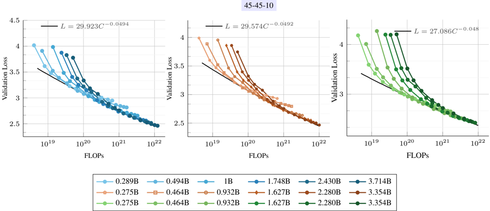
## Line Graphs: Validation Loss vs FLOPs (45-45-10)
### Overview
Three side-by-side line graphs compare validation loss against computational resources (FLOPs) for different model sizes. Each graph shows a logarithmic relationship between FLOPs and validation loss, with distinct color-coded data series and fitted curves.
### Components/Axes
- **X-axis (FLOPs)**: Logarithmic scale from 10¹⁹ to 10²².
- **Y-axis (Validation Loss)**: Linear scale from 2.5 to 4.5.
- **Legends**:
- **Left Graph**: Blue (0.289B, 0.494B, 1B), Orange (0.275B, 0.464B, 0.932B), Green (0.275B, 0.464B, 0.932B).
- **Middle Graph**: Blue (1B, 1.748B, 2.430B), Orange (0.932B, 1.627B, 2.280B), Green (0.932B, 1.627B, 2.280B).
- **Right Graph**: Blue (2.430B, 3.714B), Orange (3.354B), Green (2.280B, 3.354B).
- **Fitted Curves**: Black lines with equations (e.g., `L = 29.923C⁻⁰.⁰⁴⁹⁴` for the left graph).
### Detailed Analysis
1. **Left Graph (45-45-10)**:
- **Blue Lines**: Slope downward steeply, with validation loss decreasing from ~4.0 to ~2.5 as FLOPs increase from 10¹⁹ to 10²².
- **Orange Lines**: Similar trend but slightly higher validation loss at equivalent FLOPs.
- **Green Lines**: Overlap with orange lines, suggesting identical performance for these sizes.
2. **Middle Graph (45-45-10)**:
- **Blue Lines**: Validation loss decreases from ~4.0 to ~2.5, with steeper slopes than the left graph.
- **Orange Lines**: Start at higher loss (~4.0) and decline more gradually.
- **Green Lines**: Overlap with orange lines, indicating similar performance.
3. **Right Graph (45-45-10)**:
- **Blue Lines**: Validation loss drops from ~4.0 to ~2.5, with the steepest slopes.
- **Green Lines**: Start at ~4.0 and decline sharply, overlapping with blue lines at higher FLOPs.
### Key Observations
- **Consistent Trend**: All graphs show validation loss decreasing as FLOPs increase, confirming the inverse relationship.
- **Logarithmic Fit**: Equations (e.g., `L = 29.923C⁻⁰.⁰⁴⁹⁴`) indicate diminishing returns at higher FLOPs.
- **Color Consistency**: Legend colors match line colors across graphs (e.g., blue = 0.289B in left, 1B in middle, 2.430B in right).
- **Overlapping Lines**: Some sizes (e.g., 0.932B and 1.627B) show identical performance in certain graphs.
### Interpretation
The data demonstrates that larger models (higher FLOPs) achieve lower validation loss, but with diminishing returns. The logarithmic fits suggest that computational efficiency plateaus beyond a certain threshold. Overlapping lines in some graphs imply that specific model sizes yield comparable performance, highlighting potential redundancy in resource allocation. The consistent trend across all graphs underscores the universal trade-off between computational cost and model accuracy.