## Box Plot: Normalized Cut Performance across 10 Graphs
### Overview
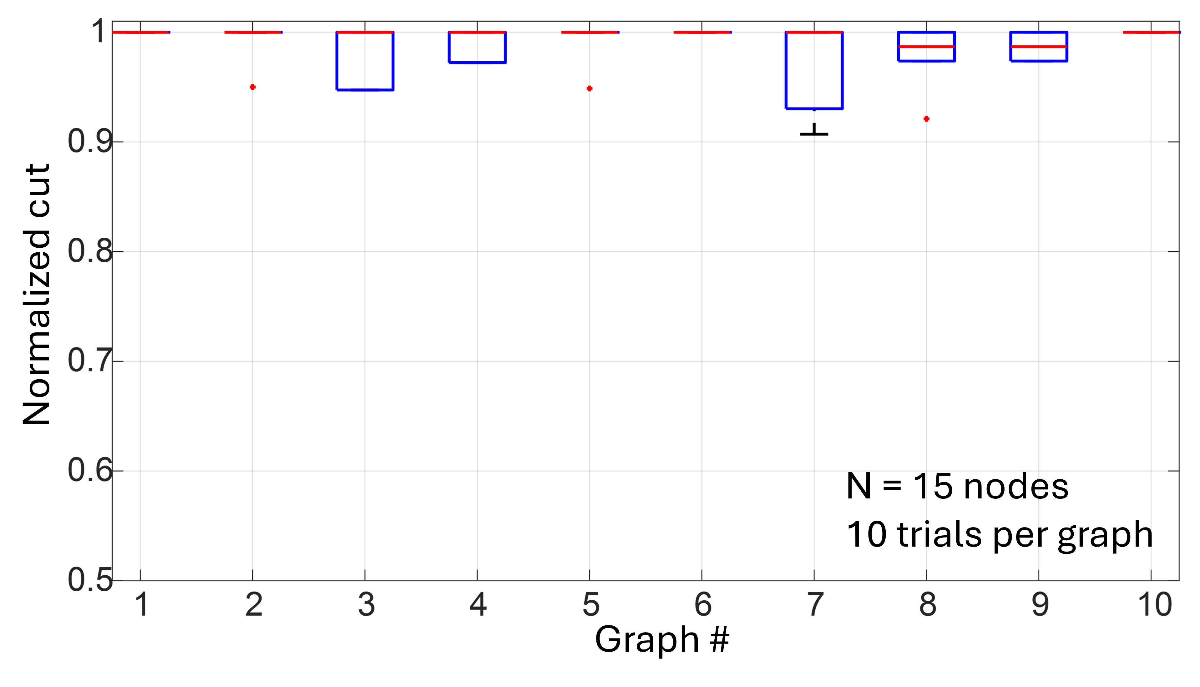
This image displays a box-and-whisker plot illustrating the "Normalized cut" performance metric across 10 distinct graphs. The chart indicates that for a set of 15 nodes, the algorithm or method being tested consistently achieves high performance, with most trials resulting in a normalized cut value of 1.0.
### Components/Axes
* **Y-Axis:** Labeled "Normalized cut". The scale ranges from 0.5 to 1.0, with major tick marks at 0.1 intervals.
* **X-Axis:** Labeled "Graph #". The scale ranges from 1 to 10, representing the specific graph being tested.
* **Annotations:** Located in the bottom-right quadrant of the plot area, the text reads:
* "N = 15 nodes"
* "10 trials per graph"
* **Visual Elements:**
* **Blue Boxes:** Represent the interquartile range (IQR) of the data.
* **Red Horizontal Lines:** Represent the median value within the boxes.
* **Black Lines (Whiskers):** Represent the range of the data (excluding outliers).
* **Red Dots:** Represent statistical outliers.
### Detailed Analysis
The data is plotted for 10 distinct graphs. Below is the breakdown of the distribution for each:
* **Graph 1:** Median at 1.0. No box or whiskers visible, indicating all 10 trials resulted in 1.0.
* **Graph 2:** Box spans approximately 0.95 to 1.0. Median at 1.0. A red outlier dot is present at approximately 0.95.
* **Graph 3:** Box spans approximately 0.95 to 1.0. Median at 1.0.
* **Graph 4:** Box spans approximately 0.97 to 1.0. Median at 1.0.
* **Graph 5:** Median at 1.0. No box visible. A red outlier dot is present at approximately 0.95.
* **Graph 6:** Median at 1.0. No box or whiskers visible.
* **Graph 7:** Box spans approximately 0.93 to 1.0. Median at 1.0. A lower whisker extends down to approximately 0.91.
* **Graph 8:** Box spans approximately 0.97 to 1.0. Median is slightly below 1.0, at approximately 0.98. A red outlier dot is present at approximately 0.92.
* **Graph 9:** Box spans approximately 0.97 to 1.0. Median at 1.0.
* **Graph 10:** Median at 1.0. No box or whiskers visible.
### Key Observations
* **High Performance Ceiling:** The vast majority of trials across all graphs result in a normalized cut of 1.0, suggesting the method is highly effective for these specific graph configurations.
* **Variance:** Graph 7 exhibits the most significant spread in data, with the lowest whisker reaching down to ~0.91.
* **Outliers:** Graphs 2, 5, and 8 contain outliers, indicating that while the method is generally consistent, there are occasional trials where the performance drops significantly compared to the median.
* **Median Shift:** Graph 8 is the only instance where the median line is visibly lower than 1.0 (approx. 0.98), suggesting it may be the most difficult graph configuration among the set.
### Interpretation
The "Normalized cut" is a standard metric used in graph theory and computer vision to evaluate the quality of graph partitioning or clustering. A value of 1.0 typically represents an optimal or near-optimal cut.
The data demonstrates that the algorithm is highly robust for 15-node graphs, as it achieves the optimal score of 1.0 in the median case for 9 out of 10 graphs. The presence of outliers and the slight performance dip in Graph 8 suggest that the algorithm's performance is dependent on the specific topology of the graph being analyzed. The "N = 15 nodes" constraint implies a relatively small graph size, which likely contributes to the high success rate. The consistency across most graphs suggests that the method is reliable, though the outliers in graphs 2, 5, 7, and 8 indicate that certain graph structures may occasionally challenge the algorithm's convergence or partitioning logic.