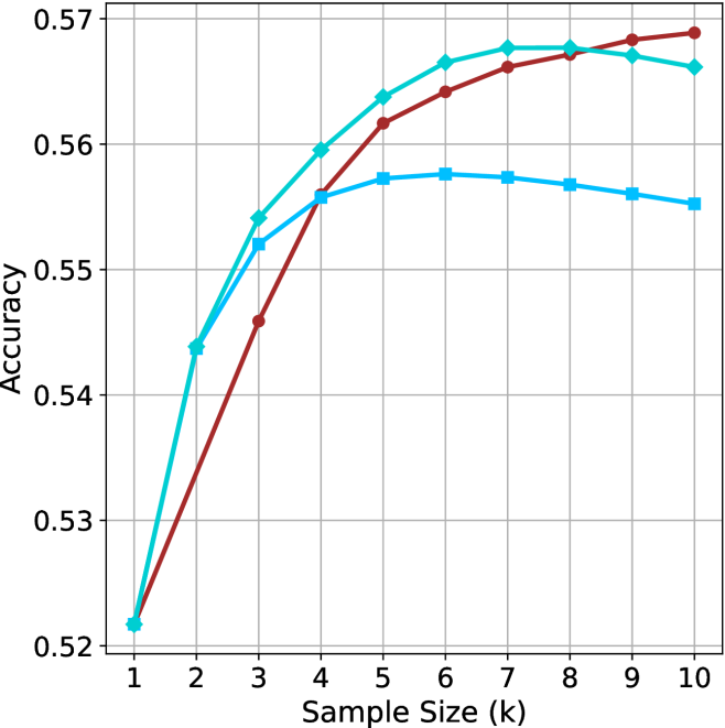
## Line Chart: Accuracy vs. Sample Size
### Overview
The image is a line chart displaying the relationship between "Accuracy" (y-axis) and "Sample Size (k)" (x-axis) for three different data series, represented by different colored lines: cyan, brown, and light blue. The chart includes a grid for easier reading of values.
### Components/Axes
* **X-axis:** "Sample Size (k)" ranges from 1 to 10 in integer increments.
* **Y-axis:** "Accuracy" ranges from 0.52 to 0.57 in increments of 0.01.
* **Grid:** Present in the background to aid in value estimation.
* **Data Series:** Three distinct lines, each with different markers:
* Cyan line with diamond markers.
* Brown line with circle markers.
* Light blue line with square markers.
### Detailed Analysis
* **Cyan Line (Diamond Markers):**
* Trend: Initially increases sharply, peaks around a sample size of 7, then decreases slightly.
* Data Points:
* Sample Size 1: Accuracy ~0.522
* Sample Size 3: Accuracy ~0.55
* Sample Size 5: Accuracy ~0.562
* Sample Size 7: Accuracy ~0.567
* Sample Size 10: Accuracy ~0.565
* **Brown Line (Circle Markers):**
* Trend: Increases sharply, peaks around a sample size of 8, then decreases slightly.
* Data Points:
* Sample Size 1: Accuracy ~0.522
* Sample Size 3: Accuracy ~0.546
* Sample Size 5: Accuracy ~0.564
* Sample Size 8: Accuracy ~0.568
* Sample Size 10: Accuracy ~0.569
* **Light Blue Line (Square Markers):**
* Trend: Increases, plateaus around a sample size of 6-7, then decreases slightly.
* Data Points:
* Sample Size 1: Accuracy ~0.522
* Sample Size 3: Accuracy ~0.552
* Sample Size 5: Accuracy ~0.556
* Sample Size 7: Accuracy ~0.556
* Sample Size 10: Accuracy ~0.555
### Key Observations
* All three lines start at approximately the same accuracy value (~0.522) for a sample size of 1.
* The brown line (circle markers) achieves the highest peak accuracy, slightly above 0.568, at a sample size of approximately 8.
* The light blue line (square markers) plateaus at a lower accuracy compared to the other two lines.
* All three lines show a slight decrease in accuracy after reaching their peak values.
### Interpretation
The chart illustrates how accuracy changes with varying sample sizes for three different models or algorithms. The initial increase in accuracy suggests that larger sample sizes generally improve performance. However, the plateauing and subsequent decrease indicate that there is a point of diminishing returns, and beyond a certain sample size, the accuracy either stabilizes or even decreases, possibly due to overfitting or increased noise in the data. The brown line (circle markers) appears to be the most effective, achieving the highest accuracy among the three. The light blue line (square markers) is the least effective, plateauing at a lower accuracy.